Interfere · design research
A teardown of interfere.com: the art direction, typography, color, layout, components, motion, brand assets and copywriting of every public page type. It is written as a brand-and-design-engineering reference: every value was measured in the browser on 2026-11-21 at 1440 × 900 (plus 390 and 768 for responsive). Estimates are marked ≈.
What Interfere is (in one line)
An AI "production visibility" tool. It watches errors, sessions, traces and deploys, opens a problem, finds the root cause and suggests the fix. The marketing site sells that to engineers, designers, product managers and support with one persona page each.
The design in five sentences
- One dark theme, built from white-alpha on near-black (
oklch(0.15 0 0) ≈ #0b0b0b): no gray hex scale, just .93 / .686 / .392 text and .035 / .07 / .106 / .173 fills.
- One brand gradient, orange → magenta → purple → blue, used at 20–50% alpha as a horizon glow behind product UI and in a full-bleed closing band on every page.
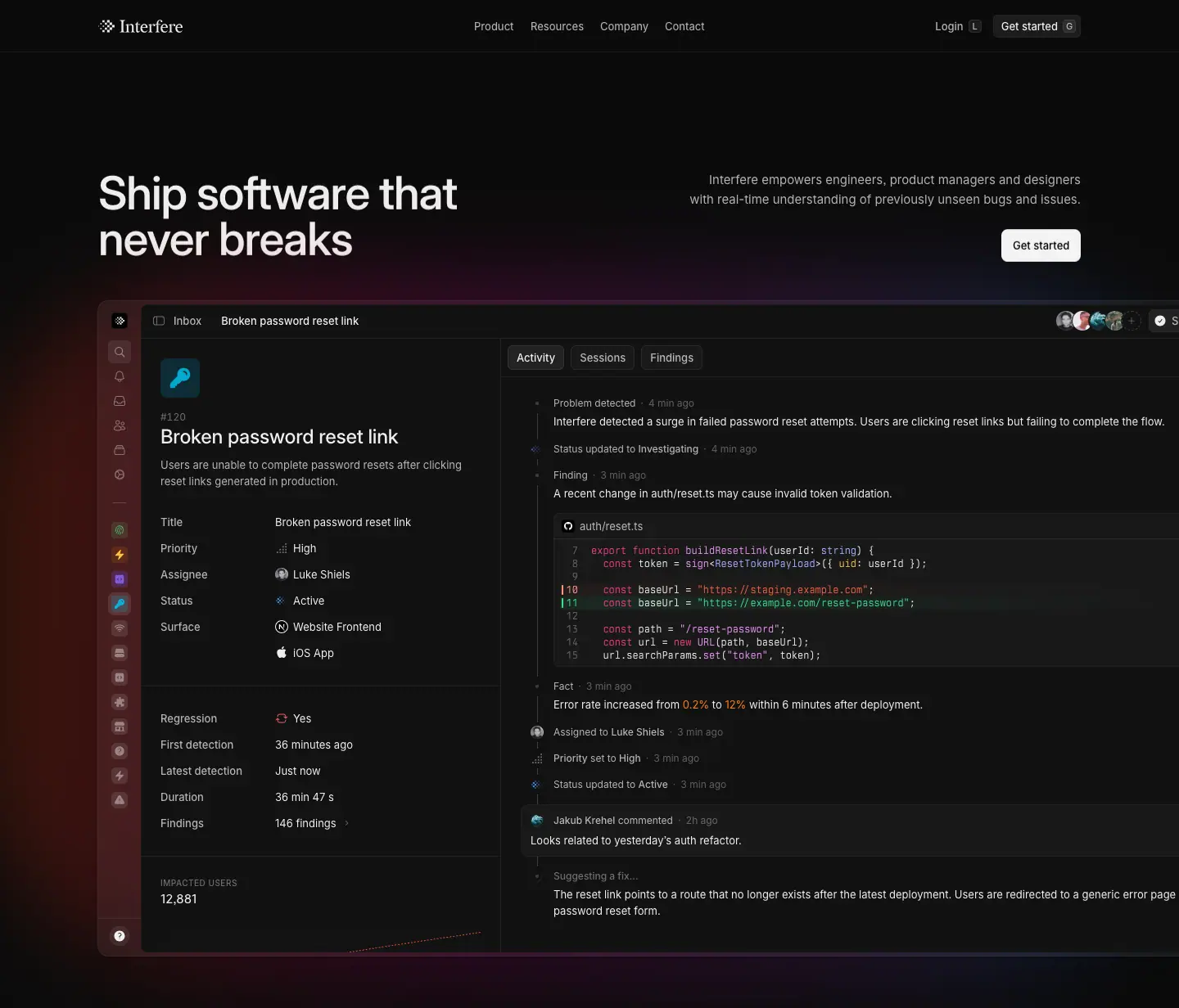
- Product UI is the illustration. Every hero and feature visual is the real app (Radix-colored code, chips, timelines), rebuilt in HTML/CSS, not screenshots. Skeleton bars replace detail that doesn't serve the message.
- Small, dense type. Inter Variable with
ss03, body copy at 13–15 px, headings at 28 and 56 px, weight 500 (550 on the home H1). Heldane Text (serif) appears only for human voices: quotes, the founder letter, photo captions. Berkeley Mono for code, Departure Mono for the pixel motif.
- Motion explains the product. Hero words rise out of a 10 px blur in a 40 ms stagger, a timeline draws itself like events arriving, the testimonial reveals 3 words at a time on scroll. Everything respects
prefers-reduced-motion.
The team explained most of these choices themselves in How we built Interfere's new website (Sep 1, 2026). Those first-party reasons are quoted throughout.
Contents
System
| Doc |
What it covers |
| 01 · Design principles |
the 9 rules behind every page |
| 02 · Color system |
surfaces, text alphas, brand gradient, Radix semantic colors, WCAG ratios |
| 03 · Typography |
4 typefaces, sources and licences, free substitutes, the full measured scale |
| 04 · Layout, grid and spacing |
1200 px container, 4 px base, section rhythm, article columns |
| 05 · Heroes |
the 6 hero types |
| 06 · Section types |
20 reusable section patterns |
| 07 · Copywriting and voice |
headline formulas, verbs, tone, microcopy |
| 08 · Components |
nav, mega-menu, buttons with keycaps, chips, cards, forms, footer |
| 09 · Art direction |
product-as-illustration, glow, blueprint grids, isometric, photography, logo |
| 10 · Brand assets and graphics |
inventory of every graphic type, how it is made, how to recreate it |
| 11 · Motion and interaction |
keyframes, easings, durations, scroll reveal, hover/press |
| 12 · Glossary |
the vocabulary to brief a page like this |
| 13 · Build recipe |
CSS tokens and component snippets to rebuild the look |
| Public pages |
all 142 public URLs, grouped |
Pages (section-by-section reviews)
Pages captured
22 pages at 1440 px full height (images/full/), home at 390 and 768 px and About at 390 px (images/responsive/), 32 component and asset crops (images/assets/), and per-section crops for every page (images/<page>/). Raw DOM measurements are in data/.
| Captured |
URL |
| Home |
https://interfere.com/ |
| About |
https://interfere.com/about |
| For Engineers / Designers / PMs / Support |
https://interfere.com/product/engineers (and /designers, /product-managers, /customer-support) |
| Security |
https://interfere.com/security |
| Download |
https://interfere.com/download |
| Careers + one job post |
https://interfere.com/careers, https://interfere.com/careers/founding-designer |
| Blog + 2 posts |
https://interfere.com/blog, /blog/how-we-built-interferes-new-website, /blog/seed-announcement |
| Changelog + 2 entries |
https://interfere.com/changelog, /changelog/desktop-app, /changelog/mcp-feedback |
| Guides + 2 guides |
https://interfere.com/guides, /guides/interfere-vs-sentry, /guides/what-is-otlp |
| Legal |
https://interfere.com/legal/privacy-policy |
| Join (demo form) |
https://interfere.com/join |
| Docs home |
https://interfere.com/docs |
Stack (stated by the team, confirmed in the page source)
TanStack Start + Vite (moved from Next.js), Tailwind CSS v4 (--spacing: .25rem), Radix Colors for every color scale, Motion for JS animation, Base UI for primitives (the nav menu exposes data-starting-style / --positioner-width), Cloudflare image resizing (/cdn-cgi/image/format=auto,width=256/). Docs run on Mintlify with Inter but its own tokens.
Known gaps
/docs and /join scroll inside an app shell, so their "full page" captures are one viewport (900 px).- The hero timeline animation plays only on the first visit per session (by design), so later captures show its end state.
- Hover and press states were read from computed styles after
agent-browser hover, not filmed.
- No public pricing page exists (
/pricing is not in the sitemap); pricing is sales-led through /join.
Public pages · every URL on interfere.com
142 public pages, taken on 2026-11-21 from /sitemap.xml (70 marketing URLs) and /docs/sitemap.xml (71 documentation URLs), cross-checked against the header and footer navigation. robots.txt blocks only /download/starting and /email/unsubscribe, so those are not listed. Titles are each page's <title> tag with the " › Interfere" suffix removed.
Header and footer link to a few routes that are not in the sitemap: /auth (login, app-only), and external links to X, LinkedIn, Discord. /join is "Request a demo". There is no public pricing page: pricing is sales-led.
| Group |
Pages |
| Marketing |
3 |
| Product |
4 |
| Company |
1 |
| Careers |
9 |
| Blog |
4 |
| Changelog |
13 |
| Guides |
28 |
| Security |
3 |
| Legal |
6 |
| Docs · Getting started |
2 |
| Docs · Product |
25 |
| Docs · SDK |
13 |
| Docs · Integrations |
13 |
| Docs · API reference |
18 |
Marketing (3)
Product (4)
Company (1)
Careers (9)
Blog (4)
Changelog (13)
Guides (28)
Security (3)
Legal (6)
Docs · Getting started (2)
Docs · Product (25)
Docs · SDK (13)
Docs · Integrations (13)
Docs · API reference (18)
01 · Design principles
Nine rules that explain almost every pixel on interfere.com. Each one has the evidence (what was measured) and the reason (why it works for this company).
1. The marketing page should feel like the product
Evidence. The home hero is a 1,320 px wide, fully interactive-looking copy of the Inbox → Problem view, rebuilt in HTML with the product's own Radix tokens (--color-primary-foreground, int-btn, int-status-* classes ship in the same CSS as the app). The same component names (int-btn-primary, int-btn-xl) appear on marketing buttons.
Why. In the team's words: "We are big fans of websites where the marketing page is the product, and while this wasn't realistic for us, we wanted to do something similar." For a developer tool, a real-looking UI is the most credible proof. Visitors read the code diff, the "0.2% → 12%" spike and the suggested fix and understand the product without a sentence of copy.
2. Dark, quiet, and one temperature
Evidence. Every page (22/22) renders on oklch(0.15 0 0). There is no light theme. All grays are white at .035–.93 alpha. Saturated color appears only inside product UI.
Why. Developer tools live in dark IDEs and terminals; a dark site feels native to that audience. Using alpha instead of fixed grays lets the brand gradient bleed through cards, which the team tested explicitly: "We settled on the semi-transparent grey… the only option that met all criteria."
3. One signature: the gradient
Evidence. The same four stops (#ff3b00 → #f6009d → #973ec6 → #008eff, or the deeper #ef5f00 → #c2007a → #53009e → #0086f0) appear as the hero glow, the closing CTA band on all 22 pages, the About backdrop, the Download radial, guide covers and changelog covers.
Why. "The gradient shows up throughout the website… It's a nice visual thread that ties seemingly unrelated elements together and makes the website feel cohesive." A single, repeated, low-alpha gradient gives recognisability without loud color.
4. Pixels echo the logo
Evidence. The logomark is a checkerboard of squares. That pixel motif recurs as the 3D floating-tile hero on Careers, the giant dithered Interfere wordmark at the bottom of every footer, Departure Mono labels ("RESET PASSWORD LINK"), the SOC 2 seal in the changelog and the app icon on Download.
Why. The team named "a pixelated final word in the headline that echoes the logo" as one of the two signature details of the identity. A shape language derived from the mark makes every page brand-specific even when the logo is off-screen.
5. Small type, big contrast in hierarchy
Evidence. Body and UI copy sit at 13 px and 15 px. Section titles are 28 px, display is 56 px. Nothing between 36 and 56 on marketing pages. Weight is 500 for almost every heading.
Why. Small, dense text matches the product (an app UI) and lets the 56 px display lines feel large without needing a bold weight. Hierarchy comes from size jumps and alpha (.93 vs .686 vs .392), not from weight.
6. Human voice gets a serif
Evidence. Heldane Text (Klim) is used only for the customer quote (28 px home, 24 px join), the founder letter on About (18 px / 28 px), the About manifesto (32 px), the seed-post pull quote (28 px) and the photo caption.
Why. Inter speaks for the product, the serif speaks for people. The switch signals "a person is talking now" without labels.
7. Show less of the product, on purpose
Evidence. Feature mocks use skeleton bars (rgba(255,255,255,.173) blocks) for parts that don't matter; whole panels fade into the page with eased gradient masks; mocks are cropped by the viewport edge.
Why. "Sometimes showing the actual product as is can introduce unnecessary noise… We decided to simplify the graphics by using skeleton UI for unimportant pieces of the UI."
8. Animate to explain, then stop
Evidence. Hero: blur 10→0, opacity 0→1, translateY 20%→0, 0.8 s, words staggered 40 ms. Timeline: line draws → marker → content, once per visit. Quote: words reveal in groups of three as you scroll. All marketing keyframes have a prefers-reduced-motion: reduce override.
Why. "Most of the animations we built give you a glimpse into how the product works." and "Over-animation is a real thing, especially now that it's very easy to animate anything." The heavy hero runs once per session because "it would become annoying quickly."
9. Everything is built in code
Evidence. Product heroes, the engineering diagram (SVG paths), the GTM dot pattern (canvas), the isometric PM asset (CSS transform) and all product windows are DOM, not images. Images are used only for photos, partner logos and article covers.
Why. "A landing page with assets built in code feels very different from one that uses images… it's a big performance win." Code assets stay crisp at every DPR, can animate, and stay in sync with the product's tokens.
How to apply these principles
- Pick one dark page color and derive every surface from white alpha.
- Pick one gradient and use it at ≤ 50% alpha in the same 3–4 places on every page.
- Derive a secondary motif from the logo's geometry.
- Use the real product UI as the illustration and simplify it with skeletons.
- Reserve a serif for human voices.
- Animate only what explains the product, play heavy sequences once, honour reduced motion.
02 · Color system
Interfere is a single dark theme. There is no light mode and no theme switch. color-scheme is dark and the <body> background on every one of the 22 captured pages measures oklch(0.15 0 0).
The whole palette is built from one neutral, one white and alpha. Instead of a gray scale with named hex values, the site paints white at different opacities over the near-black page. A small set of saturated colors appear only inside product UI (code syntax, status dots, metrics) and in one recurring brand gradient.
1. Surfaces
| Token (my name) |
Measured value |
sRGB hex |
Where |
--bg page |
oklch(0.15 0 0) |
#0b0b0b |
<body> on every page |
--bg-raised |
rgb(17,17,17) |
#111111 |
footer gradient start, sub-nav, cards in About / careers sidebar |
--bg-input |
rgb(25,25,25) |
#191919 |
application-form textarea and dropzone (careers post) |
--bg-skip |
rgb(42,42,42) |
#2a2a2a |
"Skip to content" link, focus chip |
--fill-1 |
rgba(255,255,255,.035) |
≈ #141414 on bg |
subtle panel fills (product mock sidebar, quote card) |
--fill-2 |
rgba(255,255,255,.07) |
≈ #1c1c1c on bg |
the workhorse: secondary buttons, keycaps, chips, 1px hairlines (35 borders on home) |
--fill-3 |
rgba(255,255,255,.106) |
≈ #242424 |
hover / pressed fill, selected tab |
--fill-4 |
rgba(255,255,255,.173) |
≈ #353535 |
avatars, skeleton bars, strong separators (61 nodes on home) |
Why alpha instead of hex grays. Every surface is a translucent white over the same black. When a gradient glow sits behind a card (hero, About letter, closing CTA), the card picks up a trace of the glow color instead of looking like a flat gray sticker. It also means a single variable (--bg) controls the depth of the whole UI.
A long, eased gradient (linear-gradient(rgb(17,17,17) 0%, oklch(0.177 …) 9.99%, oklch(0.1756 …) 19.07% …)) is used for the footer and for fade masks. The 10%, 19%, 27% stops are a classic "smooth/eased gradient" (a non-linear ramp that removes the banding a 2-stop gradient shows on near-black).
2. Text
Text is white with four opacity steps. Contrast ratios are computed against #0b0b0b (WCAG 2.x).
| Role |
Measured |
Flattened hex |
Contrast |
Use |
--text-1 primary |
rgba(255,255,255,.93) |
#eeeeee |
16.96 : 1 |
headings, body in product UI, active nav |
--text-serif |
rgba(255,255,255,.80) |
#cecece |
12.51 : 1 |
Heldane serif paragraphs on About |
--text-2 secondary |
rgba(255,255,255,.686) |
#b2b2b2 |
9.28 : 1 |
lead paragraphs, nav links, labels |
--text-3 tertiary |
rgba(255,255,255,.392) |
#6b6b6b |
3.69 : 1 |
eyebrows, meta, footer links, dimmed headline words |
--text-4 quaternary |
rgba(255,255,255,.333) |
#5c5c5c |
2.94 : 1 |
timestamps and line numbers inside product mocks only |
--text-ghost |
oklab(1 0 0 / .035) |
≈ #141414 |
1.04 : 1 |
words of the scroll-revealed quote before they light up |
| on-light |
rgb(0,0,0) on rgba(255,255,255,.95) |
#000 on #f3f3f3 |
18.93 : 1 |
primary button |
Notes:
--text-3 (3.69:1) passes WCAG AA only for large text. Interfere uses it at 13 px for footer links, eyebrows, dates and categories. That is a deliberate trade: low-priority text recedes so the 0.93 headings carry the hierarchy. It fails AA for small text; copy this only for non-essential metadata.--text-4 (2.94:1) is used only inside illustrated product UI, where it is decoration.- The two-tone headline ("Interfere finds issues in your app, understands what's happening…") mixes
--text-1 and --text-3 in one H2. Highlighted verbs get a fill chip behind them (see §4).
3. The brand gradient
One four-stop gradient appears on almost every page, always at low opacity and always heavily blurred:
/* as measured, home & about closing CTA band */
linear-gradient(90deg,
  rgba(255, 59,   0, .20) 0%,    /* #ff3b00 orange-red */
  rgba(246, 0,  157, .20) 38%,   /* #f6009d magenta    */
  rgba(151, 62, 198, .20) 71%,   /* #973ec6 purple     */
  rgba(0,  142, 255, .20) 100%); /* #008eff blue       */

/* deeper variant: About hero, product hero glow */
linear-gradient(90deg,
  rgba(239, 95, 0, .50) 0%,      /* #ef5f00 */
  rgba(194, 0, 122, .39) 33%,    /* #c2007a */
  rgba(83, 0, 158, .36) 66%,     /* #53009e */
  rgba(0, 134, 240, .49) 100%);  /* #0086f0 */

/* Download page: same four stops as a radial */
radial-gradient(at 70% 15%, rgba(239,95,0,.4) 0%, rgba(194,0,122,.4) 35%,
  rgba(83,0,158,.4) 60%, rgba(0,134,240,.4) 100%);

Where: hero glow behind the product frame, the full-width closing CTA band ("Ship software that never breaks") on every page, the About page hero, the Download page, a 1px gradient border on the product hero (engineers page), and the seed-round blog cover.
Why: the gradient is the brand's only "color". It reads as a sunrise/horizon light: warm (orange) on the left, cool (blue) on the right. Kept at 20–50% alpha and blurred, it never competes with text, and it ties marketing pages to the product's own red/blue status semantics (error → resolved). Using the same four stops everywhere makes the glow recognisable as Interfere even without the logo.
4. Product UI semantic colors (inside mocks only)
Measured on the home page product frames and code blocks. Contrast against #0b0b0b.
| Role |
Value |
Contrast |
Seen as |
| Syntax keyword |
#e93d82 |
5.11 |
export function, const |
| Syntax function |
#e796f3 |
9.42 |
buildResetLink, sign |
| Syntax type |
#9eb1ff |
9.55 |
string, ResetTokenPayload |
| Syntax property |
#ffc53d |
12.47 |
uid |
| Diff added |
rgba(70,254,165,.83) → #3cd58b |
10.39 |
added line + gutter |
| Diff removed / string |
#ec6142 |
5.96 |
staging URL |
| Line number changed |
#ff977d |
9.35 |
gutter number |
| Metric warning |
#ff801f |
7.84 |
"0.2% → 12%" |
| Fill: blue |
rgba(0,119,255,.227) |
|
highlighted verb chip "finds" |
| Fill: violet |
rgba(131,84,254,.21) |
|
status/agent chip |
| Fill: green |
rgba(112,254,140,.106) |
|
"Completed" control check |
| Fill: orange |
rgba(250,130,0,.133) |
|
warning chip |
| Fill: cyan |
rgba(0,190,253,.157) |
|
session chip |
These are the Radix Colors dark scale hues (crimson 9 #e93d82, amber 9 #ffc53d, plum-ish, indigo-ish) — the product and the marketing site share one token set, which is why the mocks look like screenshots rather than illustrations.
Why: colour is reserved for meaning. Marketing chrome is 100% neutral, so the only saturated pixels on a page are the ones that tell the product story (a red error, a green fix, an orange spike). The eye goes straight to them.
5. Borders and dividers
- 1px
rgba(255,255,255,.07): card edges, table rows, section rules, footer rule. 35 instances on home.
- 1px
rgba(255,255,255,.173): only on the active/elevated product window.
- Conic-gradient border sweep (
conic-gradient(from 180deg, transparent 0deg, rgba(255,255,255,.173) 180deg, transparent 180deg)) on the hero product frame: a lit top edge, like light catching glass.
6. Rules to copy
- One near-black (
#0b0b0b), never pure #000 for the page.
- All grays are white-alpha:
.035 / .07 / .106 / .173 fills and .93 / .686 / .392 text.
- One brand gradient, four stops, orange → magenta → purple → blue, ≤ 50% alpha, always blurred or masked.
- Saturated colors only inside product UI, and each one means something.
- Primary button is the only near-white block on the page (
rgba(255,255,255,.95) with black text): it is the brightest object in any viewport.
03 · Typography
Four typefaces, loaded as self-hosted, subset WOFF2 files from assets.interfere.com (each family is split into a core file for Basic Latin and an extended file for the rest, via unicode-range). All use font-display: swap.
| Family |
Role |
Files on the site |
Weights used |
Count of elements (home) |
Inter Variable (InterVariable) |
everything: UI, headings, body |
inter-variable-core, -extended, -italic-core, -italic-extended |
400, 450, 500, 550 |
2,107 |
Heldane Text (HeldaneText) |
human voice: quotes, founder letter, captions |
regular, medium, bold + italics |
400 |
27 |
Berkeley Mono (BerkeleyMono) |
code in product mocks and article inline code |
variable 100–900 |
400 |
295 |
Departure Mono (DepartureMono) |
pixel-motif labels |
400 |
400 |
3 |
Inter's @font-face sets font-feature-settings: "ss03" (Inter's round quotes and commas stylistic set), so every Inter glyph on the site renders with it.
1. Where to get each font
| Font |
Designer / foundry |
Licence |
Get it |
Free substitute |
| Inter Variable |
Rasmus Andersson |
SIL OFL (free) |
rsms.me/inter, Google Fonts "Inter" |
(it is free) |
| Heldane Text |
Kris Sowersby, Klim Type Foundry |
commercial, per-domain web licence |
klim.co.nz |
Newsreader (Google, OFL) or Source Serif 4 at 400; for the same calligraphic feel, Crimson Pro |
| Berkeley Mono |
US Graphics Company |
commercial, per-seat + web licence |
usgraphics.com |
JetBrains Mono, Geist Mono, IBM Plex Mono |
| Departure Mono |
Helena Zhang |
SIL OFL (free) |
departuremono.com |
(it is free) |
2. The measured scale
The Tailwind theme defines a numbered scale on a 4 px unit (--spacing: .25rem):
| Token |
Formula |
px |
--type-scale-00 |
spacing × 2 |
8 |
--type-scale-01 |
× 2.5 |
10 |
--type-scale-02 |
× 2.5 + 1 px |
11 |
--type-scale-03 |
× 3 |
12 |
--type-scale-04 |
× 3 + 1 px |
13 (--text-body-sm, buttons) |
--type-scale-05 |
× 3.5 + 1 px |
15 (--text-body-base) |
--type-scale-06 |
× 4.5 |
18 (--text-body-lg) |
--type-scale-07 |
× 5 |
20 |
--type-scale-08 |
× 6 |
24 (--text-heading-5, lh 32) |
--type-scale-09 |
× 7 |
28 (--text-heading-4, lh 36) |
--type-scale-10 |
× 9 |
36 |
--type-scale-11 |
× 11 |
44 |
--type-scale-12 |
× 14 |
56 |
Note the +1 px offsets (11, 13, 15): Inter at 13 and 15 px sits better on the pixel grid and reads larger than 12 and 14 without jumping to 16.
Roles as rendered (computed styles, 1440 px)
| Role |
Size / line-height |
Weight |
Tracking |
Color |
Where |
| Display H1 (home) |
56 / 56 |
550 |
−0.56 px (−1%) |
.93 |
"Ship software that never breaks" |
| Display H1 (About, Security) |
56 / 56 |
500 |
−1.12 px (−2%) |
.93 |
centered heroes |
| Display H1 (persona pages) |
56 / 56 |
500 |
−0.56 px |
.93 |
"More time building, less time fixing." |
| Closing CTA H2 |
56 / 56 |
500 |
−0.56 px |
.93 |
every page |
| Download H1 |
44 / 55 |
500 |
−1.1 px (−2.5%) |
.93 |
"Download Interfere" |
| Page title H1 (content pages) |
36 / 44 |
500 |
−0.36 px |
.93 |
Blog, Changelog, Guides, job, legal |
| Section H2 |
28 / 36 |
500 |
−0.28 px |
.93 (+ .392 second clause) |
feature sections |
| Card title / sub H2 |
24 / 32 |
500 |
−0.24 px |
.93 |
product mock titles, guide section titles |
| Card title (index) |
20 / 24 |
500 |
−0.2 px |
.93 |
blog and guide cards |
| Article H2 |
18 / 24 |
500 |
normal |
.93 |
blog, guides, legal, job posts |
| Feature title |
15 / 24 |
500 |
normal |
.93 |
three-up columns |
| Lead |
15 / 24 |
400 |
normal |
.686 |
hero subtitles, section text |
| Article body |
16 / 24 |
400 |
normal |
.80 |
blog and guide paragraphs |
| UI / nav |
13 / 20 |
450–500 |
normal |
.686 |
nav triggers 450, buttons 500 |
| Meta / eyebrow |
13 / 20 |
400–500 |
normal |
.392 |
dates, categories, "Compliance" |
| Overline |
10 / 16 |
500 |
+0.5 px (5%) |
.392 |
UPPERCASE "IMPACTED USERS" |
| Code |
12 / 16 (mocks), 13 / 20 (articles) |
400 |
normal |
syntax colors |
Berkeley Mono |
| Quote (serif) |
28 / 36 home, 32 / 40 About, 24 join |
400 |
−0.28 px |
reveal from .035 to .93 |
Heldane Text |
| Letter (serif) |
18 / 28 |
400 |
normal |
.80 |
About founder letter |
| Legal footer |
11 / 16 |
400 |
normal |
.392 |
copyright line |
Tracking rule
Letter-spacing is −1% of the font size for every heading from 20 px up (20 → −0.2, 24 → −0.24, 28 → −0.28, 36 → −0.36, 56 → −0.56). The two centered statement heroes (About, Security) tighten to −2%, and Download to −2.5%, because centered display lines with short words show gaps more. Body and UI text is never tracked. Uppercase overlines get +5%.
Why: Inter is drawn for text sizes; at display sizes its default spacing looks loose. A proportional −1% keeps headings consistent across sizes without per-size tuning.
Line-height rule
- Display: 1.0 (56/56). Tight, because display lines are 2 lines at most.
- Headings 20–36: ≈1.2–1.3 (24/20, 32/24, 36/28, 44/36).
- Body: 24 px for 15 and 16 px (1.6 and 1.5), 20 px for 13 px (1.54).
3. Weight strategy
Only 400, 450, 500 and 550 appear on marketing pages. 450 (a variable-font in-between) is used for nav triggers, footer column titles, "Learn more" links and the About section labels; 550 only for the home H1. There is no 600/700 on marketing (the Mintlify docs use 550–600).
Why: Inter Variable lets the team pick weights between the classic steps. 450 makes 13 px gray text hold up on black without looking bold; 550 gives the one home headline extra presence while staying in the same family voice as the 500 headings.
4. Two-tone headlines
Section headings often split into a bright lead clause and a dim continuation:
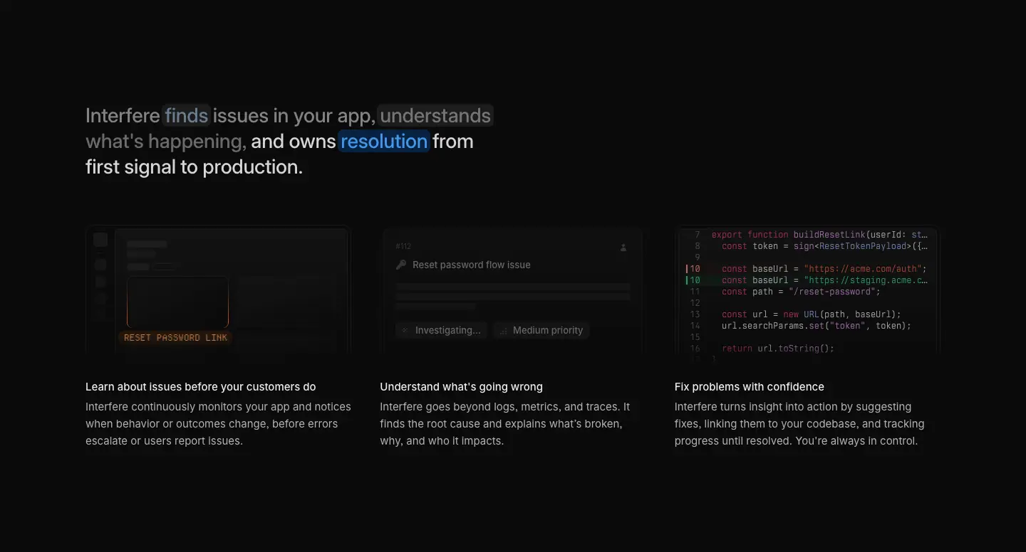
Interfere finds issues in your app, understands what's happening, and owns resolution from first signal to production. (28/36, .93 + .392)
Secure by design. Safe by default.
On the home "how it works" H2 the verbs finds, understands, resolution also get a colored fill chip (blue rgba(0,119,255,.227), gray .07) that animates in sequence with the three cards below.
Why: the bright clause is the scannable headline; the dim clause is supporting copy that doesn't need its own paragraph. It halves vertical space and keeps a single typographic block.
5. Serif moments

The Heldane quote words start at oklab(1 0 0 / .035) with a 6 px blur and resolve to .93 as the section scrolls (see 11 · Motion). The About page sets the whole founder letter in Heldane at 18/28, .80 alpha, inside a raised card.
6. Code type
Berkeley Mono at 12/16 in mocks, 13/20 for inline code in articles (.80 white on a .07 fill). Syntax colors are the Radix dark scale: keyword #e93d82, function #e796f3, type #9eb1ff, property #ffc53d, added line rgba(70,254,165,.83).
7. Recreate it
@font-face { font-family: InterVariable; src: url(/fonts/InterVariable.woff2) format("woff2");
  font-weight: 100 900; font-display: swap; font-feature-settings: "ss03"; }
:root {
  --font-sans: "InterVariable", system-ui, sans-serif;
  --font-serif: "HeldaneText", "Newsreader", Georgia, serif;
  --font-mono: "BerkeleyMono", "JetBrains Mono", ui-monospace, monospace;
  --font-pixel: "DepartureMono", monospace;
}
.display  { font: 500 56px/56px var(--font-sans); letter-spacing: -0.01em; }
.h-page   { font: 500 36px/44px var(--font-sans); letter-spacing: -0.01em; }
.h-section{ font: 500 28px/36px var(--font-sans); letter-spacing: -0.01em; }
.lead     { font: 400 15px/24px var(--font-sans); color: rgb(255 255 255 / .686); }
.ui       { font: 500 13px/20px var(--font-sans); }
.overline { font: 500 10px/16px var(--font-sans); letter-spacing: .05em; text-transform: uppercase; color: rgb(255 255 255 / .392); }
04 · Layout, grid and spacing
1. Base unit and container
- Base unit: 4 px. Tailwind v4 with
--spacing: .25rem. Every padding, gap, button height and even the type scale is a multiple of it.
- Container: 1,200 px content width. The wrapper class is
max-w-[calc(var(--constrained-max)+var(--spacing)*6*2)], measured at 1,244 px with 22 px side padding on desktop, so the content edge sits at x = 120 on a 1,440 px viewport.
- Mobile gutter: 24 px (all H1/H2 start at x = 24 at 390 px).
- Header: 64 px tall, static (it scrolls away), transparent background, 1 px
.07 bottom rule.
2. Section rhythm (desktop / mobile)
| Section |
Padding top/bottom at 1440 |
at 390 |
| Hero |
0 (internal spacing: H1 starts 144 px below the header) |
0 |
| Logo wall |
48 / 48, 1 px bottom rule |
48 / 48 |
| "How it works" statement + 3 cards |
144 / 144 (md:py-36) |
64 / 64 (py-16) |
| Quote band |
0 (fixed 492 px tall card band) |
0 |
| Feature rows (×3) |
96 / 96 (md:py-24), 1 px .07 divider between rows |
64 / 64 |
| Security card |
0 (card is self-padded) |
0 |
| "The Latest" |
120 / 120 (md:py-30) |
96 / 96 |
| Closing CTA band |
≈ 160 above the 56 px H2, ≈ 376 from H2 top to the footer |
|
Why the varied rhythm. The statement section gets the most air (144 px) because it is the thesis of the page. Feature rows are a repeated unit and use a tighter 96 px plus a hairline divider so they read as one list. The last content section steps back up to 120 px to give the closing band room.
3. Column patterns (all measured at 1440)
| Pattern |
Measurement |
Used on |
| Split hero |
H1 at x 120, w 450 · lead right-aligned at x 808, w 512 · button right-aligned at x 1223 |
Home |
| Persona hero |
text column x 120, w ≈ 505 · asset canvas on the right half on a blueprint grid |
4 product pages |
| Centered statement |
H1 centered, w 508–568 |
About, Security, Careers, Download, closing CTA |
| Feature row |
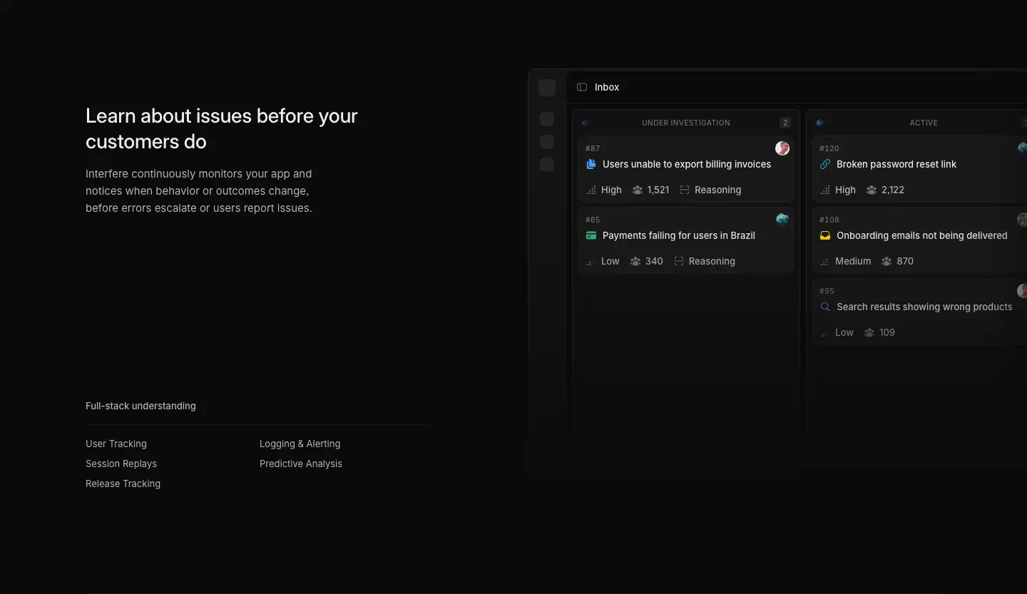
text column w 480 at x 120 · product window starts ≈ x 740 and bleeds past the viewport edge |
Home, product pages |
| Three-up |
3 × 373 px, gap 40 px (x = 120 / 533 / 947) |
Home "how it works", "The Latest", careers values |
| Two-up cards |
2 × 592 px, gap 16 px |
Guides index, guide "more guides" |
| Changelog entry |
title + authors column w 560 at x 120 · cover image w 558 at x 761 · gap ≈ 81 |
Changelog |
| Blog index |
filter rail x 120–≈ 400 · featured card 894 px at x 425 · two-up 438 px below |
Blog |
| Article |
body column 628 px at x 406 · figures break out to 788 px (x 326) · hero cover 934 px (x 253) · sticky table of contents in the left rail |
Blog posts, guides, legal |
| Job post |
content w 552 at x 120 · sticky summary card on the right |
Careers posts |
| Four-up |
compliance badges, subprocessor cards, footer columns (4 × ≈ 290) |
Security, footer |
Why the bleed. Product windows run off the right edge of the viewport on desktop (hero is 1,320 px wide inside a 1,440 viewport, starting at x 120). It suggests the app is bigger than the page and keeps the left edge aligned with the text column, so the eye moves text → product in one line.
Why the 628 px article measure. At 16 px Inter, 628 px holds ≈ 75–80 characters per line, the upper end of comfortable reading, and lets 788 px figures break out by 80 px on each side for a clear "this is a figure" signal.
4. Radii
Measured on home (count of elements): 6px (59), 3px (51), 8px (42), 4px (24), 10px (13), 12px (10), 16px (4), pills 9999px (6).
| Radius |
Use |
| 3–4 px |
chips, code keycaps, status markers inside mocks |
| 6 px |
nav triggers, header buttons, int-btn-md |
| 8 px |
primary button (int-btn-rounded = spacing × 2) |
| 10 px |
int-btn-xl, product window corners |
| 12 px |
testimonial author chip, cards |
| 16 px |
mega-menu panel (rounded-3xl = spacing × 4), large cards |
| full |
avatars, the "Ask about Interfere on" icon buttons |
Radii grow with the size of the object: small inside, larger outside. Nested radii follow outer = inner + padding.
5. Borders, depth and shadow
- No drop shadows on marketing cards. Depth comes from fill alpha and 1 px
rgba(255,255,255,.07) rules.
- The one large shadow is the hero product window:
0 0 0 .5px rgba(255,255,255,.07), 0 149px 199px rgba(0,0,0,.07), 0 62px 83px rgba(0,0,0,.05), 0 33px 44px rgba(0,0,0,.04) … (a layered, physically-modelled shadow with 5+ stacked layers).
- The nav panel uses a 1 px ring (
oklab(.46 0 0 / .30)) plus a soft drop.
6. Responsive behaviour
| Breakpoint |
Change |
| 1440 → 768 |
container narrows; split hero stacks (H1, lead, button, then product); three-up becomes a stack; product windows keep the bleed |
| 390 |
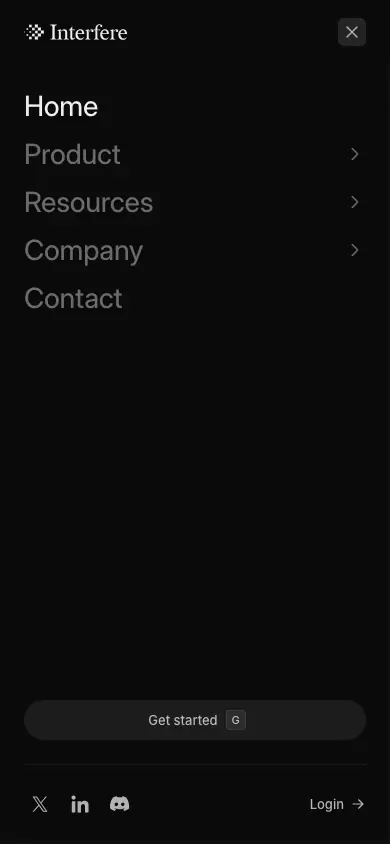
H1 drops from 56 → 36 px (36/36, −0.36 px); "how it works" H2 drops 28 → 24 px; section padding falls to 64 px; nav collapses into a full-screen sheet with a close button; "The Latest" becomes a horizontal scroller with prev/next buttons; footer columns stack |

The mobile menu is a full-height sheet: large 18 px links, chevrons for sub-menus, a wide secondary "Get started" button with its G keycap, and social icons at the bottom.
05 · Heroes
Interfere uses six hero types. They share the 64 px header, a dark canvas and (on marketing pages) the brand gradient as a floor glow. What changes is the layout and the asset.
Type 1 · Split headline + full product window (Home)
- Layout. H1 left (56/56, weight 550, 2 lines, x 120). Lead right-aligned in the opposite column (15/24,
.686, two lines, w 512). Primary button under the lead, right-aligned. The product window starts 64 px below and runs 1,320 px wide, bleeding off the right edge.
- Asset. A pixel-faithful Inbox → Problem view: sidebar of colored app icons, problem title, property list, Activity/Sessions/Findings tabs, timeline with a GitHub file card and a red/green diff, a "Fact" with orange metrics, a comment, and "Suggesting a fix…".
- Light. The brand gradient sits behind the window as a 50 px-blurred horizon; the window's top edge gets a lit conic-gradient border.
- Motion. H1 words rise from a 10 px blur in 40 ms steps (0.40 s, 0.44 s, 0.48 s …), lead and button rise as blocks, then the timeline draws event by event. Plays once per session.
- Why. The split puts the promise (left) and the proof (right/below) in one glance. Right-aligning the lead stops the hero from looking like a centered template and leaves a diagonal reading path: headline → lead → button → product.
Type 2 · Persona hero on a blueprint grid (4 product pages)
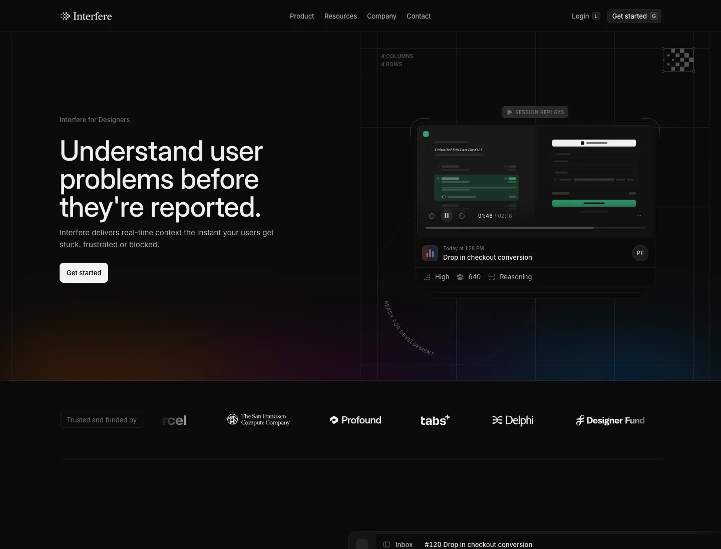
- Layout. Eyebrow "Interfere for Designers" (13 px
.392), H1 56/56 three lines left, lead 15/24 .686, white button. Right half is a construction grid: thin .07 lines, dimension labels ("4 COLUMNS · 4 ROWS"), a pixel-mark tile in a corner.
- Asset per persona (all built in code, per the team):
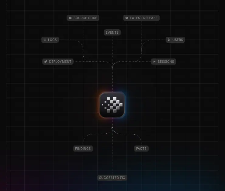
- Engineers: an animated SVG node diagram (sources → Interfere mark → outcomes), dashes flowing via
stroke-dashoffset to −5 over 0.7 s.
- Designers: a stack of session-replay cards cycling with blur, opacity and scale.
- Product Managers: an isometric card stack (CSS transform) with an "Impacted users 1,270" sparkline.
- Customer Support: company cards tied to a problem by a dotted pattern drawn on
<canvas> (SVG was too many DOM nodes).
- Why. Each persona sees the slice of the product that matters to them; the shared grid makes the four pages a family. The blueprint grid says "engineered", fitting a tool for builders.
Type 3 · Centered statement over a full-bleed gradient (About)
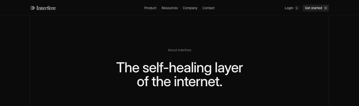
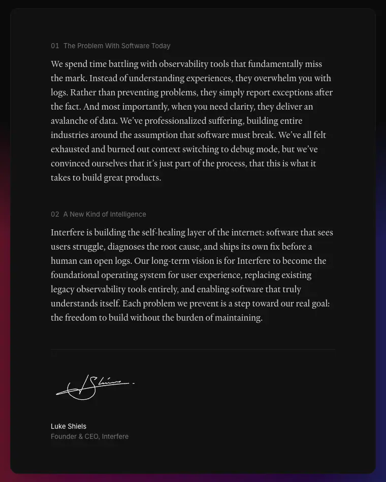
- Eyebrow "About Interfere", H1 56/56 −2% centered ("The self-healing layer of the internet."), then a raised card containing the founder letter in Heldane Text, signed with a handwritten signature. The gradient fills the whole background at 50% alpha.
- Why. A manifesto reads as a letter, not a feature list. The serif, the signature and the centered column all signal "personal".
Type 4 · Centered title + compliance halo (Security)
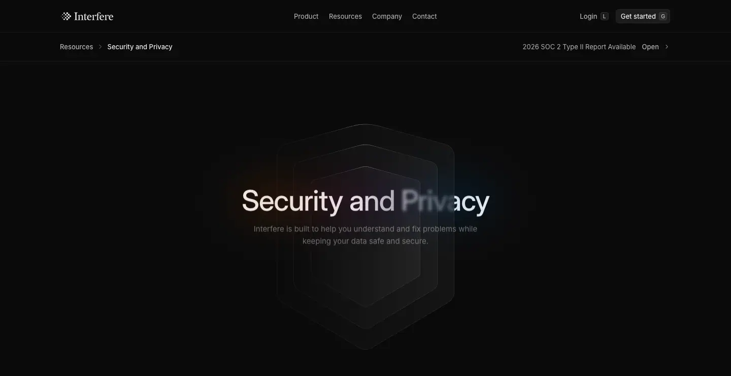
- H1 "Security and Privacy" centered, 56/56 −2%, over a stack of concentric shield outlines with a soft gradient glow on one word. A breadcrumb bar sits below the header ("Resources / Security and Privacy") with a right-aligned "2026 SOC 2 Type II Report Available · Open" link.
- Why. Trust pages need calm and authority: centered, symmetrical, no product noise.
Type 5 · Object hero (Careers, Download)
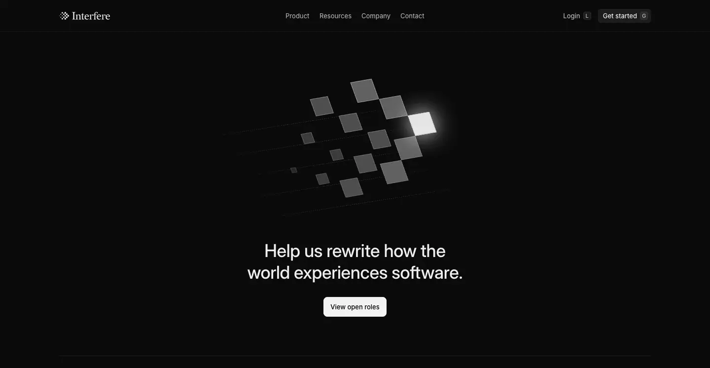
- Careers: the logomark exploded into 3D floating tiles lit from the top right, above a centered H1 (36/44) and "View open roles".
- Download: the app icon (pixel mark on a glossy black squircle), "Download Interfere" (44/55), and two buttons, white "Download for macOS" + dark "Download for Windows", then a large isometric, perspective-tilted app window.
- Why. These pages sell one object (the team, the app), so the hero is that object.
Type 6 · Plain page title (content templates)

- H1 at 36/44 left-aligned at x 120, ≈ 64 px below the header (Blog, Changelog, Guides, legal, job posts). Articles center the H1 above a framed cover.
- Why. Content pages are read, not sold; the title gets out of the way.
Hero checklist (what all six share)
- 64 px header, transparent.
- One H1, weight 500 (550 on home), −1% tracking (−2% when centered and short).
- One white primary button (
rgba(255,255,255,.95), black text, 40 px tall, 8 px radius).
- Brand gradient as light, never as a fill behind text.
- An asset built in code that shows the product or the brand mark.
06 · Section types
The site is assembled from about twenty repeatable sections. Each entry gives the structure, the measured values, and why it works.
1. Logo wall ("Trusted and funded by")

A label pill (13 px .392 inside a 1 px .07 bordered chip) followed by a marquee of monochrome partner and investor logos (Vercel, The San Francisco Compute Company, Profound, tabs, Delphi, Designer Fund, Hummingbird). The row scrolls with @keyframes marquee 30 s linear infinite and stops under prefers-reduced-motion. Edges fade with a horizontal mask. 48 px padding, 1 px bottom rule.
Why: mixing customers and investors under "trusted and funded by" builds credibility for an early company with few logos; the slow marquee implies "more than fits".
2. Statement + three-step loop
A two-tone 28/36 H2 with highlighted verbs ("finds", "understands", "resolution") above three 373 px cards. Each card is a small looping product vignette (a "RESET PASSWORD LINK" alert in Departure Mono, a "Reset password flow issue" card with Investigating… / Medium priority chips, a code diff) with a 15 px title and 15/24 .686 body below. The highlight chip moves to the verb that matches the active card.
Why: "There's no product like Interfere on the market, so we feel it's important to explain how it works clearly." Linking the verb in the headline to the active card ties copy and visual together.
3. Scroll-revealed testimonial
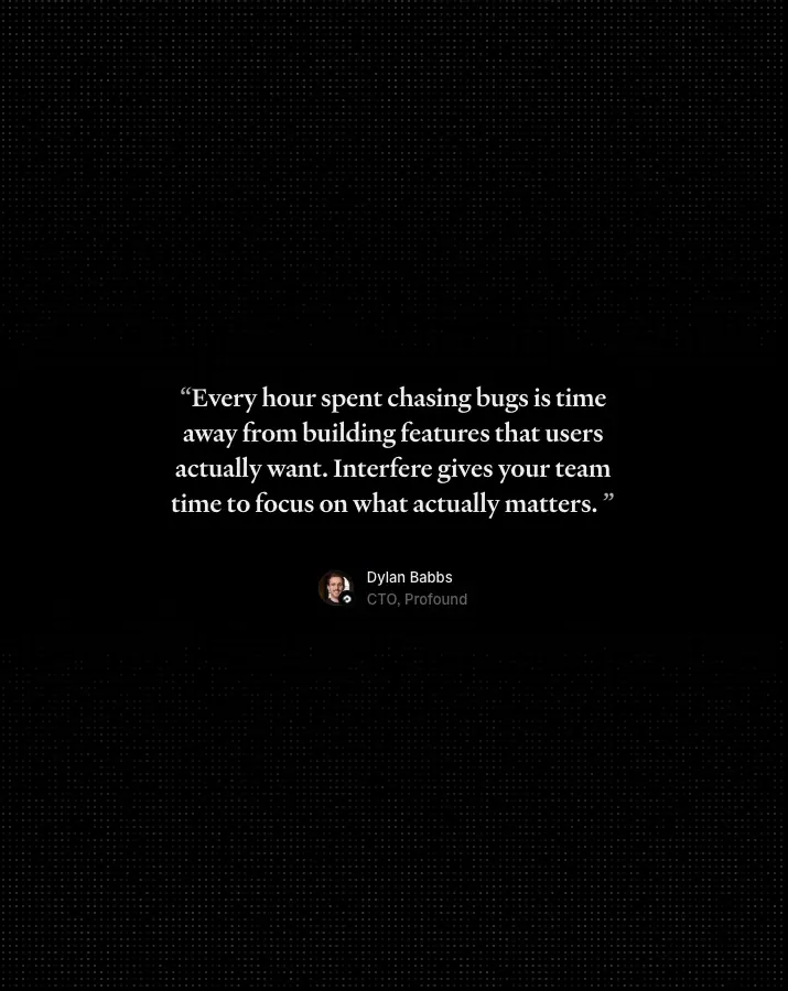
A full-width 1,200 × 492 card (fill .035, faint diagonal light rays, gradient glow at the bottom) with one Heldane quote at 28/36. Words reveal three at a time from blur 6 px / alpha .035 to sharp .93 as the section crosses the viewport. Author chip below: 40 px avatar with a company badge, name .93, title .686.
Why: one strong quote, read slowly, beats a carousel of five. The scroll-linked reveal makes the visitor read it.
4. Feature row (text left, product right, bleed)
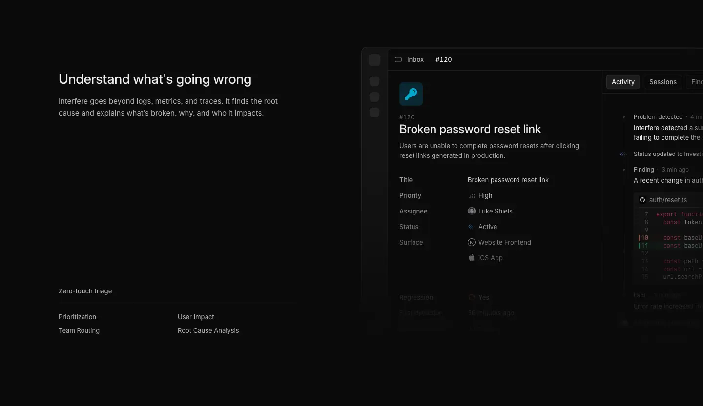
Text column 480 px: 28/36 H2, 15/24 .686 paragraph, then at the bottom a two-column capability list under a 13 px label and a hairline ("Full-stack understanding · User Tracking · Session Replays · Release Tracking · Logging & Alerting · Predictive Analysis"). On the right, a product window (Inbox board, problem detail, timeline) bleeding off-canvas and fading into the page at the bottom. Rows are separated by 1 px .07 rules, 96 px padding.
Why: the capability list is SEO-friendly and scannable without becoming a bullet-point wall; the bleed keeps the visual large without stealing width from text.
5. Security strip
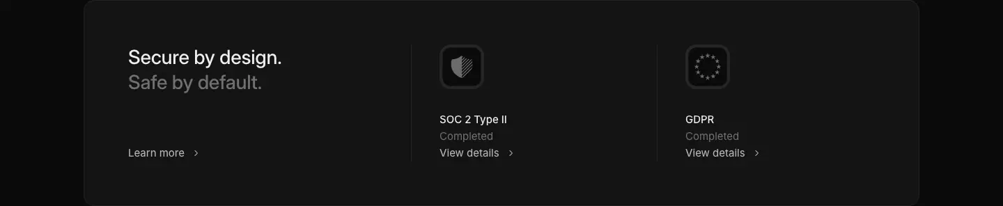
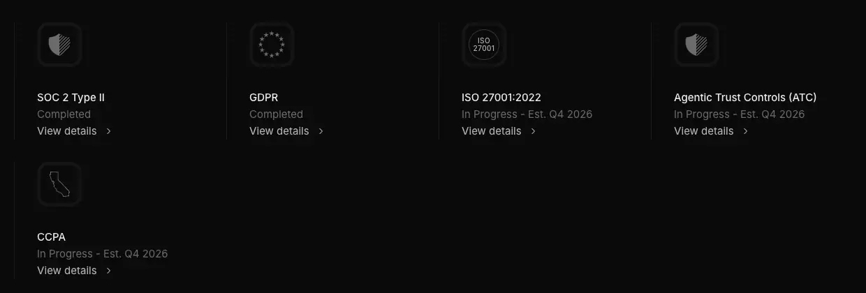
A wide rounded card split into three: "Secure by design. / Safe by default." two-tone H2 with "Learn more ›", then two badge columns (SOC 2 Type II · Completed · View details ›, GDPR · Completed). Badge icons are 56 px rounded tiles with an engraved shield / dotted ring.
Why: enterprise buyers look for compliance before reading features; a compact strip answers it without a whole section.
6. "The Latest" (changelog teaser)
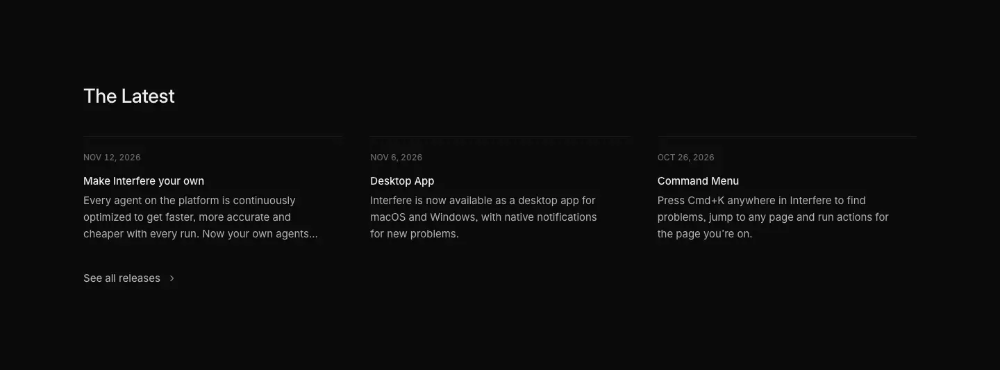
28/36 H2, then three columns: uppercase date (12 px, .392), 15 px title, 15/24 .686 excerpt clamped to 3 lines; "See all releases ›". On mobile it becomes a horizontal scroller with prev/next buttons.
Why: shipping cadence is a trust signal for an early startup; it proves the product is alive.
7. Closing CTA band (every page)
Full-bleed band, the brand gradient as a horizon at the top edge fading into the page, centered 56/56 H2 (the home headline repeated on most pages, a persona-specific line on product pages: "Debug less. Resolve faster.", "Stay ahead of customer issues."), one white "Get started" button.
Why: repeating the promise at the end closes the loop; the gradient band visually "ends" the page before the footer.
8. Footer with AI-assistant row and giant wordmark
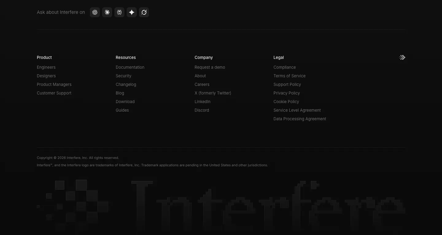
"Ask about Interfere on" + five 28 px round icon buttons (ChatGPT, Claude, Perplexity, Gemini, Grok) that open each assistant with a prefilled "What does Interfere (the startup) do" prompt; four link columns (Product, Resources, Company, Legal) at 13 px .392; copyright and trademark line at 11 px; and a 1,200 px dithered pixel wordmark "Interfere" bleeding off the bottom.
Why: the AI row is a 2025–26 pattern: instead of "read our docs", it invites the visitor to ask their own assistant (and seeds answer-engine visibility). The giant wordmark signs the page.
9. Persona feature grid
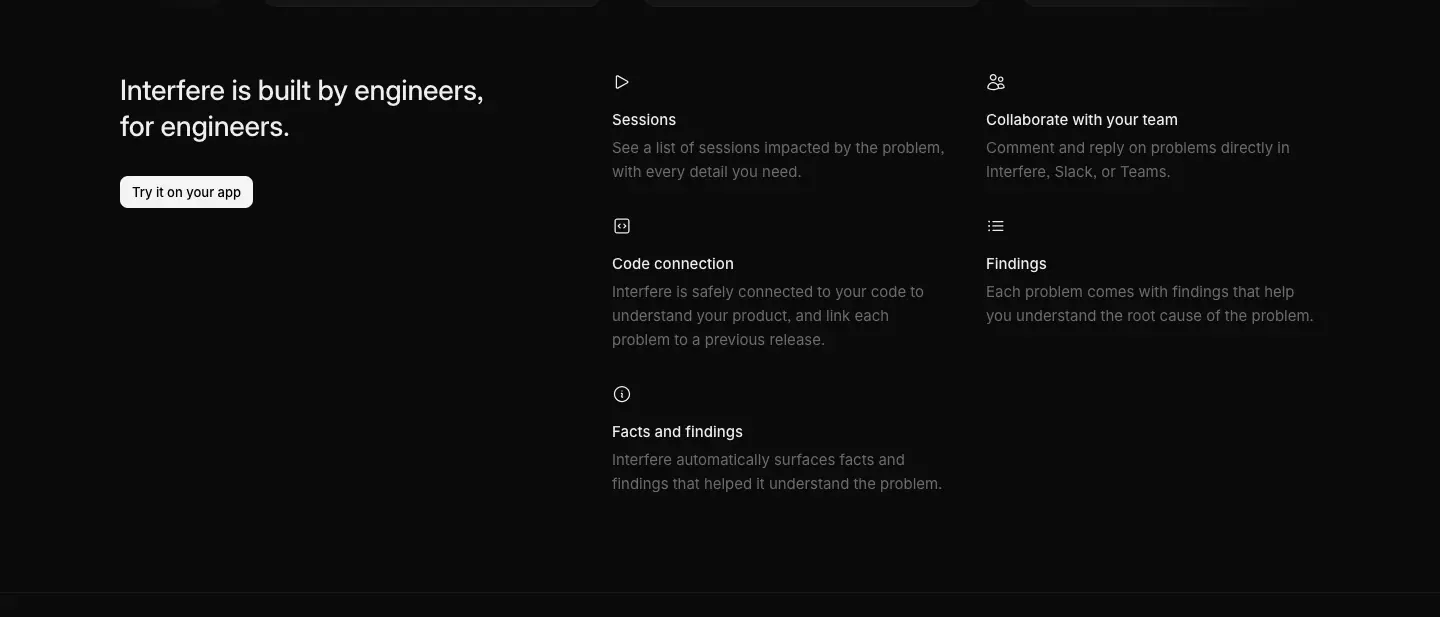
Left: 28/36 H2 + secondary button ("Try it on your app"). Right: a 2 × 3 grid of icon + 15 px title + 15/24 .392 description (Sessions, Collaborate with your team, Code connection, Findings, Facts and findings…). Icons are 16 px line icons, no tiles.
Why: a classic "feature index" that stays light because there are no card borders, just type.
10. Process steps (MTTR)
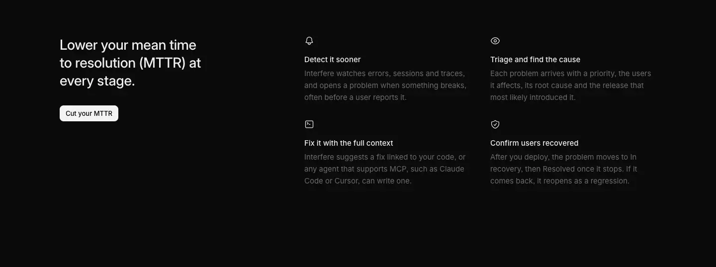
H2 left with a button; four steps right (Detect it sooner, Triage and find the cause, Fix it with the full context, Confirm users recovered), each icon + title + description.
Why: maps the product to the engineer's real workflow and the metric they are judged on.
11. Integrations + code snippet pair
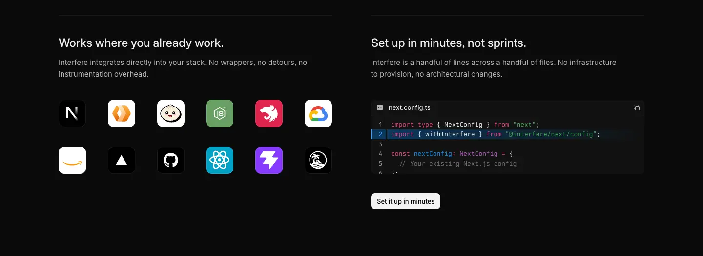
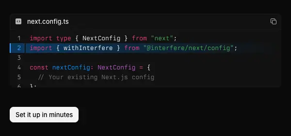
Two half-width blocks. Left: "Works where you already work." + a 7 × 2 grid of 40 px app tiles (framework, host and repo icons such as Next.js, Vercel, GitHub and React). Right: "Set up in minutes, not sprints." + a next.config.ts code card (Berkeley Mono, line numbers, added-line highlight) + "Set it up in minutes".
Why: answers the two setup objections (does it fit my stack, how long does it take) side by side.
12. Chat + problem composite
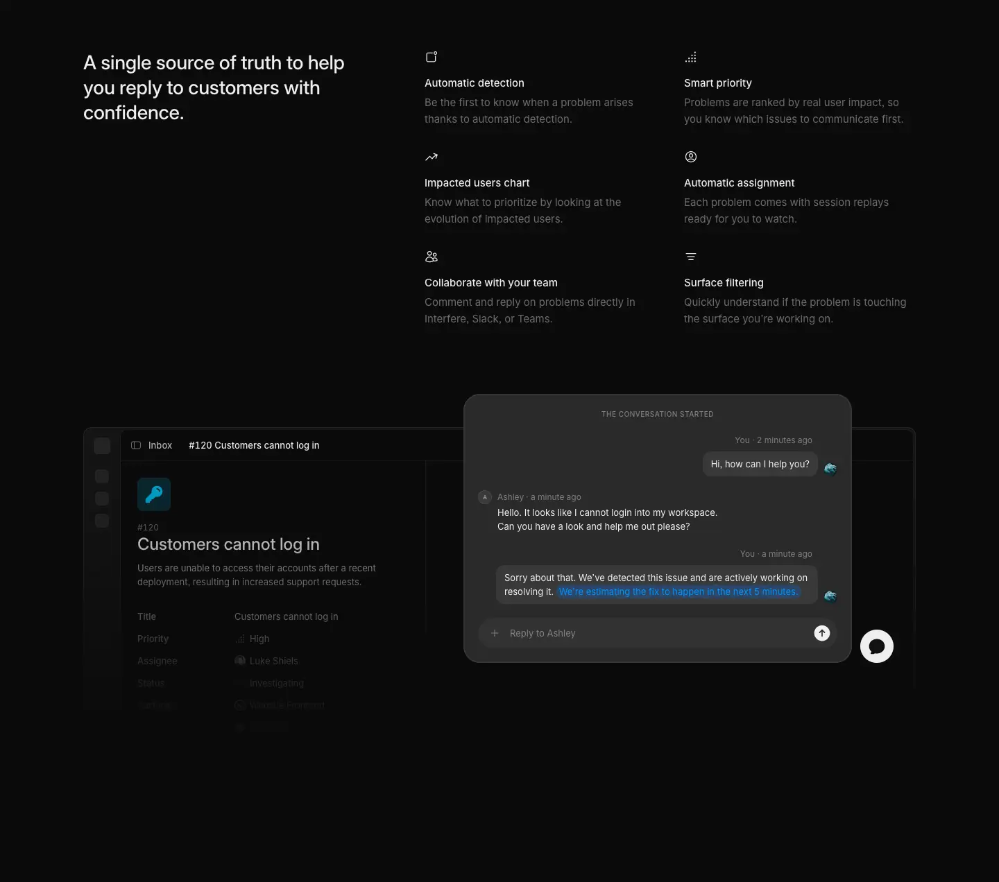
A problem window overlapped by a floating support-chat card ("Sorry about that. We've detected this issue…" with an inline blue link). Overlap and drop shadow show two tools working together.
13. Investor and partner grid (About)
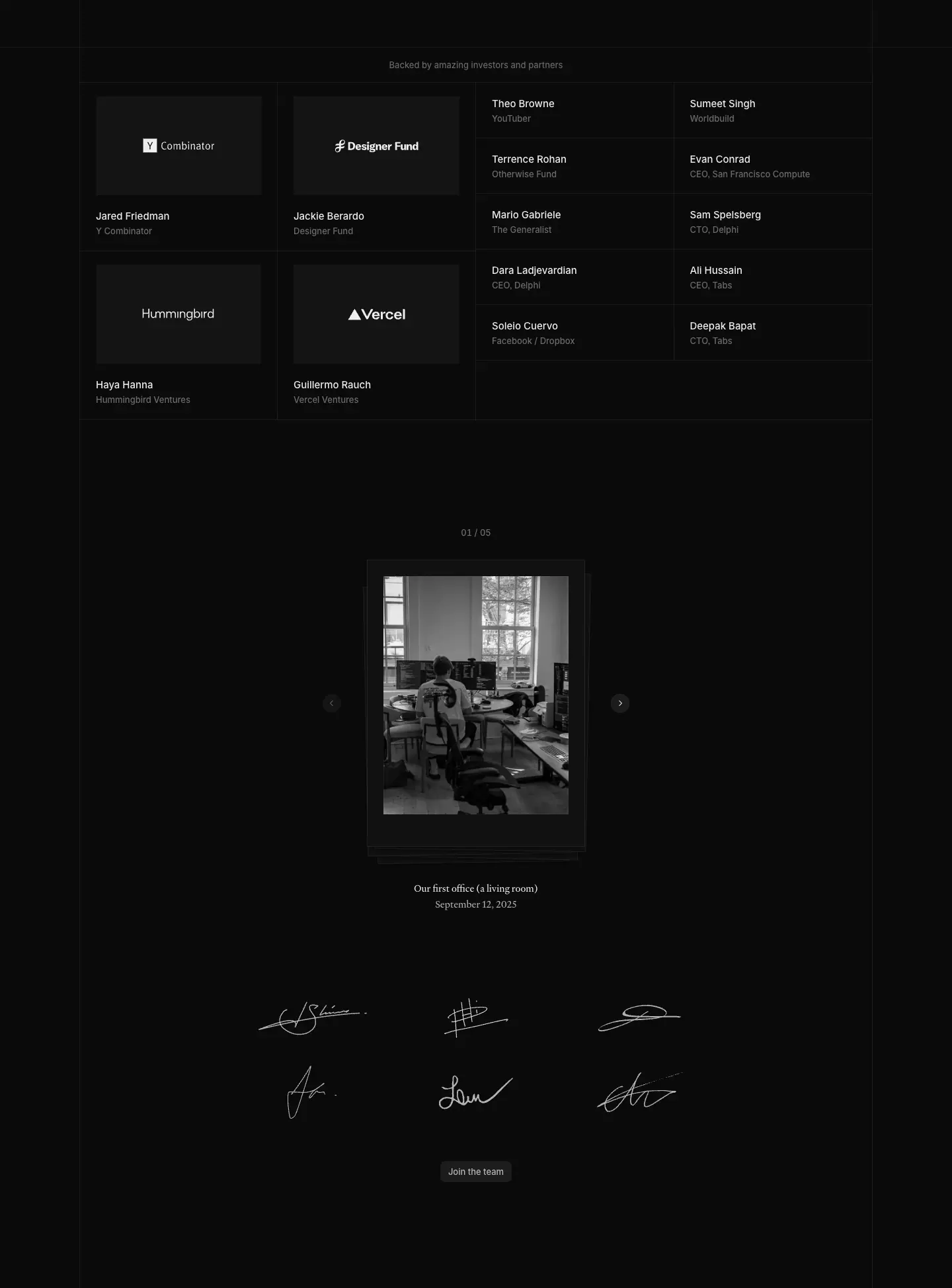
Four logo tiles (Y Combinator, Designer Fund, Hummingbird, Vercel) with the partner's name and title under each, then a two-column table of angel investors (name .93, role .392), all on 1 px .07 hairlines. Below: a photo carousel ("Our first office (a living room)", Heldane caption, date) and a block of team signatures drawn in white strokes, then "Join the team".
Why: a seed-stage company borrows trust from the people behind it; signatures and a living-room photo make the team human.
14. Values cards (Careers)
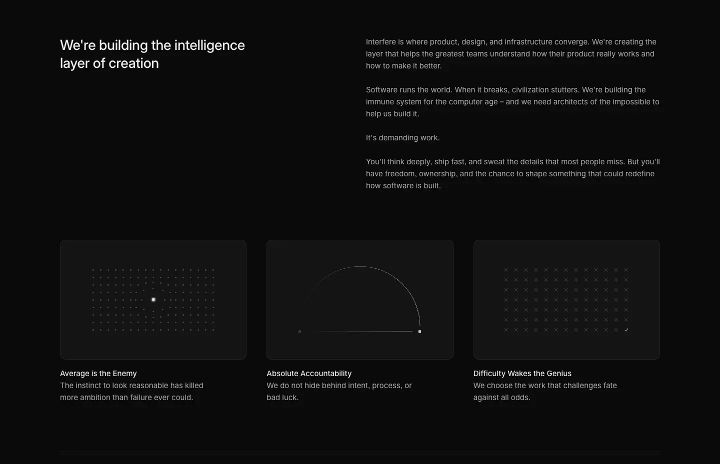
Three cards with abstract dot-matrix illustrations (a lone lit dot on a grid, a half-circle arc, a dot field) above "Average is the Enemy", "Absolute Accountability", "Difficulty Wakes the Genius".
15. Team roster + open roles table
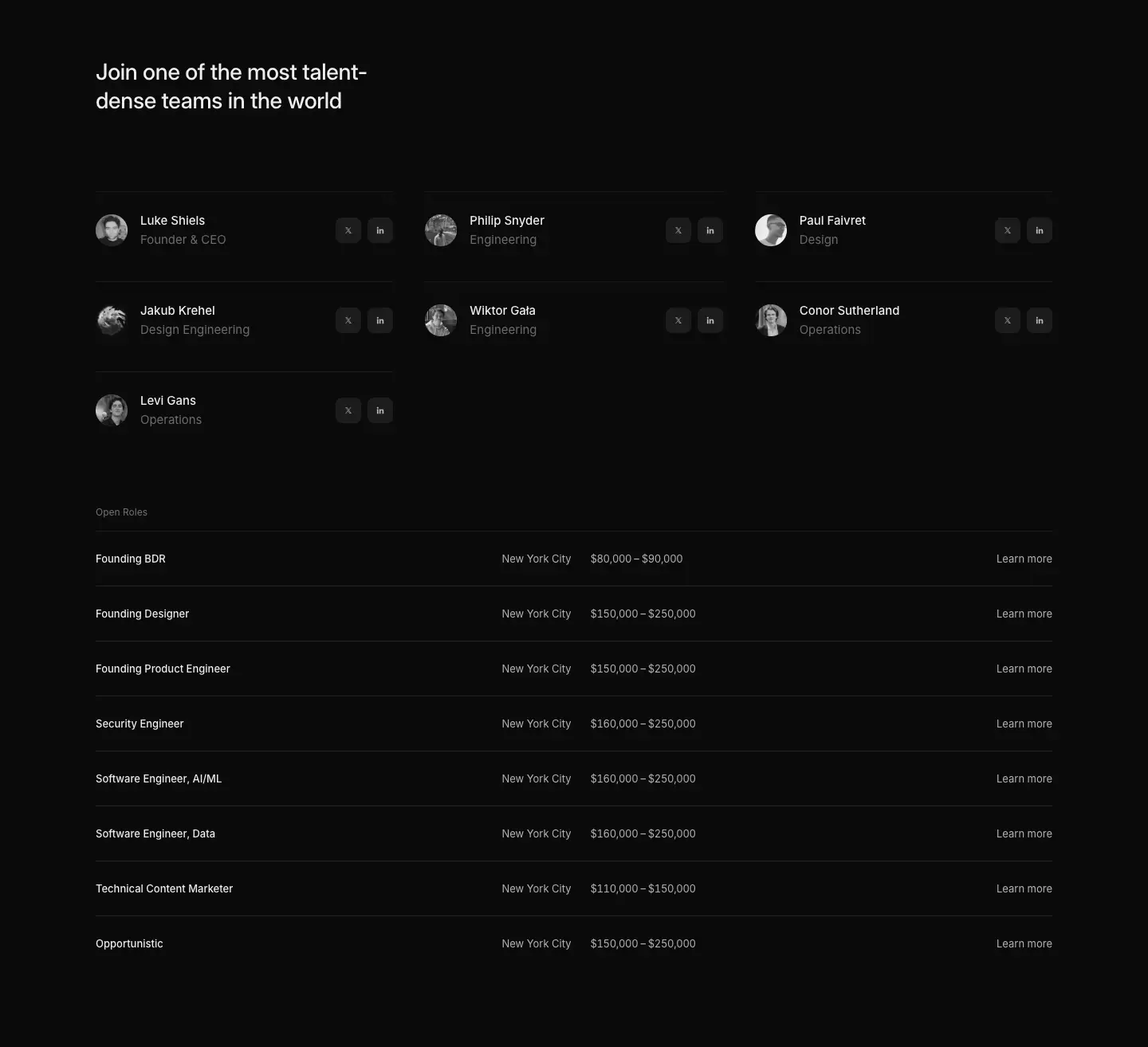
A three-column roster (32 px grayscale avatar, name, role, X and LinkedIn icon buttons) and a full-width roles table: role, location, salary range in tabular figures (13 px, −0.325 px tracking), "Learn more" right-aligned, 1 px hairlines.
Why: publishing salary ranges and faces in a table is a credibility move aimed at senior candidates.
16. Compliance grid / subprocessors / FAQ / controls (Security)
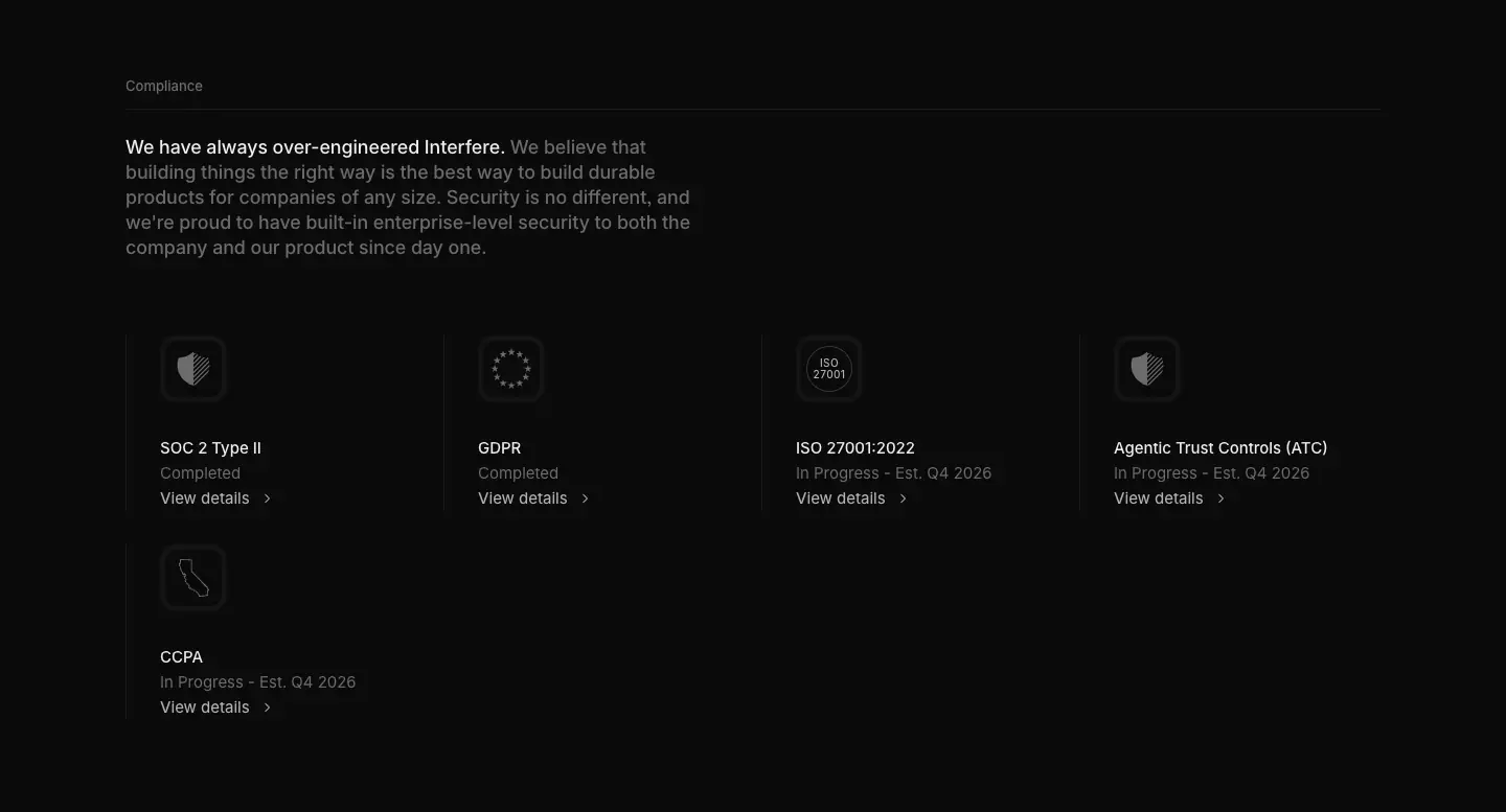
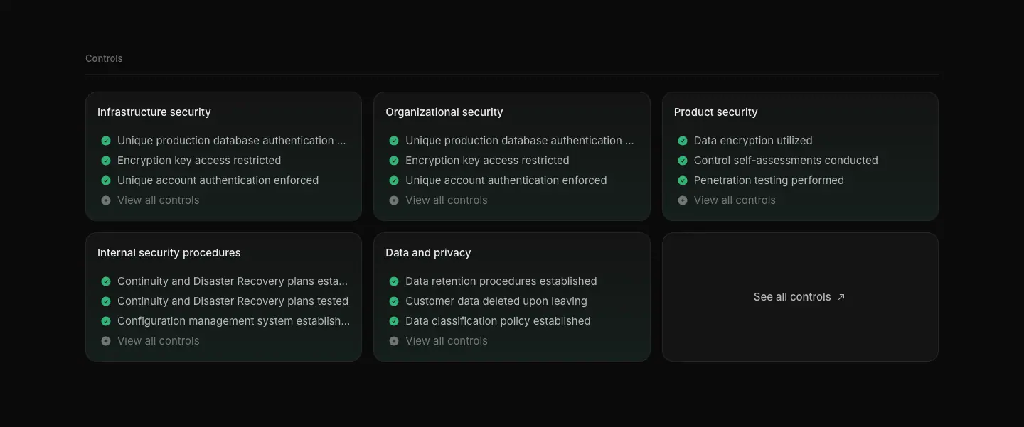
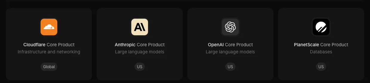
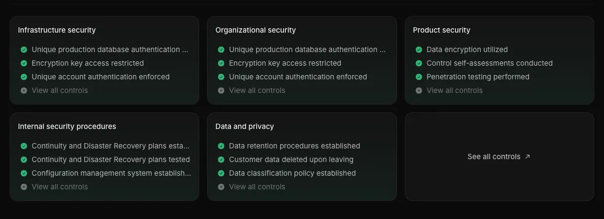
Compliance badges (SOC 2 Type II, GDPR, ISO 27001:2022, Agentic Trust Controls, CCPA) with status lines ("Completed", "In Progress · Est. Q4 2026"); subprocessor cards with vendor logo tiles and region pills ("Global", "US"); a category-tagged accordion FAQ; control cards with green check rows and "View all controls"; a resources row of document tiles ("DOC" thumbnails).
17. Changelog entry block
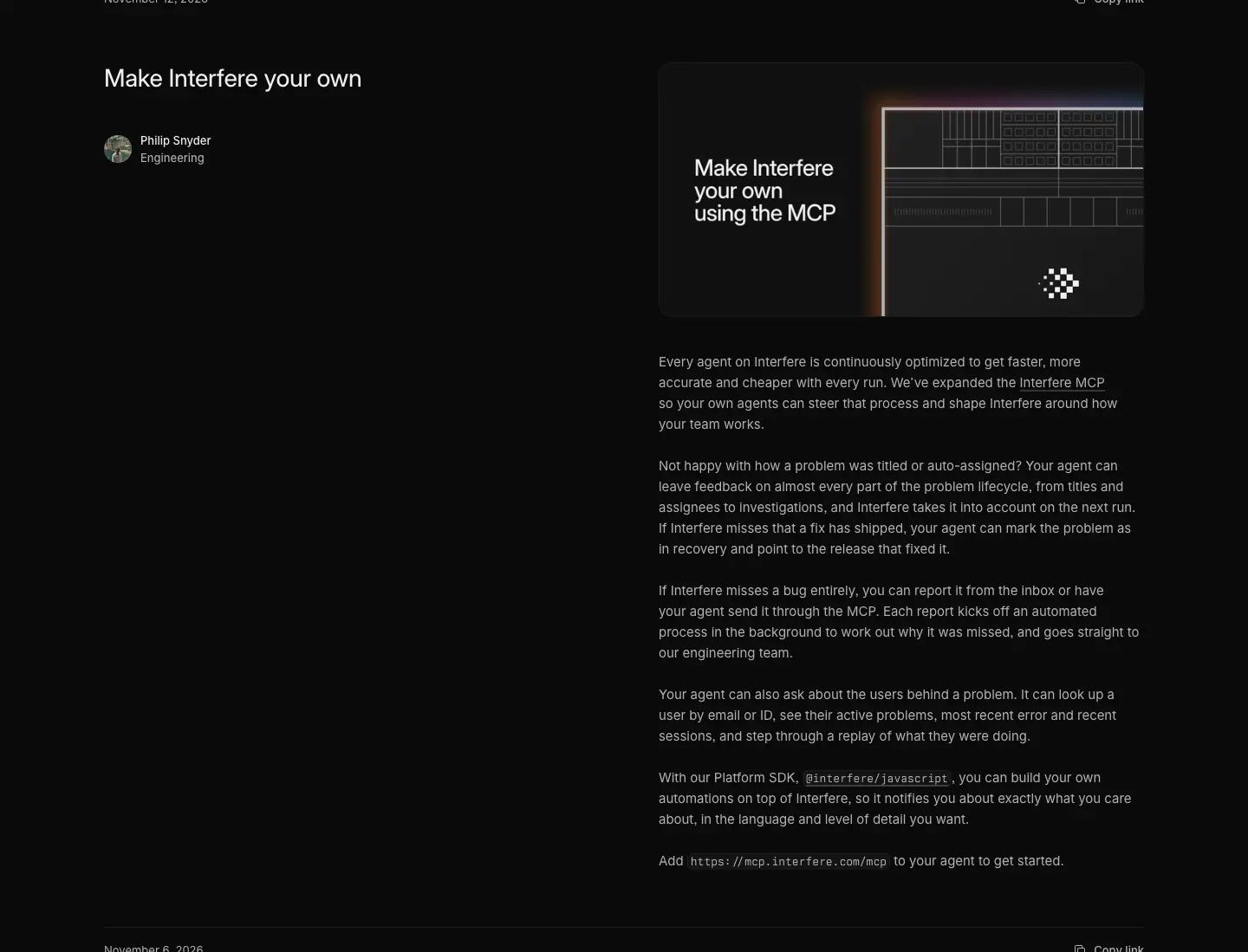
Date + "Copy link" on a rule, title and author avatars on the left, a 558 px cover graphic on the right (dark tile, gradient, product snippet, title set in the cover), then the body text under the cover.
18. Guide card grid
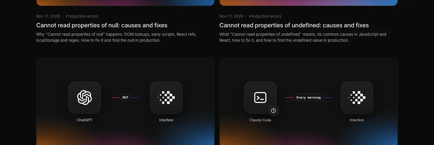
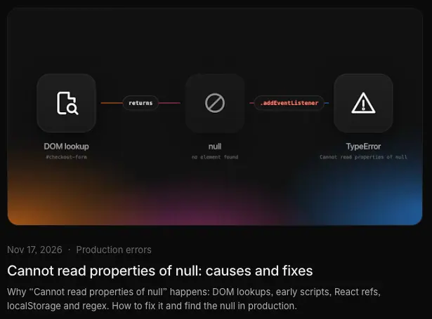
Two-up 592 px cards: a generated cover (dark tile, gradient floor glow, app-icon tiles connected by a labelled line: "ChatGPT — MCP — Interfere", "Sentry vs Datadog"), then date · category, 20/24 title, 13/20 description.
19. Blog featured + grid
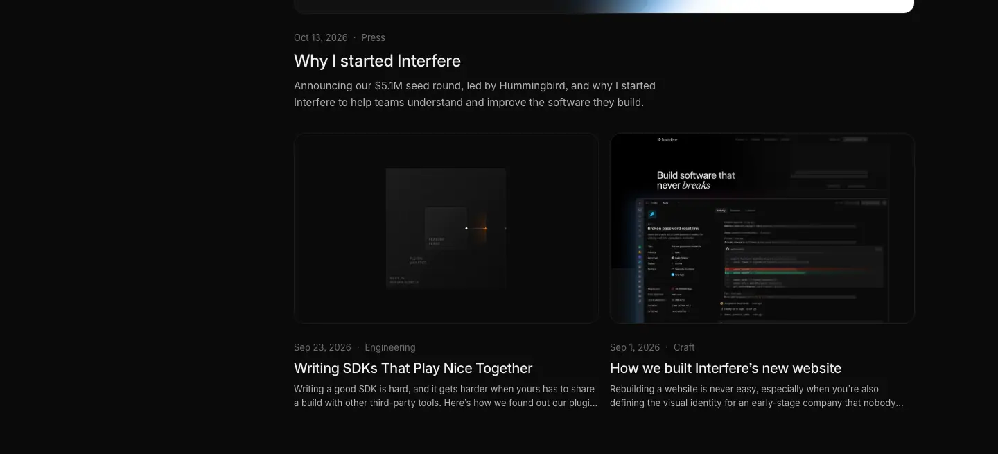
A filter rail (search, All / Craft / Engineering / Press) and a featured 894 px cover with the seed-round gradient, then two 438 px cards.
20. Article body
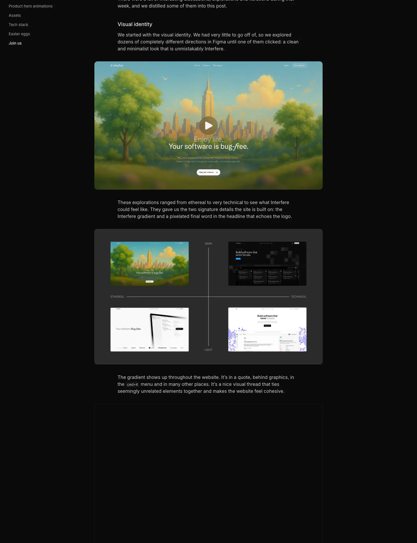
628 px text column, 16/24 .80 body, 18/24 H2s, inline code in Berkeley Mono on a .07 chip, 788 px figures and autoplaying muted videos with a custom scrubber and speed control (0.25×–2×), left sticky table of contents, "Copy link" in the breadcrumb bar, author pair with roles at the top.
07 · Copywriting and voice
1. Voice in one line
Confident, plain, outcome-first. Short declaratives, no jargon in headlines, technical depth saved for lists, docs and guides.
2. Headline inventory (measured H1 / H2 copy)
| Page |
Headline |
Formula |
| Home H1 |
Ship software that never breaks |
Outcome promise, absolute ("never") |
| Home lead |
Interfere empowers engineers, product managers and designers with real-time understanding of previously unseen bugs and issues. |
Who + what + benefit |
| Home H2 |
Interfere finds issues in your app, understands what's happening, and owns resolution from first signal to production. |
Three verbs = the product loop |
| Home features |
Learn about issues before your customers do / Understand what's going wrong / Fix problems with confidence |
Learn → Understand → Fix (the same loop again) |
| Security strip |
Secure by design. Safe by default. |
Parallel pair |
| Engineers |
More time building, less time fixing. / Debug less. Resolve faster. |
Antithesis pair |
| Designers |
Understand user problems before they're reported. / Understand what your users experience. |
"Before" framing |
| PMs |
Own the problems your users face. / Make better product decisions, faster. |
Ownership |
| Support |
Stay ahead of customer problems. / Stay ahead of customer issues. |
Proactive framing |
| About |
The self-healing layer of the internet. |
Category creation |
| Careers |
Help us rewrite how the world experiences software. |
Mission |
| Download |
Download Interfere / Available for macOS and Windows |
Literal |
Patterns
- Verb-led, present tense. "Ship", "Understand", "Own", "Stay ahead", "Debug less".
- Contrast pairs in closing lines ("Debug less. Resolve faster.", "Secure by design. Safe by default.", "Minutes, not sprints").
- The same three-verb loop (find/learn → understand → fix/resolve) repeats in the H2, the three cards and the three feature rows. Repetition makes the model memorable.
- Persona headlines describe the reader's job, not the product. None of the four persona H1s contains the word "Interfere".
- Periods on headlines on persona and About pages ("Own the problems your users face."), none on the home H1. The period adds finality to statements of fact.
3. Body copy
- 15 px, two to three lines, ≈ 18–25 words per paragraph.
- Subject is usually "Interfere" ("Interfere continuously monitors your app and notices when behavior or outcomes change, before errors escalate or users report issues.").
- Pain named concretely: "before errors escalate or users report issues", "without jumping between tools".
- Ends on the reassurance: "You're always in control."
4. Microcopy
| Element |
Copy |
| Primary CTA |
Get started (everywhere; keycap G in the header) |
| Secondary CTAs |
Login (L), Try it on your app, Find the root cause, Cut your MTTR, Set it up in minutes, View open roles, Join the team |
| Links |
Learn more ›, View details ›, See all releases ›, View all subprocessors ›, Copy link |
| Labels |
Trusted and funded by, Full-stack understanding, Zero-touch triage, Built for speed & teams of any size |
| Status words |
Completed, In Progress · Est. Q4 2026, Investigating…, Suggesting a fix…, Subscribed |
| Footer |
Ask about Interfere on [ChatGPT / Claude / Perplexity …] |
Why "Get started" everywhere: a single CTA string means one decision, and the G shortcut turns the CTA into a keyboard command for developers.
5. Mock data as copywriting
The fake product data is written as carefully as the headlines: "Broken password reset link", "Users are unable to export billing invoices", "Payments failing for users in Brazil", "Error rate increased from 0.2% to 12% within 6 minutes after deployment", "Looks related to yesterday's auth refactor." Real-sounding, high-stakes, instantly understood problems sell the product better than lorem ipsum.
6. Long-form voice
- Blog: first person, behind-the-scenes and opinionated ("Over-animation is a real thing").
- Changelog: "We've…" + what it unlocks, with a code sample when relevant.
- Guides: SEO-structured explainers and comparisons ("Sentry pricing in 2026: plans, overage rates and real monthly bills", "Interfere vs Sentry", "What is OTLP?"), each ending with "Where Interfere fits".
- Careers: hard-edged values ("Average is the Enemy", "Absolute Accountability", "Difficulty Wakes the Genius", "You'll think deeply, ship fast, and sweat the details…").
7. Rules to copy
- One promise, repeated at top and bottom of every page.
- Name the job of the reader, not the feature.
- Build a three-verb product loop and reuse it in headline, cards and sections.
- Two-tone headlines: bright claim + dim elaboration.
- Write the fake data as if it were real.
- One CTA string site-wide.
08 · Components
Interfere's marketing site and app share one component layer: the int-* classes (int-btn, int-status-*) are in the same stylesheet, and primitives come from Base UI.
1. Header

- 64 px, transparent, static, 1 px
.07 bottom rule. Logo lockup left (pixel mark + serif-like "Interfere" wordmark, 104 × 18 px).
- Center nav: Product, Resources, Company (menu triggers) and Contact (link). 13 px, weight 450,
.686; 28 px tall, 6 px radius, padding 0 8 px. Active trigger: fill #222 (Radix gray-3), text .93.
- Right: Login
L (ghost) and Get started G (secondary, fill .07). Each has a keycap.

Why keycaps: they teach keyboard shortcuts (press G to get started, L to log in) and signal "this is a tool for keyboard people".
Easter egg: logo context menu
Right-clicking the logo opens a menu: Copy icon as SVG · Copy wordmark as SVG · Download press kit.
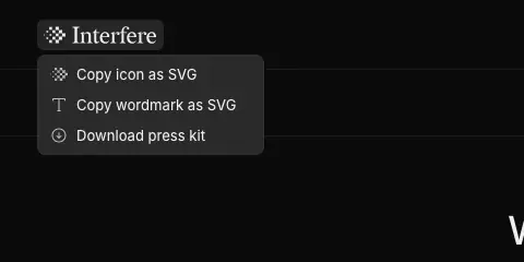
2. Mega-menu (Base UI Navigation Menu)
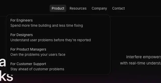
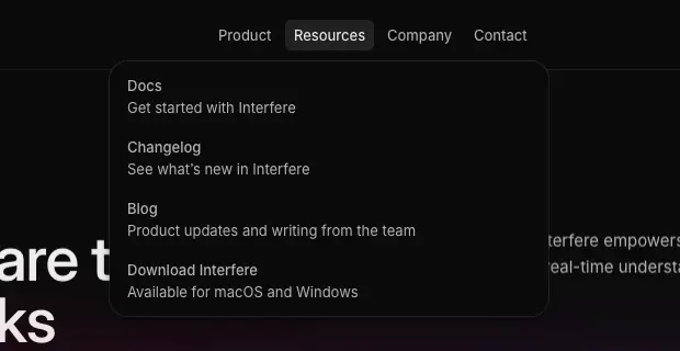
- Opens on hover (and click). Panel: 400 × 232 px, page color fill, 16 px radius, 1 px ring
oklab(.46 0 0 / .3) + soft shadow.
- Content: four rows of title (13 px
.93) + description (13 px .686), no icons. Product: For Engineers / Designers / Product Managers / Customer Support. Resources: Docs, Changelog, Blog, Download Interfere.
- Motion: the positioner animates
top/left/width/height and the popup animates opacity, transform, scale over 300 ms cubic-bezier(.22, 1, .36, 1), so moving between triggers morphs one panel instead of closing and reopening. Exit fades in 120 ms.
- Why: text-only rows keep the menu as calm as the page; the morphing panel makes moving across the nav feel continuous.
3. Buttons (int-btn)
| Variant |
Fill |
Text |
Hover |
Size used |
| Primary |
rgba(255,255,255,.95) (--white-a12) |
#000 |
fill → .80 (--white-a10) |
xl: 40 px tall, 0 14 px, 8 px radius, 13 px/500 |
| Secondary |
.07 (component-on-container-strong) |
.93 |
fill → .106 |
md: 28 px, 0 10 px, 6 px radius |
| Ghost |
transparent |
.686 |
.93 text |
header Login |
| Brand (app) |
Radix blue 9 #0090ff |
white |
blue 10 |
join form "Continue" |
- Sizes (from CSS): sm 24 px, md 28 px, lg 32 px, default/xl 40 px (
--spacing × 10). Gap 8 px; icon 20 px; keycap 20 px.
- Transition:
color, background-color, border-color 150 ms, transform 200 ms, cubic-bezier(0, 0, .2, 1) (ease-out).
- Press: buttons with
.int-btn-scales scale to 0.97 on :active.
- Secondary shadow
--s-default: 0 0 0 .5px inner ring + 0 1px 1px -1px + 0 1px 2px drops (a hairline bevel, not a shadow).

Why the primary is near-white, not brand-colored: on a black page, the brightest object wins attention. Making it white (not blue or gradient) keeps the gradient as pure atmosphere and reserves Radix blue for the app.
4. Keycap (kbd in buttons)
20 px square, 6 px radius (4 px at md), 12 px text, fill .07, .686 text. Lives inside buttons, right side.
5. Chips, tabs and status

- Segmented tabs: Activity / Sessions / Findings, 13 px, 28 px tall, 6 px radius; selected fill
.106.
- Status rows: icon + text, e.g. High (signal bars), Active (pulsing dots,
status-positive 1.2 s step-end), Investigating (status-negative blink).
- Highlight chip: inline fill behind a word in a headline (blue
rgba(0,119,255,.227), 3–4 px radius).
- Overlines: 10 px uppercase
.392 +5% tracking ("UNDER INVESTIGATION", "IMPACTED USERS").
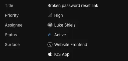
6. Product window
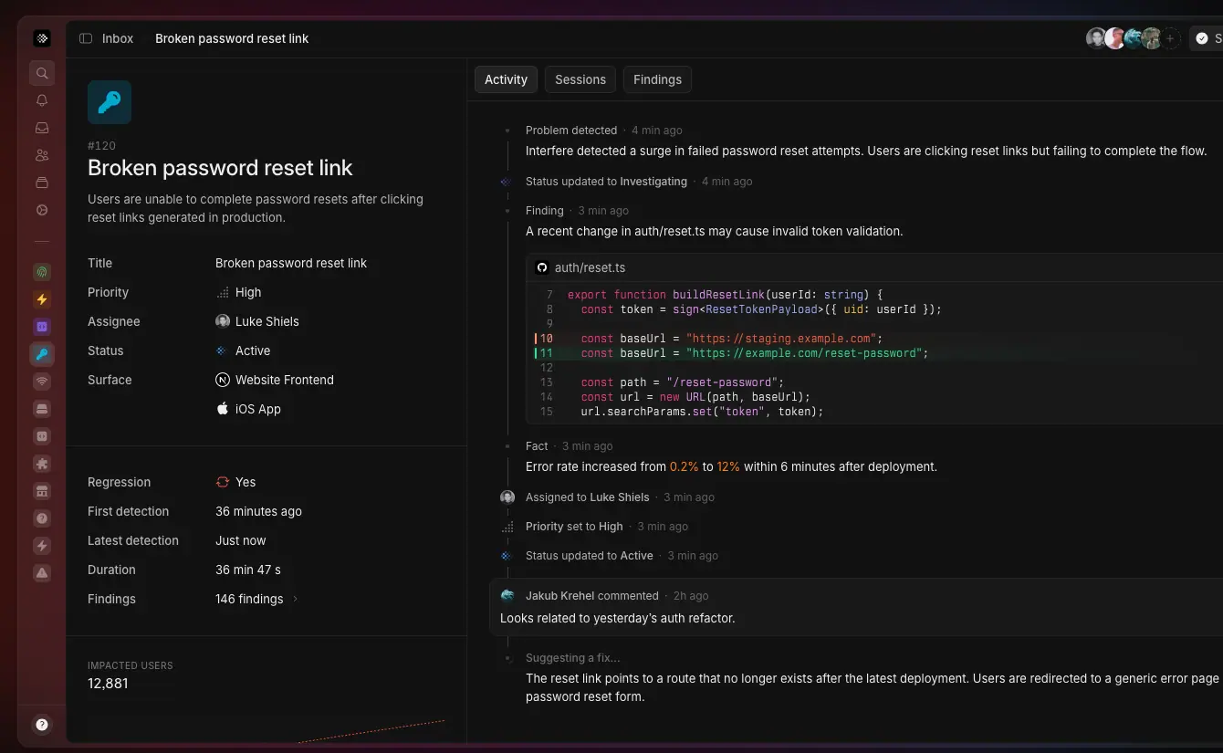
App chrome rebuilt in DOM: 48 px icon sidebar with colored 24 px app tiles (fingerprint green, lightning orange, code violet, key blue…), breadcrumb bar ("Inbox › Broken password reset link"), avatar stack, two-pane layout (properties | timeline). Outer ring .173, inner fills .035/.07, 10 px corner, layered 5-step shadow, conic lit top edge.


7. Code block
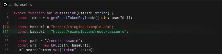
File header with GitHub icon + path ("auth/reset.ts"), Berkeley Mono 12/16, line numbers .333, removed line marker red, added line green bar + tinted row, syntax colors from Radix (see 02).
8. Cards
- Feature card (three-up): no border, illustration on a
.035 tile with 12 px radius, then 15 px title and 15/24 body.
- Changelog cover / guide cover: 16:9-ish dark tile, gradient floor glow, app-icon tiles connected by a labelled line.
- Compliance badge: 56 px tile with engraved icon, title 15/500, status
.392, "View details ›".
- Subprocessor card: centered vendor logo in a 48 px tile, name, "Core Product" label, region pill.
9. Testimonial author chip
40 px circular photo with a 14 px company logo badge at bottom right, name 13/500 .93, title 13 .686; 12 px radius hover area, padding 6 14 6 6.
10. Forms
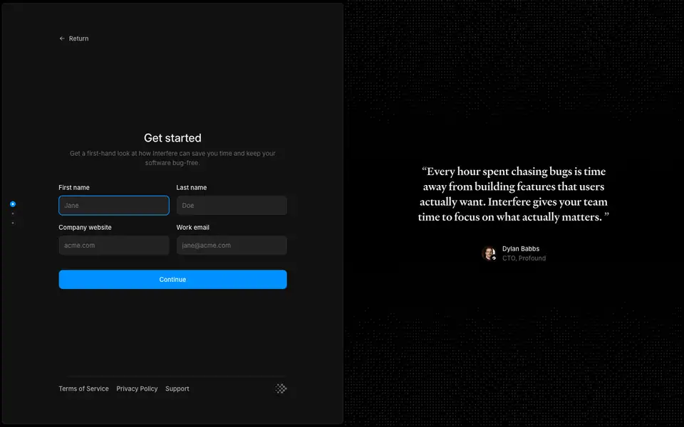
Join (/join) is a split screen: a left panel (fill #111, 8 px radius, inset 4 px from the viewport) with a 3-step progress dot rail, "Get started" 24/32, two-column inputs (label 13/500 above, 40 px input, fill .07, 8 px radius, focus ring Radix blue), a full-width blue "Continue" button; the right side is a dot-matrix field with the Heldane customer quote. Job posts use the same inputs plus a dashed resume dropzone and Yes/No radios.
Why blue here: the form is part of the product's onboarding, so it switches to the app's brand-solid (--blue-9). Marketing stays neutral; the product starts here.
11. Accordion FAQ (Security)
Rows 57 px apart: category tag (13 px .392, e.g. "Security", "Infrastructure", "Data") in a fixed left column, question 15 px, chevron right, 1 px hairlines.
12. Footer
See Header and footer for the full breakdown.
09 · Art direction
1. The direction in one sentence
"Night-time engineering, lit by a sunrise." A near-black, precise, blueprint-like world (grids, hairlines, mono type, pixel geometry), with one warm-to-cool gradient glowing at the horizon.
The team arrived at it after a week-long sprint exploring "dozens of completely different directions in Figma… from ethereal to very technical". One early exploration (shown in their blog post) was a painterly, sunny city scene with "Your software is bug-free." They chose the technical, minimal direction and kept only the gradient from the softer ones.
2. Ingredients
| Ingredient |
How it looks |
Where |
| Black canvas |
#0b0b0b, never pure black |
every page |
| Horizon gradient |
orange → magenta → purple → blue, ≤ 50% alpha, blurred 50 px, sitting under objects |
hero, CTA band, About, Download, covers |
| Product as illustration |
real UI in DOM, Radix colors, skeleton bars for noise |
heroes, features |
| Blueprint grid |
1 px .07 construction lines, dimension labels ("4 COLUMNS · 4 ROWS"), crosshair corners |
persona heroes |
| Pixel motif |
squares from the logo: dithered wordmark, 3D floating tiles, Departure Mono, pixel SOC 2 seal |
footer, Careers, changelog, labels |
| Dot matrix |
fine dot fields and grids |
Careers values, Join, Support hero (canvas) |
| Light rays |
faint diagonal beams inside the quote card |
home quote |
| Isometric / perspective |
CSS-transformed product cards |
PM hero, Download |
| Monochrome logos |
partner logos in white/gray, never in brand color |
logo wall, About |
| Grayscale photography |
team avatars and the living-room office photo |
Careers, About |
| Handwriting |
white signature strokes |
About |
3. Product as illustration
- Built in HTML/CSS, not screenshots, so it is crisp at any DPR, animatable and always on brand.
- Simplified: unimportant UI becomes skeleton bars (
.173 fill, 2–4 px radius). Panels fade out with long eased gradient masks instead of hard crops.
- Semi-transparent chrome: the team tested four sidebar treatments and picked "the semi-transparent grey… the only option that met all criteria" so the gradient glows through the app frame.
- Story-driven data: every mock tells one incident ("Broken password reset link", 12,881 impacted users, 0.2% → 12% error rate, the diff that caused it, the suggested fix).
4. The gradient as light, not fill
The gradient never sits behind body text at full strength and is never used on buttons. It is placed below or behind objects (window, card, CTA), so it reads as light spilling from a source. The About page is the only place it fills the whole background (50% alpha) — the manifesto is the brand's loudest moment.
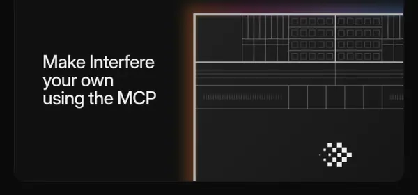
Changelog and guide covers reuse it as a floor glow at the bottom of a dark tile:
5. Pixel motif
The logomark is a 4 × 4-ish checkerboard of squares with an offset. The motif scales into:
- a 1,200 px dithered wordmark in the footer (dark gray squares that fade out toward the bottom edge),
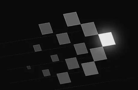
- 3D extruded tiles with one tile lit in white on Careers,
- Departure Mono labels inside mocks,
- the app icon (white pixels on a glossy black squircle with a gradient rim).

Why: the team called the pixel detail one of the two signatures of the brand. It turns a small logo into a texture the whole site can use.
6. Blueprint grids
Persona heroes sit on thin grid lines with labels like an architectural drawing. The Engineers diagram connects inputs (SOURCE CODE, LATEST RELEASE, DEPLOYMENT, EVENTS, LOGS, SESSIONS, USERS) through dashed animated lines into the Interfere mark and out to FINDINGS, FACTS and SUGGESTED FIX. Why: a diagram explains a system product faster than prose, and the grid frames it as precise engineering.
7. Photography
- Grayscale or desaturated, small (avatars 24–40 px), circular.
- One documentary photo on About (first office, a living room) in a device-like frame with a carousel.
- No stock imagery anywhere.
8. Logo usage seen on the site

- Lockup: pixel mark + wordmark, white on black, 104 × 18 px in the header.
- Mark alone: footer top-right, app icon, favicon (dark and light PNG favicons ship:
/icons/favicon/dark.png, light.png), inside product mocks as the agent avatar.
- Wordmark as texture: footer, dithered.
- Clear space: the header gives the lockup ≥ 16 px on all sides; never placed on the gradient.
- Press kit: available from the logo's right-click menu ("Download press kit"), with SVG copy actions for icon and wordmark.
9. Do / don't (as practised on the site)
| Do |
Don't |
| Glow the gradient under objects |
Put gradient behind body text or on buttons |
| Show the real product, simplified |
Use screenshots or stock illustrations |
| Use white/gray partner logos |
Use partners' brand colors |
| Use one serif for quotes and letters |
Use the serif for UI or headings |
| Use pixel geometry from the mark |
Invent unrelated decorative shapes |
10 · Brand assets and graphics inventory
Every distinct graphic type found on the 22 captured pages, how it is made (from the DOM and the team's own write-up), and how to recreate it. Crops live in images/assets/.
Legend for Made with: DOM = HTML/CSS elements · SVG = inline SVG · Canvas = <canvas> · IMG = raster image · VIDEO = <video>.
| # |
Asset |
Made with |
Where |
Recreate |
| 1 |
Logo lockup (pixel mark + wordmark) |
SVG |
header |
use the official press kit (logo right-click → Download press kit) |
| 2 |
App icon |
IMG/SVG |
Download, guide covers |
black squircle, white pixel mark, 1 px gradient rim, inner highlight |
| 3 |
Dithered footer wordmark |
SVG/DOM squares |
every footer |
render the wordmark as a grid of squares; fade alpha to 0 toward the bottom; let it bleed off the page |
| 4 |
3D pixel tiles |
DOM + CSS 3D transforms |
Careers hero |
extrude squares with two faces (top .2 white, side .08), rotateX/rotateZ, light one tile white |
| 5 |
Hero product window |
DOM |
Home, product pages |
build the real app UI; skeleton the noise; ring .173, 10 px radius, layered shadow, conic top highlight |
| 6 |
Three-step loop vignettes |
DOM |
Home |
small cropped app states that loop (alert → investigation card → diff) |
| 7 |
Code diff card |
DOM |
Home, Engineers |
Berkeley Mono 12/16, Radix syntax colors, green/red line markers |
| 8 |
Engineers node diagram |
SVG paths + CSS keyframe |
Engineers hero |
dashed paths, stroke-dashoffset 0 → −5 over 0.7 s linear infinite |
| 9 |
Session-replay stack |
DOM |
Designers hero |
stacked cards cycling with blur + opacity + scale |
| 10 |
Isometric card stack |
DOM + CSS transform |
PM hero, Download |
transform: rotateX(55deg) rotateZ(-35deg)-style isometric tilt ≈, soft shadow |
| 11 |
Dotted connection field |
Canvas |
Customer Support hero |
thousands of dots drawn on canvas (SVG was too slow, per the team) |
| 12 |
Blueprint grid + labels |
DOM borders |
persona heroes |
1 px .07 lines, 10 px uppercase labels, crosshair corners |
| 13 |
Brand gradient glows |
CSS gradients + filter: blur(50px) |
everywhere |
see 02 §3 |
| 14 |
Lit conic border |
CSS conic-gradient mask |
hero window |
conic-gradient(from 180deg, transparent, .173 white 180deg, transparent 180deg) masked to a 1 px ring |
| 15 |
Quote light rays |
CSS linear gradients |
Home quote |
2–3 diagonal linear-gradient stripes at 2–4% white |
| 16 |
Dot-matrix values art |
DOM/SVG dots |
Careers |
dot grid with one highlighted dot / an arc of dots |
| 17 |
Dot field background |
CSS radial-gradient pattern |
Join |
radial-gradient(circle, rgba(255,255,255,.12) 1px, transparent 1px) 0 0 / 6px 6px ≈ |
| 18 |
Changelog covers |
IMG (designed per release) |
Changelog |
dark tile, gradient floor, title in cover, product fragment |
| 19 |
Guide covers |
IMG (templated) |
Guides |
dark tile + gradient floor + 2–3 app-icon tiles linked by a labelled line ("MCP", "vs") |
| 20 |
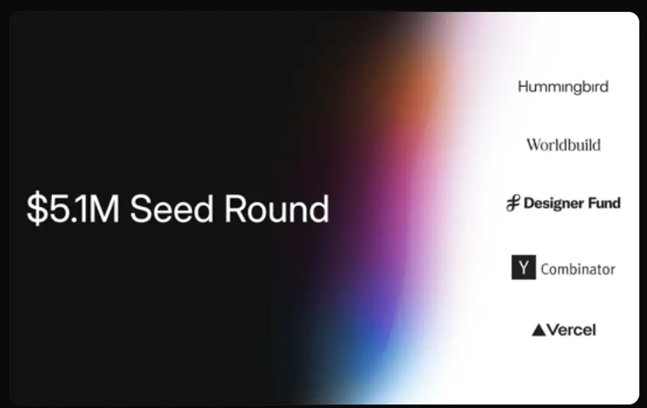
Blog seed cover |
IMG |
Blog |
vertical gradient beam splitting dark and white halves, investor logos on white |
| 21 |
Compliance badges |
SVG in a tile |
Security, Home |
engraved shield / dotted ring / "ISO 27001" text in a 56 px tile |
| 22 |
Subprocessor logos |
IMG/SVG |
Security |
vendor logos in 48 px rounded tiles |
| 23 |
Integration icon grid |
SVG tiles |
Engineers |
40 px rounded app tiles, brand-colored icons |
| 24 |
Partner/investor logos |
SVG, monochrome |
logo wall, About, Blog |
single white/gray tone (≈ 70–90% white) |
| 25 |
Team avatars |
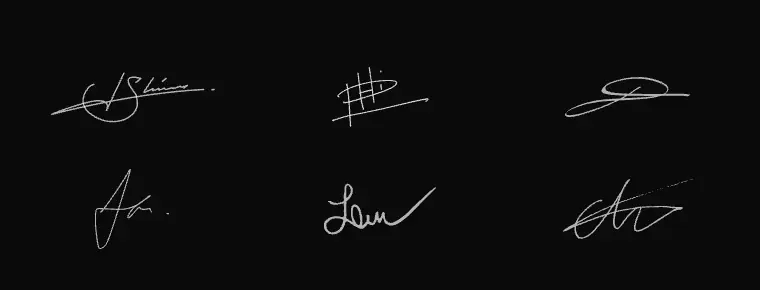
IMG via Cloudflare Images (format=auto,width=256) |
Careers, About, mocks |
grayscale crops, circular |
| 26 |
Handwritten signatures |
SVG strokes |
About |
white strokes on black, in a 3 × 2 grid |
| 27 |
Office photo carousel |
IMG |
About |
B/W photo in a dark frame with prev/next, Heldane caption |
| 28 |
Article videos |
VIDEO |
blog post |
muted autoplay loops with a custom scrubber and 0.25×–2× speed menu |
| 29 |
AI assistant icons |
SVG in 28 px round buttons |
footer |
monochrome icons for ChatGPT, Claude, Perplexity, Gemini and Grok; each opens the assistant with a prefilled "What does Interfere (the startup) do…" prompt |
| 30 |
Status animations |
SVG + keyframes |
product mocks |
status-positive / status-negative 1.2 s step-end blinks, viewfinder-scan 3 s |
Gallery

Production notes
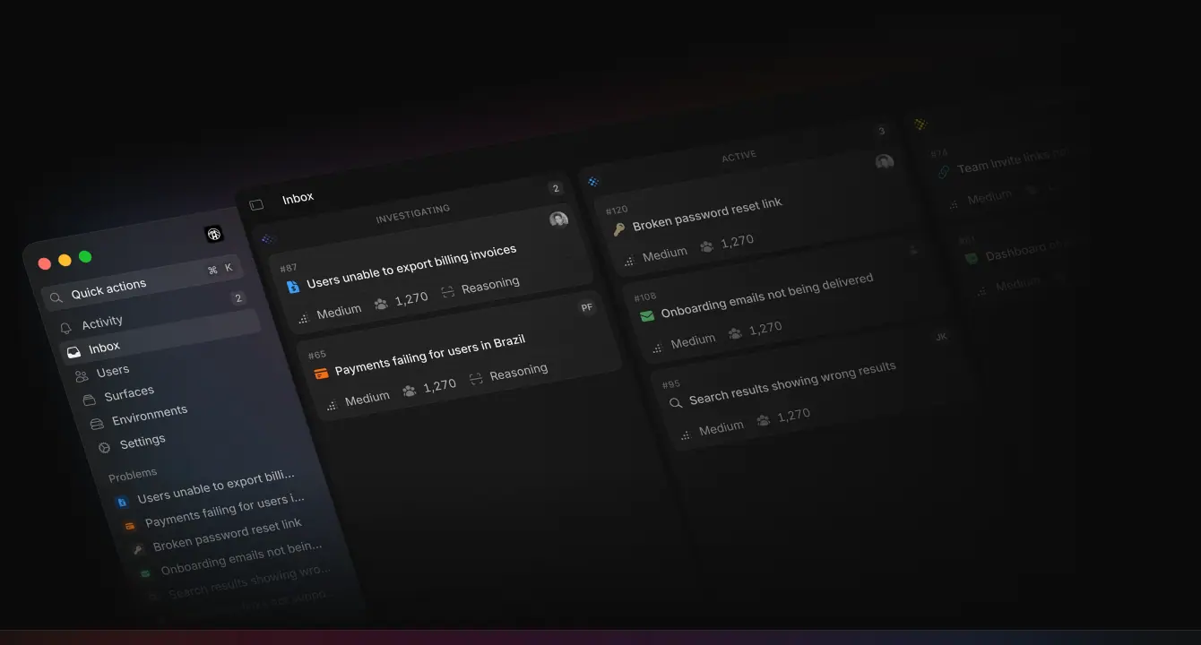
- Code first. Per the team, "every asset on the website is built in code, with a few exceptions". Raster images are only used for photos, covers and logos.
- Image delivery: Cloudflare Image Resizing (
/cdn-cgi/image/format=auto,width=256/…) serves AVIF/WebP at the right width.
- Press kit: official logo files come from the logo context menu (Copy icon as SVG, Copy wordmark as SVG, Download press kit). This research did not download them; crops here are screenshots for reference only.
11 · Motion and interaction
Measured from the stylesheets (globals-*.css, _marketing-*.css, logo-wall-*.css) and getComputedStyle on live pages. JS-driven motion (Motion library) is described from what was observed and from the team's own write-up; its exact timing is not in CSS and is marked as such.
1. Easing and duration tokens
| Token |
Value |
Use |
--ease-out |
cubic-bezier(0, 0, .2, 1) |
buttons, links, most hovers |
--ease-in-out |
cubic-bezier(.4, 0, .2, 1) |
Tailwind default transitions |
--ease-out-quad |
cubic-bezier(.25, .46, .45, .94) |
viewfinder keyframe steps |
--ease-out-cubic |
cubic-bezier(.215, .61, .355, 1) |
chart draw, viewfinder |
--ease-out-quint |
cubic-bezier(.23, 1, .32, 1) |
7 transitions on home (200 ms) |
--ease-in-out-cubic |
cubic-bezier(.645, .045, .355, 1) |
viewfinder scan |
--ease-in-out-sine |
cubic-bezier(.65, 0, .35, 1) |
brand-gradient shift |
nav menu --easing |
cubic-bezier(.22, 1, .36, 1) |
mega-menu morph, 300 ms |
--default-transition-duration |
150 ms |
|
Transition durations counted on home: 200 ms (57 elements), 150 ms (29), 300 ms (11), 500 ms (3). Nothing interactive is slower than 300 ms.
2. Hero entrance (CSS, _marketing.css)
@keyframes hero-rise   { 0% { filter: blur(10px); opacity: 0; transform: translateY(20%); } }
@keyframes hero-blur-in{ 0% { filter: blur(10px); opacity: 0; } }
@keyframes hero-fade-in{ 0% { opacity: 0; } }
.rise   { animation: .8s both hero-rise; }        /* H1 words, lead, button */
.blurIn { animation: .8s .8s both hero-blur-in; }  /* product window */
.fadeIn { animation: 1s .2s both hero-fade-in; }   /* gradient glow */
@media (prefers-reduced-motion: reduce) { .rise, .blurIn, .fadeIn { animation: none; } }
Measured delays on the home H1 words: 0.40 s, 0.44 s, 0.48 s, 0.52 s, 0.56 s … (40 ms stagger, ease). The glow fades in from 0.2 s over 1 s; the product window blurs in at 0.8 s.
Team note: "The main title animates by word, while the description and buttons each animate as a single block. The stagger timing is also slightly different for each group so the animation doesn't feel robotic."
3. Hero timeline sequence (JS)
After the entrance, the timeline in the product window plays item by item: the line draws down → the marker animates in → the content animates in (blur/opacity/translateY), and the next item starts when the previous line finishes. It "mirrors how new events enter the timeline in the product" and plays only on the first visit (later navigations show the end state). Exact per-step durations are set in JS and are not exposed in CSS.
4. Scroll-linked quote reveal (CSS custom properties)
@property --quote-progress { syntax: "<number>"; inherits: true; initial-value: 0; }
.quote { --quote-blur: 6px; --quote-window: 3; --quote-span: calc(var(--quote-total) + var(--quote-window) - 1); }
.word  {
  --quote-reveal: clamp(0, calc((var(--quote-progress) * var(--quote-span) - var(--quote-index)) / var(--quote-window)), 1);
  color: color-mix(in oklab, var(--color-primary-foreground) calc(var(--quote-reveal) * 100%), var(--color-disabled));
  filter: blur(calc((1 - var(--quote-reveal)) * var(--quote-blur)));
}
@media (prefers-reduced-motion: reduce) { .word { filter: none; } }
JS writes one number (--quote-progress, 0→1) as the section scrolls; each word computes its own reveal from its index, with a window of 3 words in transition at any moment. Words go from --color-disabled (≈ .035 white) + 6 px blur to .93 sharp. Used on the home testimonial and the About manifesto (32/40 Heldane).
Why three: "If we animated them one by one, the animation would feel quite robotic."
5. Loops
| Keyframe |
Duration / timing |
Where |
What it does |
marquee |
30 s linear infinite |
logo wall |
translateX 0 → −100% |
persona-marquee |
50 s linear infinite |
Engineers, Designers |
slower secondary strip |
signal-flow |
0.7 s linear infinite |
Engineers diagram |
stroke-dashoffset → −5 (dashes flow along paths) |
shimmer |
3 s linear infinite |
"Suggesting a fix…" text |
background-position 200% → −200% over a .392 → .93 → .392 text gradient |
ld-orbit-rotate |
0.75 s linear infinite |
loading spinner in mocks |
rotation |
status-positive |
1.2 s step-end infinite |
"Active" status dots |
opacity steps 1 → .6 → .4 → .2 |
status-negative |
1.2 s step-end infinite |
warning pulse |
.4 → 1 → .4 |
viewfinder-focus / viewfinder-scan |
3 s |
detection icon |
inset + 90° rotate, scanline ±2.5 px |
brand-gradient-shift |
2.6 s ease-in-out-sine alternate |
gradient elements (--brand-gradient-shift −40% → 40%) |
the gradient slowly slides |
logo-shake |
3.6 s linear infinite |
error icon |
quick horizontal shake at 85–98% of the cycle |
chart-draw |
1 s ease-out-cubic |
Recharts areas in mocks |
clip-path wipe left → right |
breathe, pulse |
2 s |
skeletons |
opacity 1 ↔ .5 |
All marketing loops (marquee, hero) have reduced-motion overrides.
6. Interaction states
| Element |
Rest |
Hover |
Press |
Transition |
| Primary button |
fill .95 |
fill .80 |
scale(.97) (when .int-btn-scales) |
color/bg 150 ms, transform 200 ms, ease-out |
| Secondary button |
fill .07 |
fill .106 |
|
same |
| Nav trigger |
transparent, .686 |
fill #222, .93 |
|
none (instant) |
| Mega-menu |
closed |
opens on hover; panel morphs between triggers |
|
300 ms (.22, 1, .36, 1), exit 120 ms |
| Text links |
.686 |
.93, underline color fades in |
|
150 ms text-decoration-color |
| Cards ("The Latest", guides) |
|
title brightens |
|
200 ms ease-out |
7. What is not measurable here
- The exact JS timings of the timeline sequence and the persona hero loops (Motion library), beyond what the team wrote.
- Hover visuals that need a real pointer path (the mega-menu was opened with
agent-browser hover and measured; card hovers were read from transition properties only).
8. Motion rules to copy
- Animate only
opacity, filter: blur, transform. Blur 10 → 0 px reads as "coming into focus".
- Stagger by word for headings (40 ms), by block for everything else.
- Play long sequences once per session.
- Scroll-reveal text with a 3-word window, not word-by-word.
- Keep interactive transitions ≤ 300 ms, ease-out.
- Every keyframe gets a
prefers-reduced-motion override.
12 · Glossary
The vocabulary to brief, build or critique a page like interfere.com.
| Term |
Meaning |
Interfere example |
| Alpha neutrals |
grays made by putting white at different opacities over one dark color |
.93 / .686 / .392 text, .035 / .07 / .106 / .173 fills |
| Brand gradient |
one fixed multi-stop gradient used as a signature |
orange → magenta → purple → blue |
| Horizon glow |
a blurred gradient placed under an object so it reads as light |
behind the hero window and CTA band |
| Bleed |
an element running past the container or viewport edge |
product windows off the right edge |
| Split hero |
headline on one side, lead/CTA on the other |
home hero |
| Persona page |
a landing page per job role |
/product/engineers, /designers, /product-managers, /customer-support |
| Product-as-illustration |
the real UI, rebuilt in code, used as the main visual |
every hero |
| Skeleton UI |
gray bars standing in for unimportant content |
inside feature mocks |
| Blueprint grid |
thin construction lines and dimension labels behind an asset |
persona heroes |
| Isometric |
a 3D-tilted view with parallel projection |
PM hero, Download |
| Pixel motif / dithering |
images made of squares, often fading by density |
footer wordmark, Careers tiles |
| Two-tone headline |
one heading with a bright clause and a dim clause |
"Secure by design. Safe by default." |
| Highlight chip |
a colored fill behind one word |
"finds" in the home H2 |
| Eyebrow / overline |
a small label above a heading |
"Interfere for Designers", "IMPACTED USERS" |
| Lead |
the paragraph right under a headline |
15/24 .686 |
| Logo wall / marquee |
a scrolling row of customer or investor logos |
"Trusted and funded by" |
| Keycap |
a small key label inside a button showing its shortcut |
G, L |
| Mega-menu |
a large dropdown panel from the main nav |
Product, Resources, Company |
| Morphing popover |
one dropdown panel that resizes and moves between triggers |
Base UI Navigation Menu |
| Closing CTA band |
a last full-width call to action before the footer |
"Ship software that never breaks" |
| Answer-engine row |
links that ask AI assistants about the brand |
"Ask about Interfere on…" |
| Stagger |
delaying each item in a sequence |
40 ms per hero word |
| Blur-in |
entrance from blurred and transparent to sharp |
10 px → 0 |
| Scroll-linked reveal |
animation progress tied to scroll position |
testimonial words |
| Reduced motion |
the OS setting that asks for less animation |
prefers-reduced-motion: reduce |
| Layered shadow |
several stacked shadows that model real light |
hero window |
| Hairline |
a 1 px rule at very low contrast |
rgba(255,255,255,.07) |
| Measure |
text line length |
628 px article column |
| Breakout figure |
an image wider than the text column |
788 px figures |
| Sticky TOC |
a table of contents that stays visible while scrolling |
blog and guide posts |
| Tabular figures |
digits of equal width |
salary ranges in the roles table |
| Stylistic set (ss03) |
an OpenType alternate glyph set |
Inter's rounded quotes and commas |
| Variable font |
one font file covering a weight range |
Inter 100–900, weights 450 and 550 |
| Radix Colors |
a 12-step color scale system with alpha variants |
gray, blue, crimson tokens |
| Base UI |
unstyled accessible React primitives |
nav menu, popovers |
| Programmatic SEO |
many templated pages targeting search queries |
28 guides ("Sentry alternatives", "What is OTLP?") |
| Changelog cover |
a designed image per release |
each changelog entry |
| Press kit |
official logo and brand files for media |
logo right-click menu |
13 · Build recipe
Tokens and snippets that reproduce the Interfere look. Values are the measured ones; names are mine where the site's names are internal.
1. Tokens
:root {
  color-scheme: dark;
  --spacing: 4px;

  /* surfaces */
  --bg: oklch(0.15 0 0);            /* #0b0b0b */
  --bg-raised: #111111;             /* Radix gray-1 dark */
  --bg-input: #191919;              /* gray-2 */
  --fill-1: rgb(255 255 255 / .035);
  --fill-2: rgb(255 255 255 / .07);  /* hairlines, secondary buttons */
  --fill-3: rgb(255 255 255 / .106);
  --fill-4: rgb(255 255 255 / .173); /* skeletons, strong rings */

  /* text */
  --text-1: rgb(255 255 255 / .93);
  --text-article: rgb(255 255 255 / .80);
  --text-2: rgb(255 255 255 / .686);
  --text-3: rgb(255 255 255 / .392);
  --text-ghost: rgb(255 255 255 / .035);

  /* brand */
  --brand-1: #ef5f00; --brand-2: #c2007a; --brand-3: #53009e; --brand-4: #0086f0;
  --brand-gradient: linear-gradient(90deg,
     rgb(255 59 0 / .2) 0%, rgb(246 0 157 / .2) 38%, rgb(151 62 198 / .2) 71%, rgb(0 142 255 / .2) 100%);
  --brand-gradient-strong: linear-gradient(90deg,
     rgb(239 95 0 / .5) 0%, rgb(194 0 122 / .39) 33%, rgb(83 0 158 / .36) 66%, rgb(0 134 240 / .49) 100%);
  --app-blue: #0090ff;               /* Radix blue-9: product/onboarding only */

  /* type */
  --font-sans: "InterVariable", "Inter", system-ui, sans-serif;
  --font-serif: "HeldaneText", "Newsreader", Georgia, serif;
  --font-mono: "BerkeleyMono", "JetBrains Mono", ui-monospace, monospace;
  --font-pixel: "DepartureMono", monospace;

  /* radius */
  --r-chip: 4px; --r-sm: 6px; --r-md: 8px; --r-lg: 10px; --r-card: 12px; --r-panel: 16px;

  /* motion */
  --ease-out: cubic-bezier(0, 0, .2, 1);
  --ease-out-quint: cubic-bezier(.23, 1, .32, 1);
  --ease-menu: cubic-bezier(.22, 1, .36, 1);
  --dur-fast: 150ms; --dur: 200ms; --dur-menu: 300ms;

  /* layout */
  --container: 1200px; --gutter: 22px; --gutter-mobile: 24px;
}
html { background: var(--bg); color: var(--text-1); font: 400 15px/24px var(--font-sans); font-feature-settings: "ss03"; -webkit-font-smoothing: antialiased; }
2. Layout
.container { max-width: calc(var(--container) + var(--gutter) * 2); margin-inline: auto; padding-inline: var(--gutter); }
.section        { padding-block: 96px; border-top: 1px solid var(--fill-2); }
.section--hero-statement { padding-block: 144px; }
.section--latest { padding-block: 120px; }
@media (max-width: 767px) { .container { padding-inline: var(--gutter-mobile); } .section, .section--hero-statement { padding-block: 64px; } }
.three-up { display: grid; grid-template-columns: repeat(3, 1fr); gap: 40px; }
.feature-row { display: grid; grid-template-columns: 480px 1fr; gap: 140px; overflow-x: clip; }
.feature-row__visual { margin-right: calc(50% - 50vw); }          /* bleed to the viewport edge */
.article { max-width: 628px; margin-inline: auto; }
.article figure { width: 788px; margin-inline: -80px; }
3. Type
.display   { font-size: 56px; line-height: 56px; font-weight: 500; letter-spacing: -.01em; text-wrap: balance; }
.display--home { font-weight: 550; }
.display--centered { letter-spacing: -.02em; text-align: center; }
.h-page    { font-size: 36px; line-height: 44px; font-weight: 500; letter-spacing: -.01em; }
.h-section { font-size: 28px; line-height: 36px; font-weight: 500; letter-spacing: -.01em; }
.h-section .dim { color: var(--text-3); }
.lead      { font-size: 15px; line-height: 24px; color: var(--text-2); }
.article p { font-size: 16px; line-height: 24px; color: var(--text-article); }
.overline  { font-size: 10px; line-height: 16px; font-weight: 500; letter-spacing: .05em; text-transform: uppercase; color: var(--text-3); }
.quote     { font-family: var(--font-serif); font-size: 28px; line-height: 36px; letter-spacing: -.01em; }
@media (max-width: 767px) { .display { font-size: 36px; line-height: 36px; } .h-section--statement { font-size: 24px; line-height: 32px; } }
4. Buttons with keycaps
.btn { display: inline-flex; align-items: center; gap: 8px; height: 40px; padding: 0 14px; border-radius: var(--r-md);
       font: 500 13px/20px var(--font-sans);
       transition: color var(--dur-fast) var(--ease-out), background-color var(--dur-fast) var(--ease-out), transform var(--dur) var(--ease-out); }
.btn:active { transform: scale(.97); }
.btn--primary   { background: rgb(255 255 255 / .95); color: #000; }
.btn--primary:hover { background: rgb(255 255 255 / .80); }
.btn--secondary { height: 28px; padding: 0 6px 0 10px; border-radius: var(--r-sm); background: var(--fill-2); color: var(--text-1);
                  box-shadow: 0 0 0 .5px rgb(0 0 0 / .06), 0 1px 1px -1px rgb(0 0 0 / .1), 0 1px 2px rgb(0 0 0 / .05); }
.btn--secondary:hover { background: var(--fill-3); }
.btn kbd { min-width: 20px; height: 20px; border-radius: 4px; display: grid; place-items: center;
           font: 400 12px/16px var(--font-sans); background: var(--fill-2); color: var(--text-2); }
<a class="btn btn--secondary" href="/signup">Get started <kbd>G</kbd></a>
5. Gradient glow and closing band
.glow { position: absolute; inset: auto -10% -20% -10%; height: 60%; background: var(--brand-gradient-strong);
        filter: blur(50px); opacity: .6; pointer-events: none; animation: fade-in 1s .2s both; }
.cta-band { position: relative; padding: 160px 0 200px; text-align: center; overflow: hidden; }
.cta-band::before { content: ""; position: absolute; inset: 0 0 auto; height: 280px; background: var(--brand-gradient);
                    filter: blur(60px); mask-image: linear-gradient(#000, transparent); }
6. Product window shell
.window { border-radius: var(--r-lg); background: var(--fill-1); position: relative;
  box-shadow: 0 0 0 .5px var(--fill-2), 0 149px 199px rgb(0 0 0 / .07), 0 62px 83px rgb(0 0 0 / .05),
              0 33px 44px rgb(0 0 0 / .04), 0 18px 25px rgb(0 0 0 / .035), 0 8px 13px rgb(0 0 0 / .025); }
.window::before { /* lit top edge */ content: ""; position: absolute; inset: 0; border-radius: inherit; padding: 1px;
  background: conic-gradient(from 180deg, transparent 0deg, var(--fill-4) 180deg, transparent 180deg);
  -webkit-mask: linear-gradient(#000 0 0) content-box, linear-gradient(#000 0 0); -webkit-mask-composite: xor; mask-composite: exclude; }
.skeleton { background: var(--fill-4); border-radius: 3px; height: 8px; }
7. Hero entrance
@keyframes rise { from { filter: blur(10px); opacity: 0; transform: translateY(20%); } }
.hero-word { display: inline-block; animation: rise .8s both; animation-delay: calc(.4s + var(--i) * 40ms); }
.hero-block { animation: rise .8s .7s both; }
@media (prefers-reduced-motion: reduce) { .hero-word, .hero-block { animation: none; } }
8. Scroll-revealed quote (3-word window)
const q = document.querySelector('.quote');
const words = q.querySelectorAll('.word');
words.forEach((w, i) => w.style.setProperty('--i', i));
q.style.setProperty('--total', words.length);
addEventListener('scroll', () => {
  const r = q.getBoundingClientRect();
  const p = Math.min(1, Math.max(0, (innerHeight * .85 - r.top) / (innerHeight * .6)));
  q.style.setProperty('--p', p);
}, { passive: true });
.word { --span: calc(var(--total) + 2);
  --reveal: clamp(0, calc((var(--p) * var(--span) - var(--i)) / 3), 1);
  color: color-mix(in oklab, rgb(255 255 255 / .93) calc(var(--reveal) * 100%), rgb(255 255 255 / .035));
  filter: blur(calc((1 - var(--reveal)) * 6px)); }
9. Checklist before shipping a page in this style
- [ ] One dark color, everything else white-alpha.
- [ ] Gradient used only as light, in the hero and the closing band.
- [ ] Hero asset is the product (or the brand mark), built in code.
- [ ] H1 56/56 weight 500, −1% tracking; lead 15/24
.686.
- [ ] Section titles 28/36, two-tone where it helps.
- [ ] One CTA label site-wide, white primary button with a keycap in the header.
- [ ] Hairlines at
.07, no card shadows.
- [ ] Hero blur-rise stagger, reduced-motion fallback, nothing interactive over 300 ms.
- [ ] Footer: link columns, "Ask about us on" row, giant pixel/dithered wordmark.
Home · https://interfere.com/
7,286 px tall at 1440. 11 sections. Title: "Production visibility for teams that ship fast › Interfere". Meta description: "Interfere empowers engineers, product managers and designers with real-time understanding of previously unseen bugs and issues."

1. Hero (0–1,232 px)
| Element |
Measured |
| H1 "Ship software that never breaks" |
56/56, weight 550, −0.56 px, .93, x 120, w 450, 2 lines |
| Lead |
15/24, 400, .686, right-aligned, x 808, w 512 |
| CTA "Get started" |
40 px, 0 14 px, 8 px radius, fill .95, black 13/500 |
| Product window |
starts y ≈ 366, 1,320 px wide from x 120 (bleeds 120 px off the right edge), 10 px radius |
| Glow |
brand gradient at 50% alpha, filter: blur(50px), behind the window |
What it shows. Inbox → problem "#120 Broken password reset link": property list (Priority High, Assignee, Status Active, Surface Website Frontend + iOS App), regression stats (First detection 36 minutes ago, Duration 36 min 47 s, Findings 146), "Impacted users 12,881", and the timeline: Problem detected → Status Investigating → Finding with an auth/reset.ts diff → Fact "Error rate increased from 0.2% to 12%…" → Assigned → Priority → comment "Looks related to yesterday's auth refactor." → "Suggesting a fix…" (shimmer).
Motion. Words rise from blur 10 px in 40 ms steps from 0.40 s; lead and button as blocks; the window blurs in at 0.8 s; then the timeline draws event by event, once per visit.
Why. The whole product story (detect → investigate → find cause → fix) is told in one frame. Placing the lead on the right breaks the centered-template look and creates a Z reading path. Easter egg: the "+" in the avatar stack links to Careers.
2. Logo wall (1,232–1,389 px)
"Trusted and funded by" chip, then a 30 s marquee of monochrome logos (Vercel, The San Francisco Compute Company, Profound, tabs, Delphi, Designer Fund, Hummingbird). 48 px padding, 1 px bottom rule. Why: borrows credibility from investors and early customers at once.
3. How it works (1,389–2,165 px)
Two-tone H2 (28/36, .93 + .392) with fill chips behind finds / understands / resolution. 144 px padding. Three 373 px cards (gap 40 px): looping vignettes + 15 px title + 15/24 .686 body: Learn about issues before your customers do · Understand what's going wrong · Fix problems with confidence. Why: a product category that doesn't exist yet needs a 3-step mental model before features.
4. Testimonial (2,165–2,657 px)
1,200 × 492 card, fill .035, faint light rays, gradient glow along the bottom. Heldane Text 28/36 quote revealed 3 words at a time on scroll: "Every hour spent chasing bugs is time away from building features that users actually want…" — Dylan Babbs, CTO, Profound. Why: one quote, read word by word, gets more attention than a carousel.
5–7. Feature rows (2,657–5,155 px)
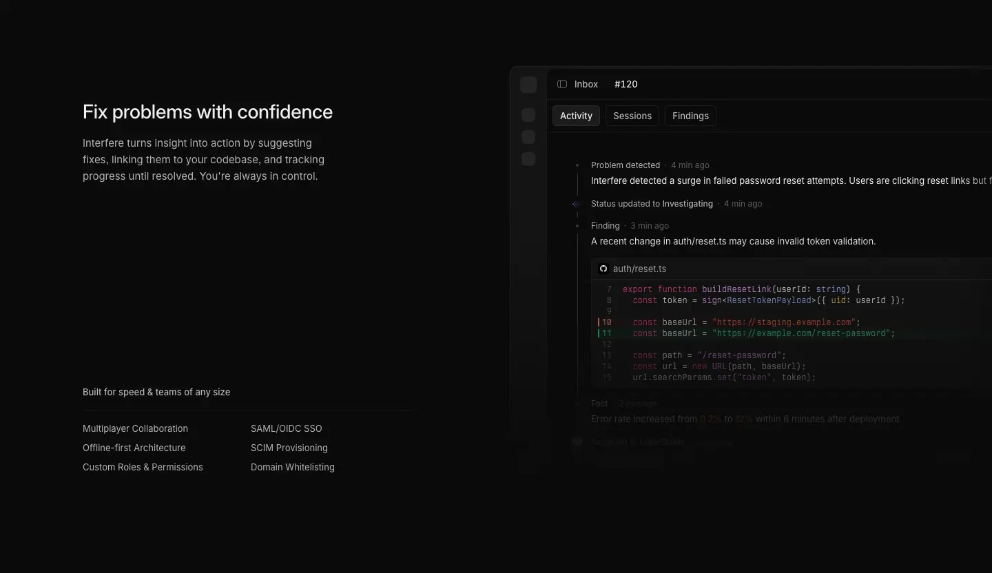
Each 832 px tall, 96 px padding, 1 px divider. Text column 480 px: H2 28/36, body 15/24 .686, then a labelled two-column capability list at the bottom:
| Row |
Visual |
Capability label → items |
| Learn about issues before your customers do |
Inbox board: Under investigation and Active columns of problem cards with priority and user counts |
Full-stack understanding → User Tracking, Session Replays, Release Tracking, Logging & Alerting, Predictive Analysis |
| Understand what's going wrong |
problem detail + timeline |
Zero-touch triage → Prioritization, Team Routing, User Impact, Root Cause Analysis |
| Fix problems with confidence |
timeline with the suggested code fix |
Built for speed & teams of any size → Multiplayer Collaboration, Offline-first Architecture, Custom Roles & Permissions, SAML/OIDC SSO, SCIM Provisioning, Domain Whitelisting |
Why: the three rows repeat the three-verb loop from section 3, so the page is one argument told twice (overview, then depth). The last row's list answers enterprise requirements (SSO, SCIM) without a separate section.
8. Security strip (5,155–5,451 px)
"Secure by design. / Safe by default." + Learn more ›, SOC 2 Type II (Completed) and GDPR (Completed) badges with View details ›.
9. The Latest (5,451–5,984 px)
120 px padding, three changelog teasers (date 12/500 uppercase .392, title 15/500, 3-line excerpt), "See all releases ›". Why: proof of momentum.
10. Closing CTA (5,984–6,520 px)
The H1 repeated at 56/56 centered, white Get started, gradient horizon at the top edge.
11. Footer (6,520–7,286 px)
See Header and footer.
Responsive
At 390 px the H1 is 36/36, the hero stacks (H1, lead, button, window cropped by the edge), the statement H2 is 24/32, feature rows stack text over visual, The Latest becomes a swipe row with arrows. At 768 px the layout stacks the same way with wider gutters.

For Engineers · https://interfere.com/product/engineers
4,910 px. Title "Interfere for Engineers". Meta: "Interfere connects errors, sessions, code changes, deployments, and investigations into a single workflow—helping engineers move from detection to resolution without jumping between tools."
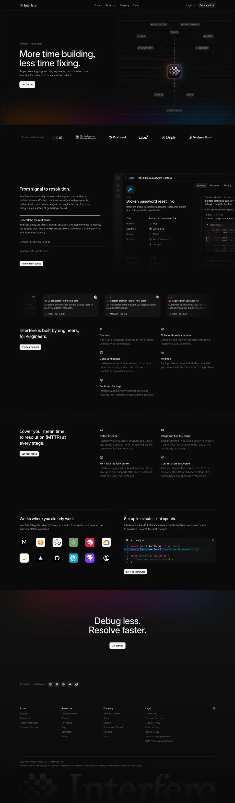
1. Hero
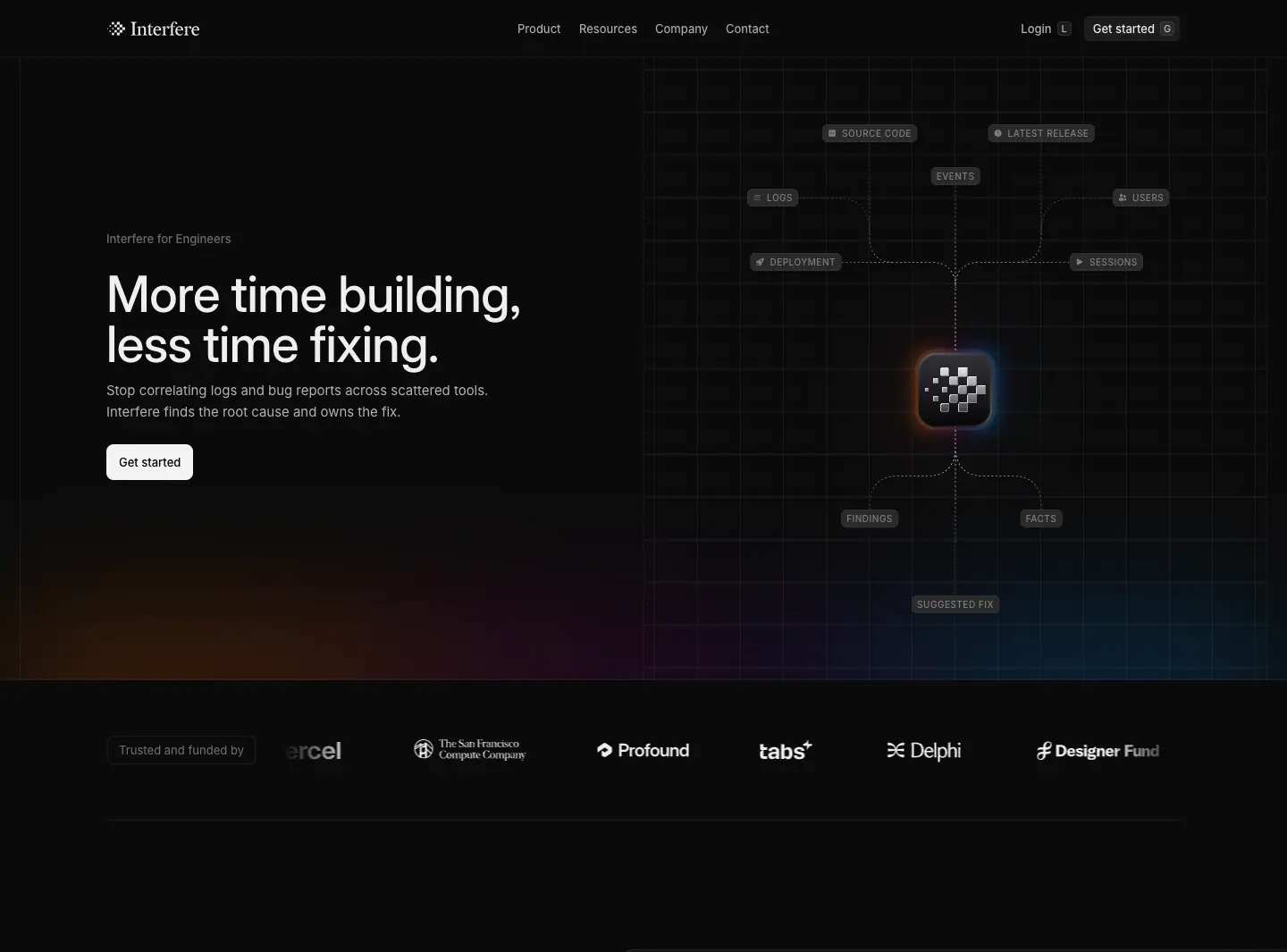
- Eyebrow "Interfere for Engineers" (13 px
.392). H1 "More time building, less time fixing." 56/56, 500, −0.56 px, x 119, w 505. Lead: "Stop correlating logs and bug reports across scattered tools. Interfere finds the root cause and owns the fix." Button "Get started".
- Right: an SVG node diagram on a blueprint grid. Uppercase 10 px node labels (SOURCE CODE, LATEST RELEASE, DEPLOYMENT, EVENTS, LOGS, SESSIONS, USERS) connect with dashed lines into a glowing Interfere-mark tile, which outputs FINDINGS, FACTS and SUGGESTED FIX. Dashes flow via
@keyframes signal-flow (0.7 s linear infinite, stroke-dashoffset → −5).
- Gradient floor glow; the logo-wall marquee follows.
Why: engineers trust architecture diagrams. Showing "everything flows into one place" sells consolidation better than a screenshot.
2. From signal to resolution
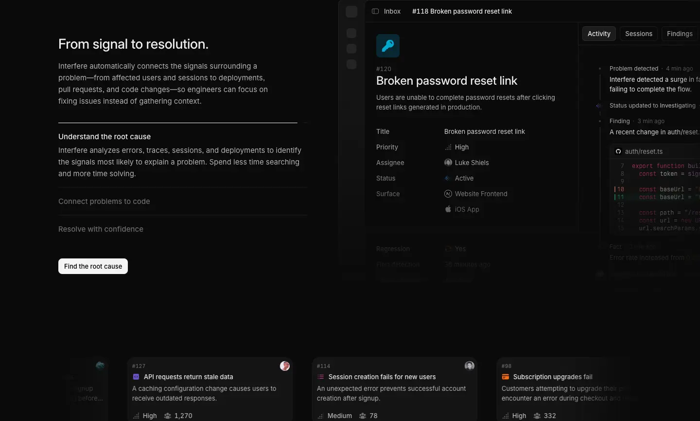
Left: H2 28/36 + paragraph + an accordion-like step list (Understand the root cause [expanded with body] · Connect problems to code · Resolve with confidence) + "Find the root cause" button. Right: the problem window. Below: a row of three problem cards ("API requests return stale data", "Session creation fails for new users", "Subscription upgrades fail") with priorities and user counts, drifting in a 50 s persona-marquee.
3. Built by engineers, for engineers
H2 + "Try it on your app" button; 2 × 3 icon grid: Sessions, Collaborate with your team, Code connection, Findings, Facts and findings. 16 px line icons, 15/500 titles, 15/24 .392 text. No borders.
4. Lower your MTTR at every stage
H2 "Lower your mean time to resolution (MTTR) at every stage." + "Cut your MTTR". Four steps: Detect it sooner · Triage and find the cause · Fix it with the full context ("…in any agent that supports MCP, such as Claude Code or Cursor…") · Confirm users recovered.
Why: speaks the metric engineering managers are measured on.
5. Works where you already work / Set up in minutes, not sprints
Two halves (24/32 H2s): a 7 × 2 grid of 40 px integration tiles, and a next.config.ts code card with the withInterfere wrapper highlighted + "Set it up in minutes".
6. Closing CTA: "Debug less. Resolve faster."

What makes this page work
- Same skeleton as the other persona pages (hero on grid → problem window → feature grid → closing line), different hero asset and copy.
- The CTA labels escalate along the page: Get started → Find the root cause → Try it on your app → Cut your MTTR → Set it up in minutes. Each matches the section's promise.
For Designers · https://interfere.com/product/designers
4,013 px. Same template as For Engineers.
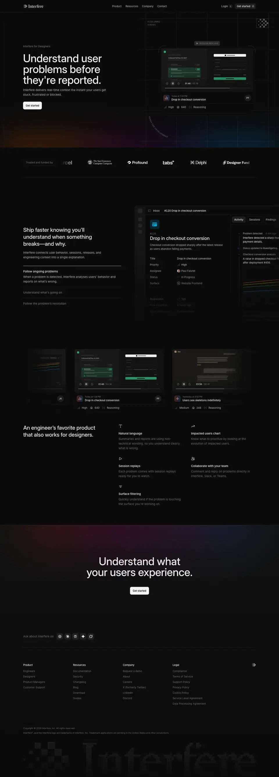
1. Hero
- Eyebrow "Interfere for Designers". H1 "Understand user problems before they're reported." (56/56, 3 lines). Lead: "Interfere delivers real-time context the instant your users get stuck, frustrated or blocked." Button "Get started".
- Asset: a session-replay player card on the blueprint grid (labels "4 COLUMNS · 4 ROWS", "SESSION REPLAYS", a curved "READY FOR DEVELOPMENT" label), showing a mini e-commerce checkout ("Unlimited Fall Pass For $125" set in Heldane at 23 px), player controls "01:46 / 02:16", and a problem chip "Drop in checkout conversion · High · 640 · Reasoning". The stack of replays cycles with blur, opacity and scale (per the team).
- A small pixel-mark tile sits in the grid's top-right corner.
Why: designers think in user journeys; a replay of a real checkout is their native artifact. The Heldane price inside the mock shows the product can render any customer UI, not just Interfere's own.
2. Ship faster knowing you'll understand what's broken
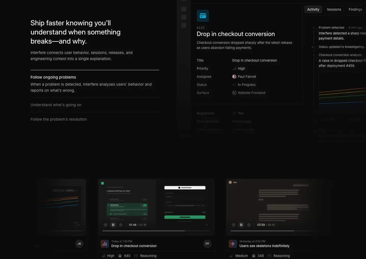
H2 + a three-step list (Follow ongoing problems · Understand what's going on · Follow the problem's resolution) beside the problem window (Inbox › #120 Drop in checkout conversion) with replay evidence.
3. An engineer's favorite product that also works for designers
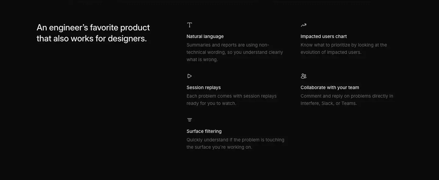
Feature grid: Natural language ("Summaries and reports are using non-technical wording…"), Impacted users chart, Session replays, Collaborate with your team, Surface filtering.
Why: addresses the designer's fear ("this is a dev tool, I won't understand it") head-on in the H2.
4. Closing CTA: "Understand what your users experience."

For Product Managers · https://interfere.com/product/product-managers
3,800 px. Same template as For Engineers.
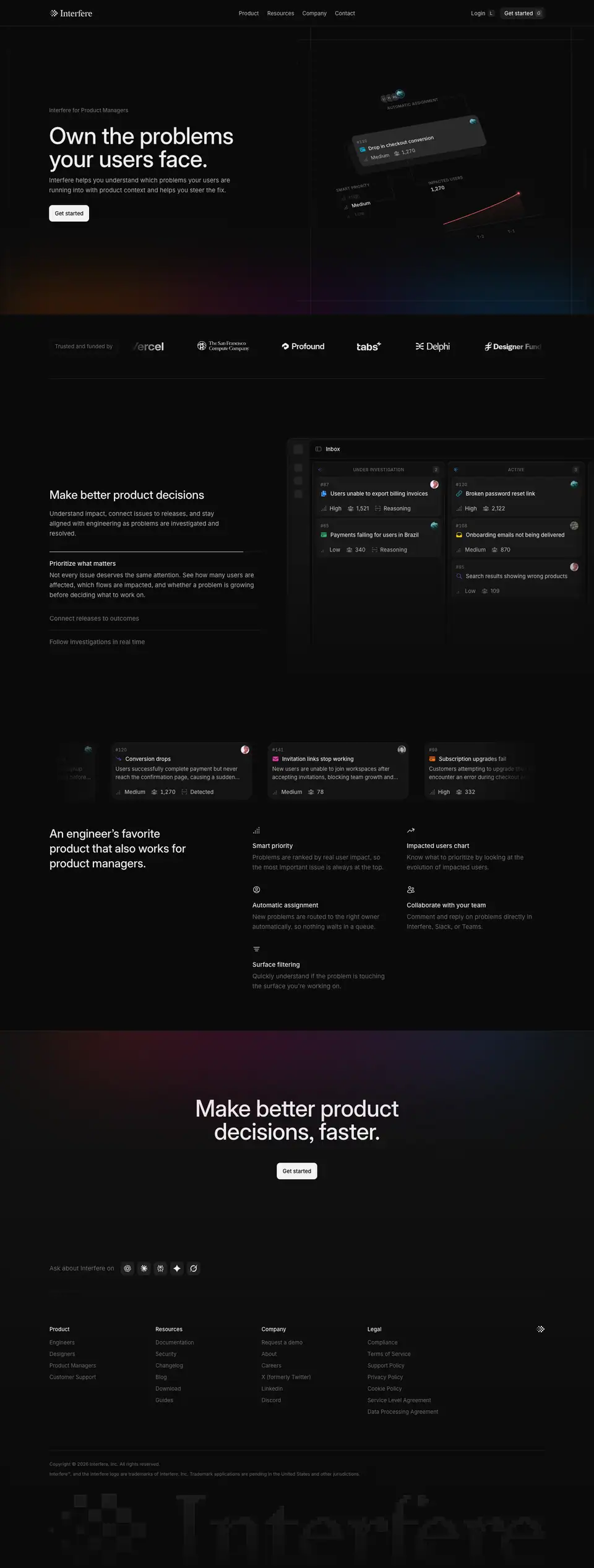
1. Hero
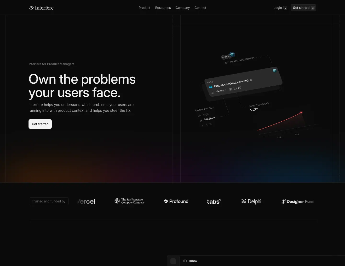
- Eyebrow "Interfere for Product Managers". H1 "Own the problems your users face." Lead: "Interfere helps you understand which problems your users are running into with product context and helps you steer the fix."
- Asset: an isometric composition (CSS transform, not animated): a problem card "#120 Drop in checkout conversion · Medium · 1,270", floating labels "AUTOMATIC ASSIGNMENT", "SMART PRIORITY (High / Medium / Low)", "IMPACTED USERS 1,270", and a rising red line chart.
Why: PMs care about impact and priority; the isometric view reads as a "dashboard of decisions" rather than a debugging screen.
2. Make better product decisions
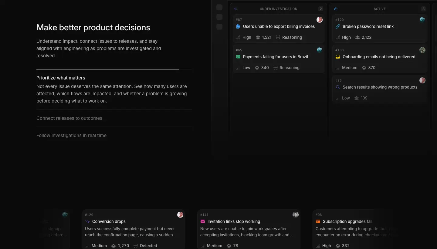
Three-step list: Prioritize what matters · Connect releases to outcomes · Follow investigations in real time, beside the problem window.
3. An engineer's favorite product that also works for PMs
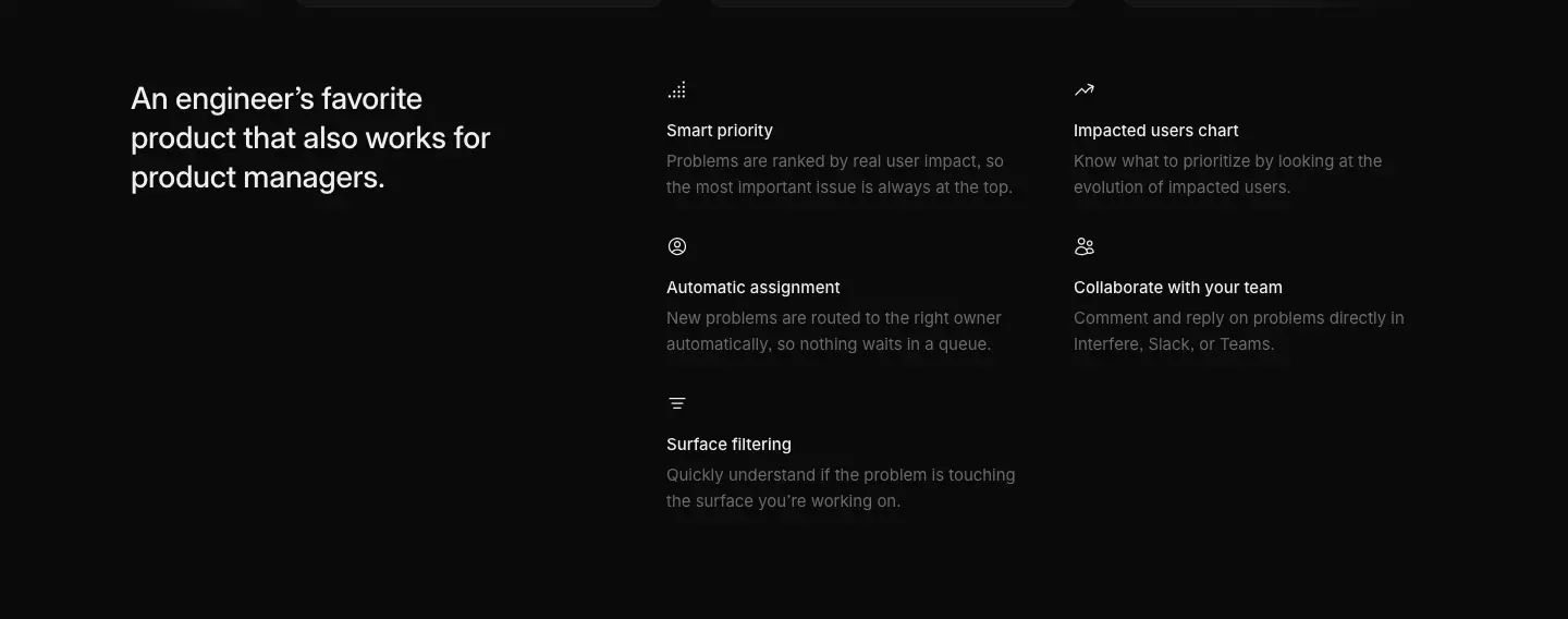
Shared feature-grid pattern with PM-relevant items: Smart priority, Impacted users chart, Automatic assignment, Collaborate with your team, Surface filtering.
4. Closing CTA: "Make better product decisions, faster."

For Customer Support · https://interfere.com/product/customer-support
4,300 px. Same template as For Engineers.
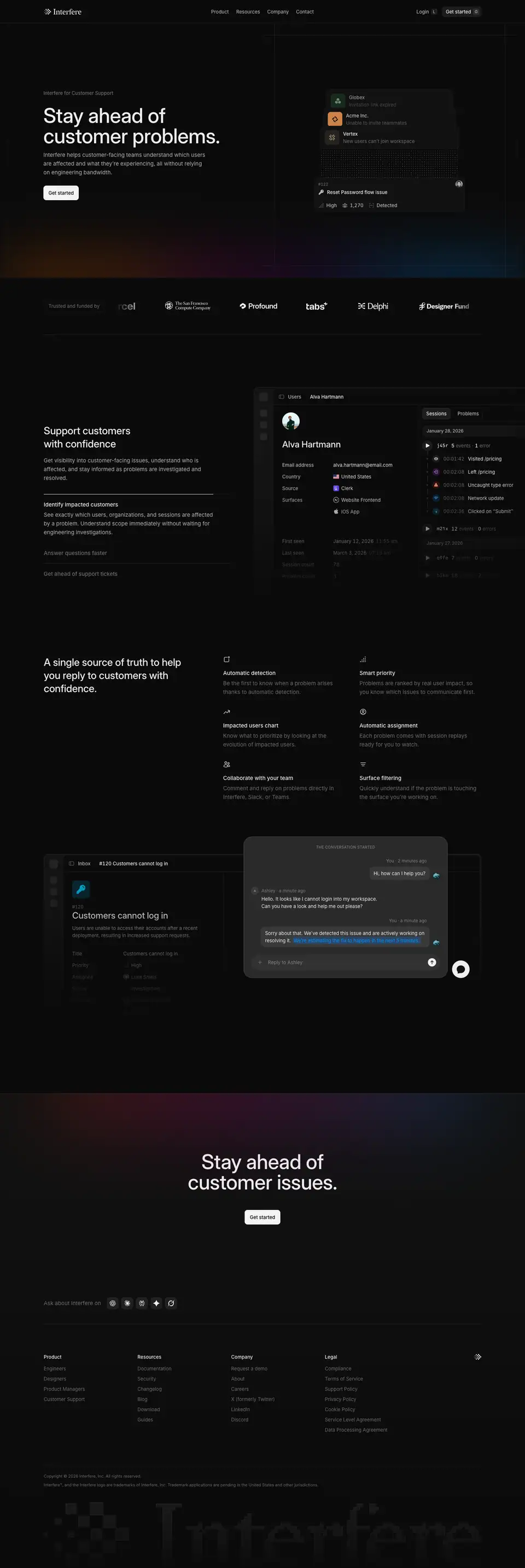
1. Hero
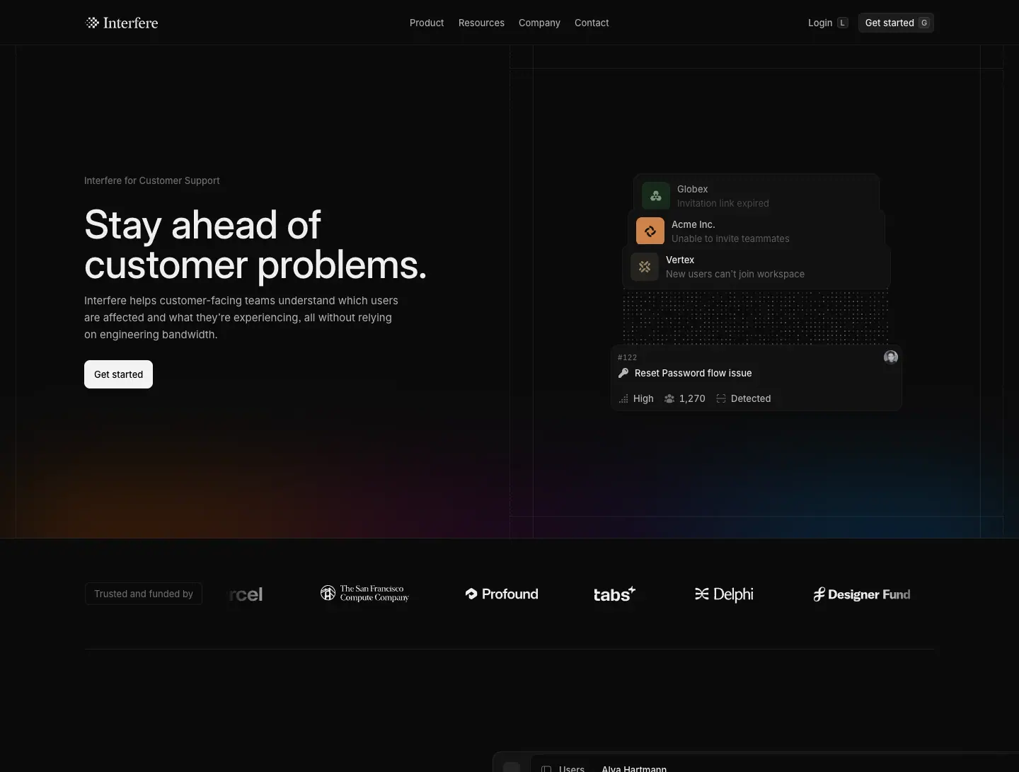
- Eyebrow "Interfere for Customer Support". H1 "Stay ahead of customer problems." Lead: "Interfere helps customer-facing teams understand which users are affected and what they're experiencing, all without relying on engineering bandwidth."
- Asset: a stack of company cards (Globex · Invitation link expired, Acme Inc. · Unable to invite teammates, Vertex · New users can't join workspace) linked through a dot field drawn on
<canvas> to one problem card "#122 Reset Password flow issue · High · 1,270 · Detected".
Why: support thinks in accounts, not stack traces; the dot field visualises "many customers, one root problem". Canvas was chosen because an SVG dot grid cost too many DOM nodes (team write-up).
2. Support customers with confidence
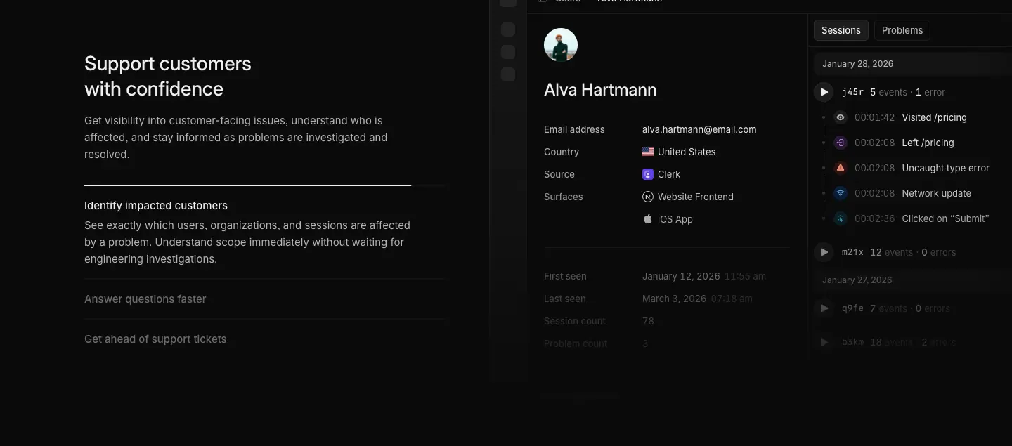
Three-step list: Identify impacted customers · Answer questions faster · Get ahead of support tickets, beside the problem window.
3. A single source of truth to help you reply to customers with confidence
Feature grid (Automatic detection, Smart priority, Impacted users chart, Automatic assignment, Collaborate with your team, Surface filtering) above a composite: the problem window "#120 Customers cannot log in" overlapped by a floating chat widget ("Hi, how can I help you?" → "Sorry about that. We've detected this issue and are actively working on resolving it. We're estimating the fix to happen in the next 5 minutes."). The estimate is a blue inline link.
Why: it shows the exact moment support values: answering a customer with a real ETA.
4. Closing CTA: "Stay ahead of customer issues."

About · https://interfere.com/about
5,367 px. Meta: "Interfere is building the self-healing layer of the internet: software that sees users struggle, diagnoses the root cause, and ships its own fix."
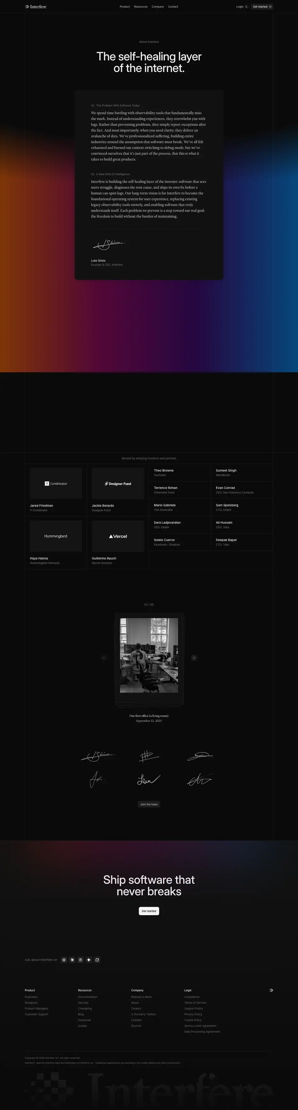
1. Hero + founder letter
- Eyebrow "About Interfere" (13/500
.392), H1 "The self-healing layer of the internet." 56/56, 500, −1.12 px (−2%), centered, w 508.
- The brand gradient fills the whole band at its strongest alpha (
#ef5f00 .5 → #c2007a .39 → #53009e .36 → #0086f0 .49), the only page where it does.
- A raised card (
#111, ≈ 16 px radius) holds the letter, set in Heldane Text 18/28 at .80, in two numbered parts with 13/450 .392 labels: "01 The Problem With Software Today", "02 A New Kind of Intelligence". It ends with a white handwritten signature, "Luke Shiels · Founder & CEO of Interfere".
- A 32/40 Heldane manifesto line uses the scroll-reveal effect: "In an age where execution is abundant, we're building the tools to enable the next generation of software to be durable, delightful with craft taste built-in from day one."
Why: a manifesto should read like a letter. The serif, the paper-like card, the numbered sections and the signature borrow from print, which signals conviction and longevity. The full gradient is the brand at its most emotional.
2–3. Letter sections

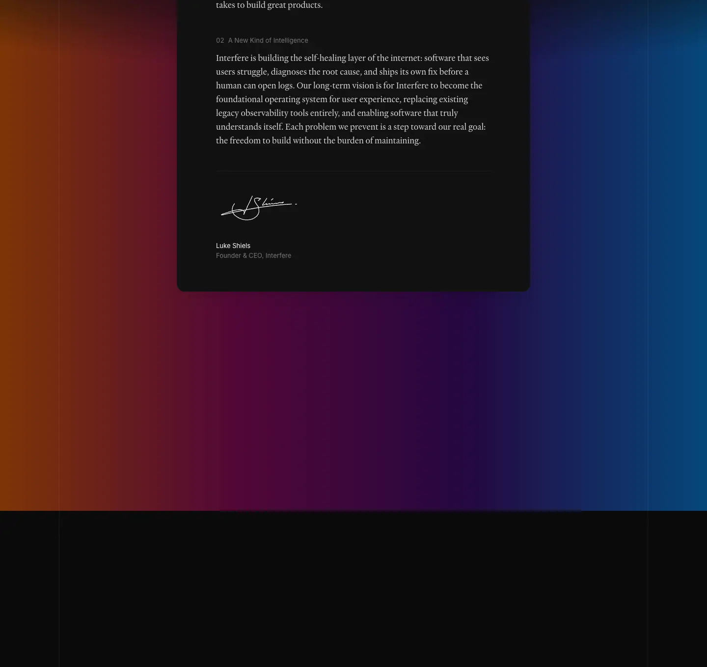
4. Backed by amazing investors and partners
- Four logo tiles (Y Combinator · Jared Friedman, Designer Fund · Jackie Berardo, Hummingbird · Haya Hanna, Vercel · Guillermo Rauch), name 15/500 under each.
- Two-column angel table on hairlines: Theo Browne (YouTuber), Sumeet Singh (Worldbuild), Terrence Rohan (Otherwise Fund), Evan Conrad (CEO, San Francisco Compute), Mario Gabriele (The Generalist), Sam Spelsberg (CTO, Delphi), Dara Ladjevardian (CEO, Delphi), Ali Hussain (CEO, Tabs), Soleio Cuervo (Facebook / Dropbox), Deepak Bapat (CTO, Tabs).
- Photo carousel "01 / 05": B/W documentary photo in a device-like frame, Heldane 15/24 caption "Our first office (a living room)", date "September 12, 2025", prev/next round buttons.
- A 3 × 2 grid of team signatures in white strokes, then "Join the team".
Why: names and faces of credible backers do the selling for a seed-stage company. The living-room photo and signatures make the team feel real and small, which suits a recruiting-heavy About page.
5. Closing CTA and footer

Mobile

Careers · https://interfere.com/careers
4,291 px. Eight open roles at capture time (see public pages).
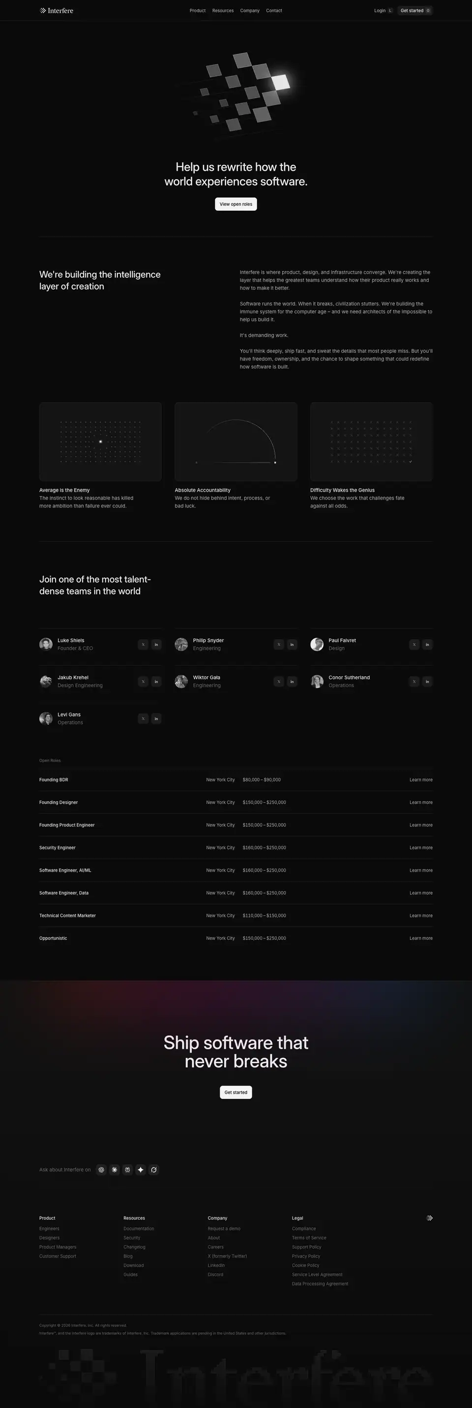
1. Hero
The logomark exploded into 3D floating tiles (extruded squares, lit from the top right, one tile glowing white), then H1 "Help us rewrite how the world experiences software." 36/44 centered, and "View open roles".
Why: the brand mark "coming apart" reads as building, potential, a team assembling. It is the most sculptural use of the pixel motif on the site.
2. We're building the intelligence layer of creation
H2 left (28/36); four short paragraphs right ("Interfere is where product, design, and infrastructure converge…", "Software runs the world. When it breaks, civilization stutters…", "It's demanding work.", "You'll think deeply, ship fast, and sweat the details that most people miss…"). Then three values cards with dot-matrix art: Average is the Enemy ("The instinct to look reasonable has killed more ambition than failure ever could."), Absolute Accountability ("We do not hide behind intent, process, or bad luck."), Difficulty Wakes the Genius ("We choose the work that challenges fate against all odds.").
Why: the copy filters candidates as much as it attracts them. Very short paragraphs give each line weight.
3. Team and open roles
- H2 "Join one of the most talent-dense teams in the world". Roster in three columns: grayscale avatar, name 15/500, role 15
.392, X and LinkedIn icon buttons.
- "Open Roles" table: role, location (New York City), salary range (13 px, −0.325 px tracking, e.g. "$80,000 – $90,000", "$150,000 – $250,000"), "Learn more".
Why: published salaries and real faces are trust signals for senior candidates and a statement of culture (transparency).
Job post template · https://interfere.com/careers/founding-designer
4,615 px. One template for all 8 roles.
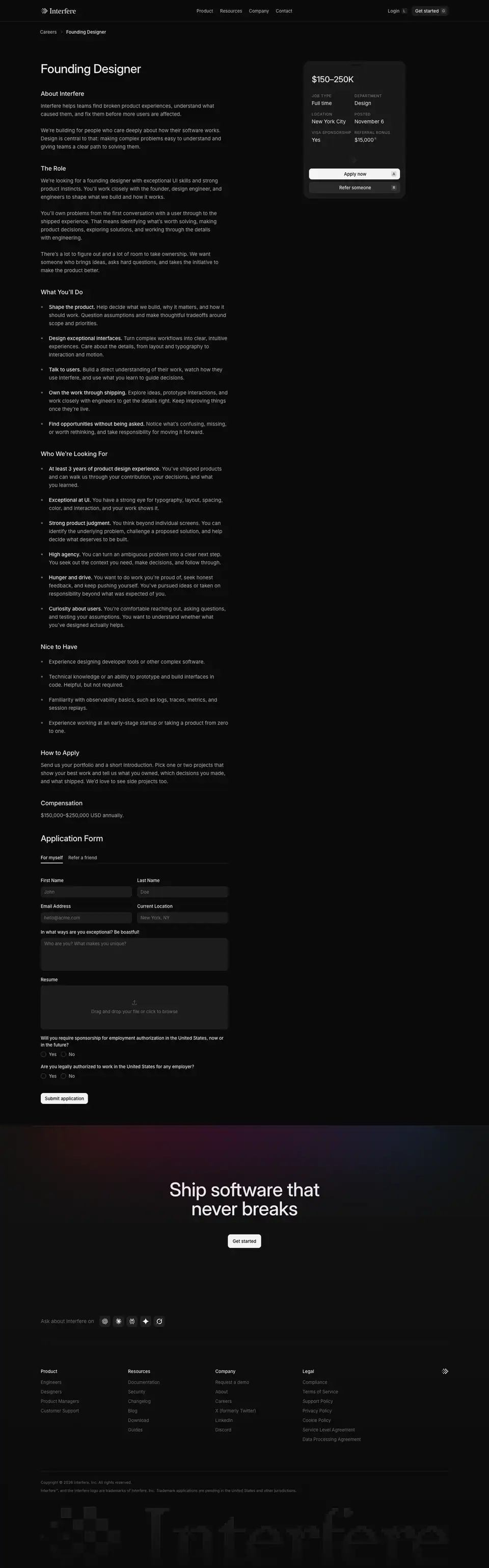
Layout
- Breadcrumb "Careers / Founding Designer".
- Left column 552 px at x 120: H1 36/44 "Founding Designer", then H2s at 18/24 (About Interfere, The Role, What You'll Do, Who We're Looking For, Nice to Have, How to Apply, Compensation), body 15/24
.686, list items with a bold 15/500 lead phrase ("Shape the product. Help decide what we build…").
- Right: a sticky summary card (
#111, ≈ 12 px radius): "$150–250K" 24/32, a 2 × 3 grid of overline labels (11 px uppercase, +0.55 px: JOB TYPE, DEPARTMENT, LOCATION, POSTED, VISA SPONSORSHIP, REFERRAL BONUS) with values (Full time, Design, New York City, November 6, Yes, $15,000), then Apply now A (primary with keycap) and Refer someone* (secondary).

Sections



Application form
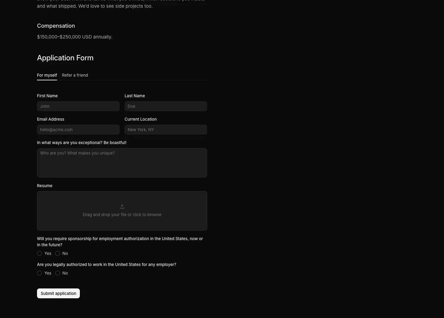
"Application Form" 24/32 with "For myself / Refer a friend" tabs, two-column inputs (First name, Last name, Email Address, Current Location), a textarea "In what ways are you exceptional? Be bold!", a dashed dropzone "Drag and drop your file or click to browse", two Yes/No radio groups (visa, authorization), "Submit application".
Why: the sticky card keeps salary and the Apply action visible through a long description; the A keycap repeats the keyboard-first idea from the header. The "Be bold!" prompt matches the values copy.
Security and Privacy · https://interfere.com/security
4,854 px. Meta: "How Interfere protects customer data: our compliance program, security controls, and answers to common security questions."
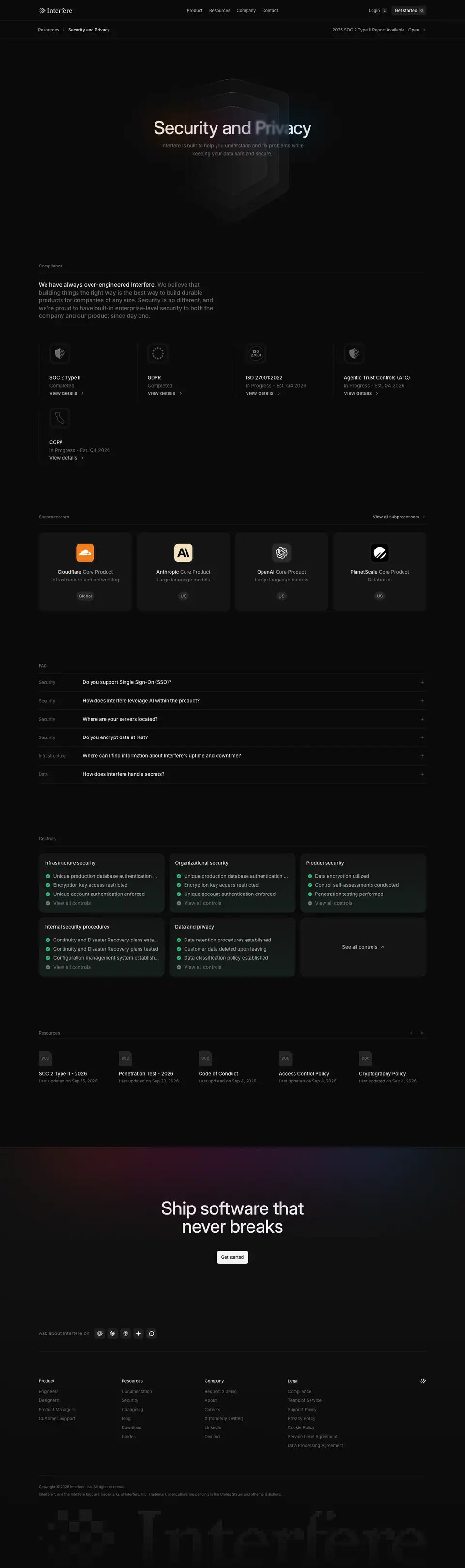
1. Hero
- A breadcrumb bar under the header: "Resources / Security and Privacy" left, "2026 SOC 2 Type II Report Available · Open" right.
- H1 "Security and Privacy" 56/56, 500, −1.12 px, centered; one word carries a soft gradient tint. Lead "Interfere is built to help you understand and fix problems while keeping your data safe and secure." 15/24
.392.
- Background: concentric shield outlines stacked in depth, very low contrast.
Why: a trust page should feel calm, symmetric and official. The report link in the breadcrumb bar answers the #1 procurement question before scrolling.
2. Compliance
Section label "Compliance" (13/500 .392), a two-tone paragraph ("We have always over-engineered Interfere. We believe that building things the right way…"), then five badges: SOC 2 Type II (Completed), GDPR (Completed), ISO 27001:2022 (In Progress - Est. Q4 2026), Agentic Trust Controls (ATC) (In Progress), CCPA (In Progress). Each: 56 px engraved icon tile, 15/500 title, status .392, "View details ›".
3. Subprocessors
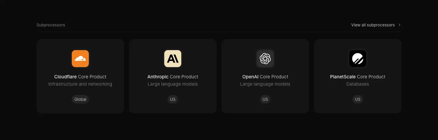
Four cards (Cloudflare · Infrastructure and networking · Global, Anthropic · Large language models · US, OpenAI · Large language models · US, PlanetScale · Databases · US), each with the vendor logo in a 48 px tile, "Core Product" label and a region pill. "View all subprocessors ›".
Why: naming AI subprocessors up front is now table stakes for an AI product selling to enterprises.
4. FAQ
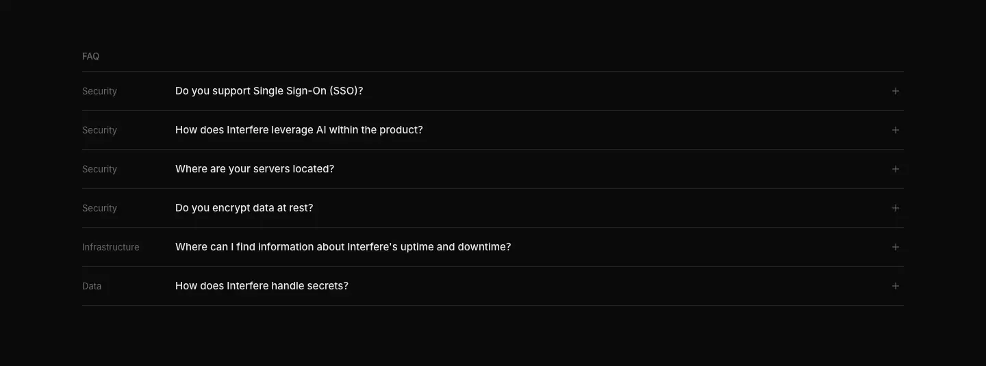
Six rows with a category column (Security, Infrastructure, Data) and a question (15/400): "Do you support Single Sign-On (SSO)?", "How does Interfere leverage AI within the product?", "Where are your servers located?", "Do you encrypt data at rest?", "Where can I find information about Interfere's uptime and downtime?", "How does Interfere handle secrets?". Rows are 57 px apart on 1 px hairlines.
5. Controls
Five cards (Infrastructure security, Organizational security, Product security, Internal security procedures, Data and privacy) each listing three controls with green check icons and "View all controls"; a sixth card "See all controls ↗" links to the trust center.
6. Resources
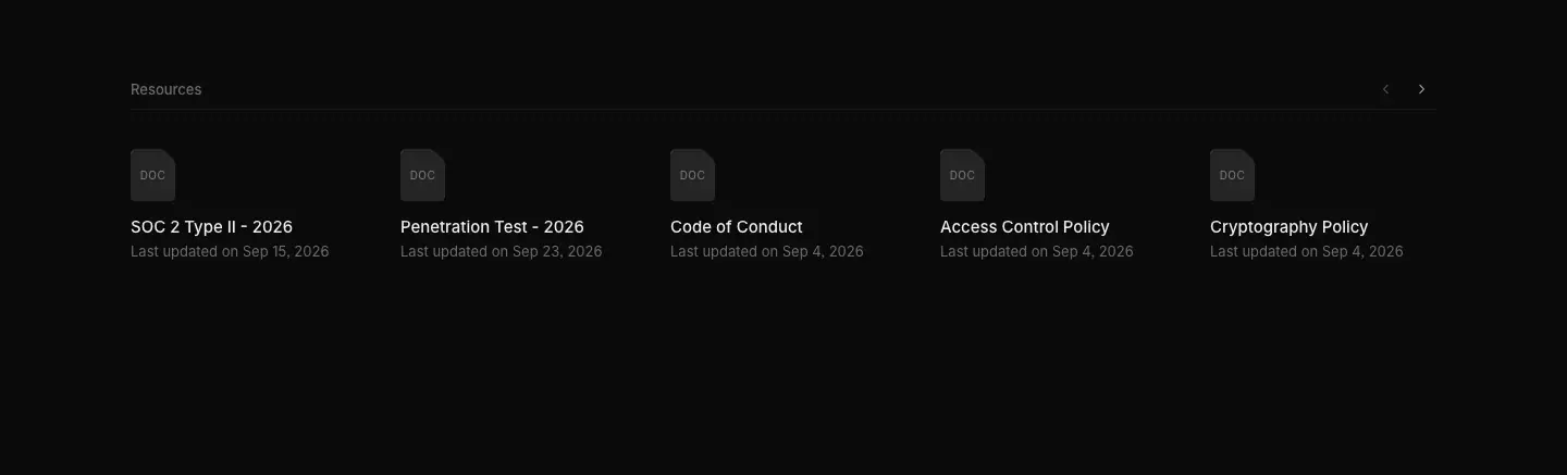
A carousel (Previous / Next slide) of 25 document tiles, five visible at a time: SOC 2 Type II - 2026, Penetration Test - 2026, Code of Conduct, Access Control Policy, Cryptography Policy, then 13 more policies and letters (Incident Response Plan, Secure Development Policy…) and the 7 legal documents. Each tile has a paper thumbnail labelled with a 10 px uppercase code (DOC, TOS, SP, PP, CP, SLA, DPA) and "Last updated on …".
7. Closing CTA

Download · https://interfere.com/download
2,485 px. Meta: "Download the Interfere desktop app for macOS and Windows."
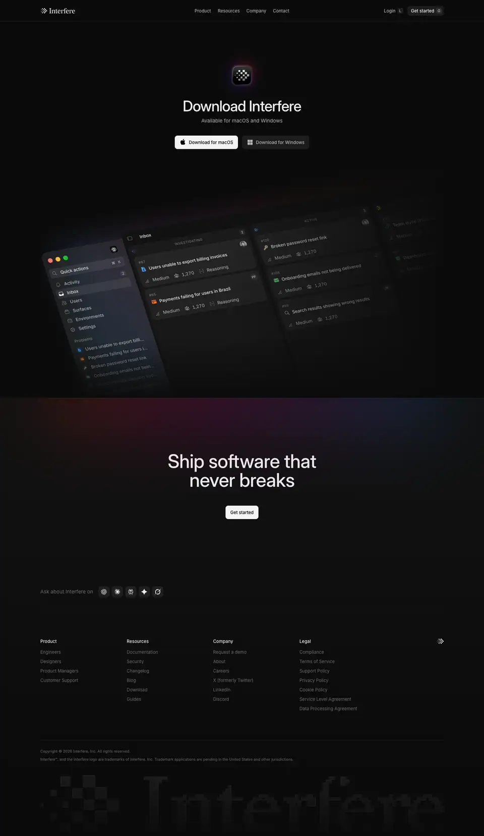
1. Hero
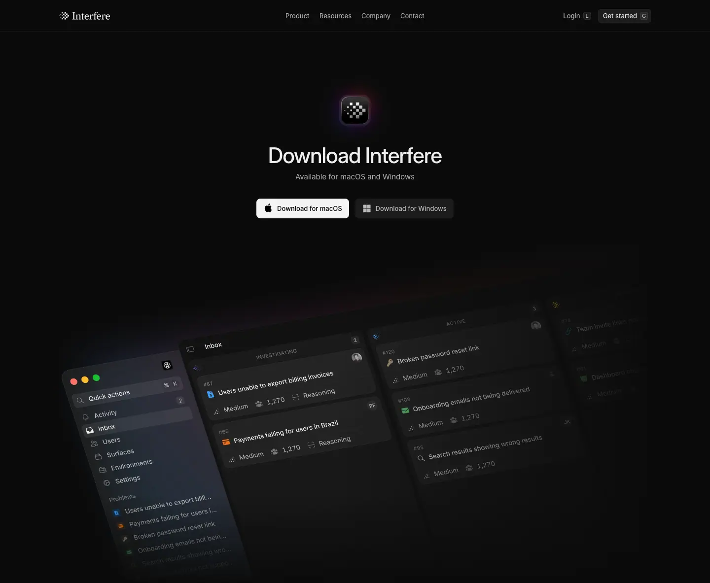
- App icon (≈ 64 px): white pixel mark on a glossy black squircle with a thin gradient rim.
- H1 "Download Interfere" 44/55, 500, −1.1 px (−2.5%), centered. Lead "Available for macOS and Windows" 15/24
.686.
- Two buttons: Download for macOS (primary white, Apple glyph) and Download for Windows (secondary, Windows glyph).
- Below: the desktop app in perspective/isometric, three columns of the Inbox (Quick actions menu, Inbox, Active problems) receding to the right, with a radial brand gradient (
radial-gradient(at 70% 15%, …, .4)) behind and fade masks to the page color on the right and bottom.
Why: a download page sells one object. The icon is the hero, the tilted window shows it is a real native app, and the OS-specific buttons remove a decision.
2. Closing CTA and footer

Get started / Request a demo · https://interfere.com/join
A single-viewport (900 px) app-style page; every "Get started" on the site leads here.
Layout
- Left panel (≈ 718 px wide, fill
#111, 8 px radius, inset 4 px from the viewport edges): "← Return", then centered "Get started" (24/32, 500) and "Get a first-hand look at how Interfere can save you time and keep your software bug-free." (15/24 .392).
- Form: First name / Last name, Company website / Work email in two columns. Labels 13/500 above inputs; inputs 40 px, fill
.07, 8 px radius; the focused input gets a Radix blue 1 px ring + outer glow.
- "Continue" full-width, Radix blue-9
#0090ff, white text.
- A 3-step progress rail of dots on the far left edge (current step blue).
- Footer links: Terms of Service · Privacy Policy · Support, and the pixel mark.
- Right side: a fine dot-matrix field with the customer quote in Heldane Text 24 px, centered, plus the author chip.
Why: this is the hand-off from marketing to product. The page switches to app conventions (blue action, multi-step form, no global nav) so the visitor feels the product has started. The quote on the right keeps reassurance in view at the moment of commitment. Asking for work email and company website qualifies leads for a sales-led motion (there is no public pricing).
Blog index · https://interfere.com/blog
2,733 px. Meta: "News and papers from the Interfere team". Three articles at capture time.
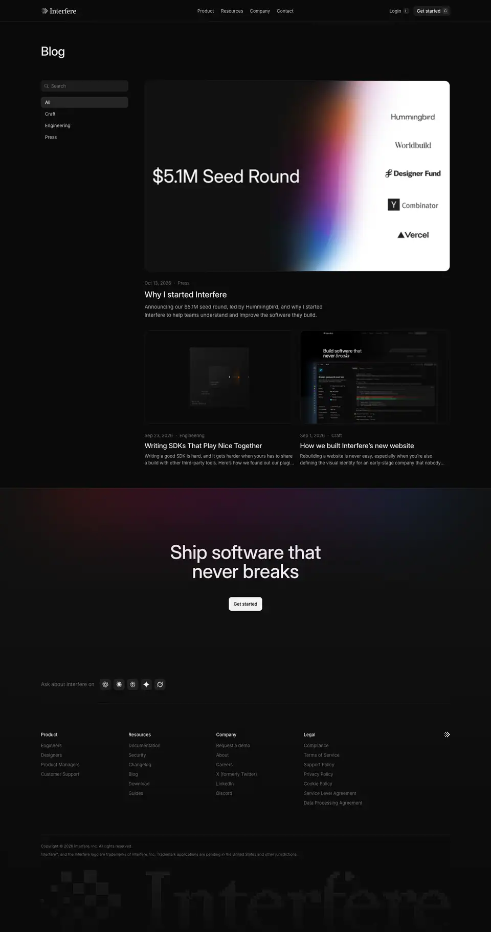
Layout
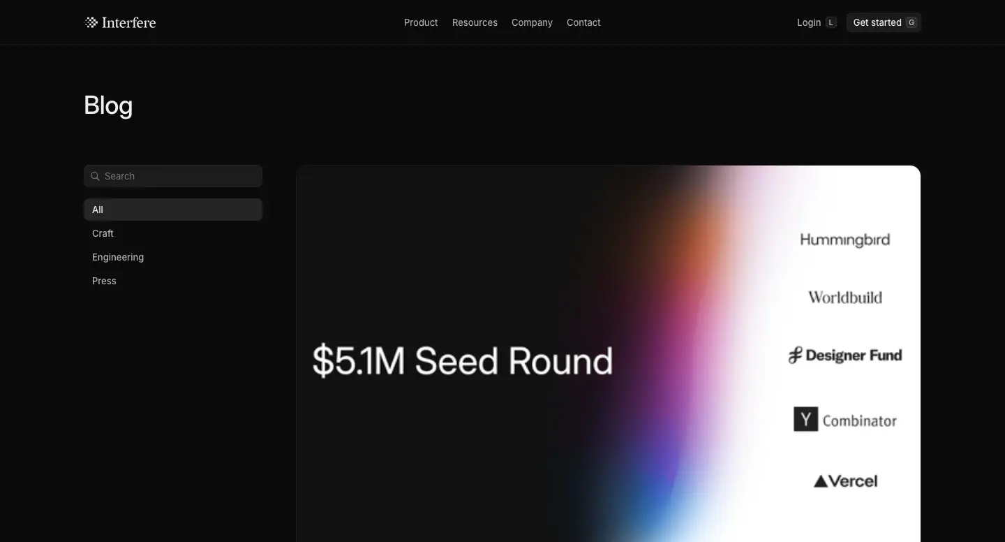
- H1 "Blog" 36/44 at x 120, then "3 articles" 15/24.
- Left rail (x 120, ≈ 280 px): a search field (fill
.07, 6 px radius) and category filters All · Craft · Engineering · Press as 13 px rows; the active row has a .07 fill.
- Featured post (894 px at x 425): the seed-round cover — dark left half with "$5.1M Seed Round", a vertical gradient beam, white right half with investor wordmarks (Hummingbird, Worldbuild, Designer Fund, Y Combinator, Vercel). Below: "Oct 13, 2026 · Press", title "Why I started Interfere" 24/32, excerpt 15/24
.686.
- Two-up (438 px each): "Writing SDKs That Play Nice Together" (Engineering) and "How we built Interfere's new website" (Craft), 20/24 titles, 13/20 excerpts.
Why: with only three posts, a featured + grid layout looks deliberate rather than empty. The rail prepares for growth without needing pagination yet. The seed cover is the only white surface on the whole marketing site, which makes the announcement pop.
Blog post template
Captured: https://interfere.com/blog/how-we-built-interferes-new-website (15,497 px, Craft, Sep 1, 2026, by Paul Faivret · Design and Jakub Krehel · Design Engineering) and https://interfere.com/blog/seed-announcement (5,348 px, Press, Oct 13, 2026, by Luke Shiels · Founder & CEO).

Layout (measured)
| Element |
Value |
| Breadcrumb bar |
"Blog / How we built Interfere's new website" left, "Copy link" right |
| H1 |
36/44, 500, −0.36 px, centered |
| Hero media |
framed cover or video, up to 934 px wide |
| Author row |
avatar pair + names 13/450, date and category right-aligned |
| Body column |
628 px at x 406 |
| Body text |
16/24, .80 |
| H2 |
18/24, 500 |
| Inline code |
Berkeley Mono 13/20 .80 on a .07 chip |
| Figures and videos |
788 px (x 326), 80 px breakout each side |
| Table of contents |
left rail, sticky, 13 px, current item .93 |
| Pull quote (seed post) |
Heldane Text 28 px with a left rule |
| End |
author pair with X / LinkedIn icons, then the closing CTA |
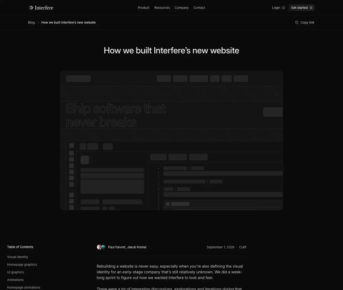
Video player
Article videos autoplay muted in a loop, with a custom player: time "00:00 / 00:13" (12/450 white), a scrubber and a speed menu 0.25× · 0.5× · 0.75× · 1× · 1.25× · 1.5× · 1.75× · 2×. Why: slowing the hero animation down to 0.25× is how readers see the stagger and the 3-word reveal the article describes.
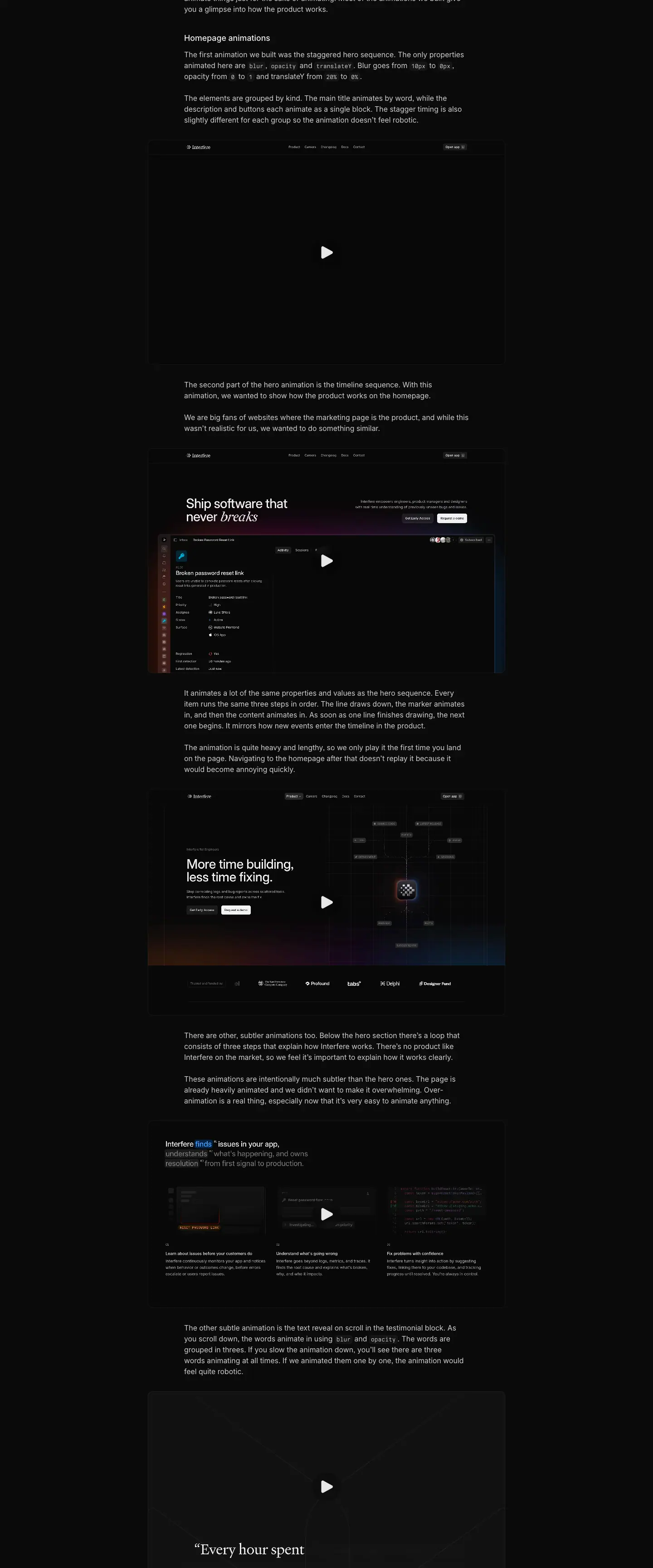
Why this post matters for this research
It is the design team's own rationale. Key quotes used across these docs:
- Visual identity: "…a clean and minimalist look that is unmistakably Interfere… two signature details the site is built on: the Interfere gradient and a pixelated final word in the headline that echoes the logo."
- Gradient: "It's a nice visual thread that ties seemingly unrelated elements together."
- Graphics: "We settled on the semi-transparent grey… the only option that met all criteria." and "Figma automatically renders shadows behind transparent fills; browsers don't."
- UI graphics: "…using skeleton UI for unimportant pieces of the UI."
- Motion: "The only properties animated here are blur, opacity and translateY. Blur goes from 10px to 0px, opacity from 0 to 1 and translateY from 20% to 0%."; "Over-animation is a real thing."
- Assets: "Every asset on the website is built in code."
- Stack: "TanStack Start and Vite… Tailwind CSS for styles, Radix for colors, Motion for animation and Base UI for primitives."
- Easter eggs: right-click the logo for brand assets; the "+" in the hero avatar stack links to Careers.
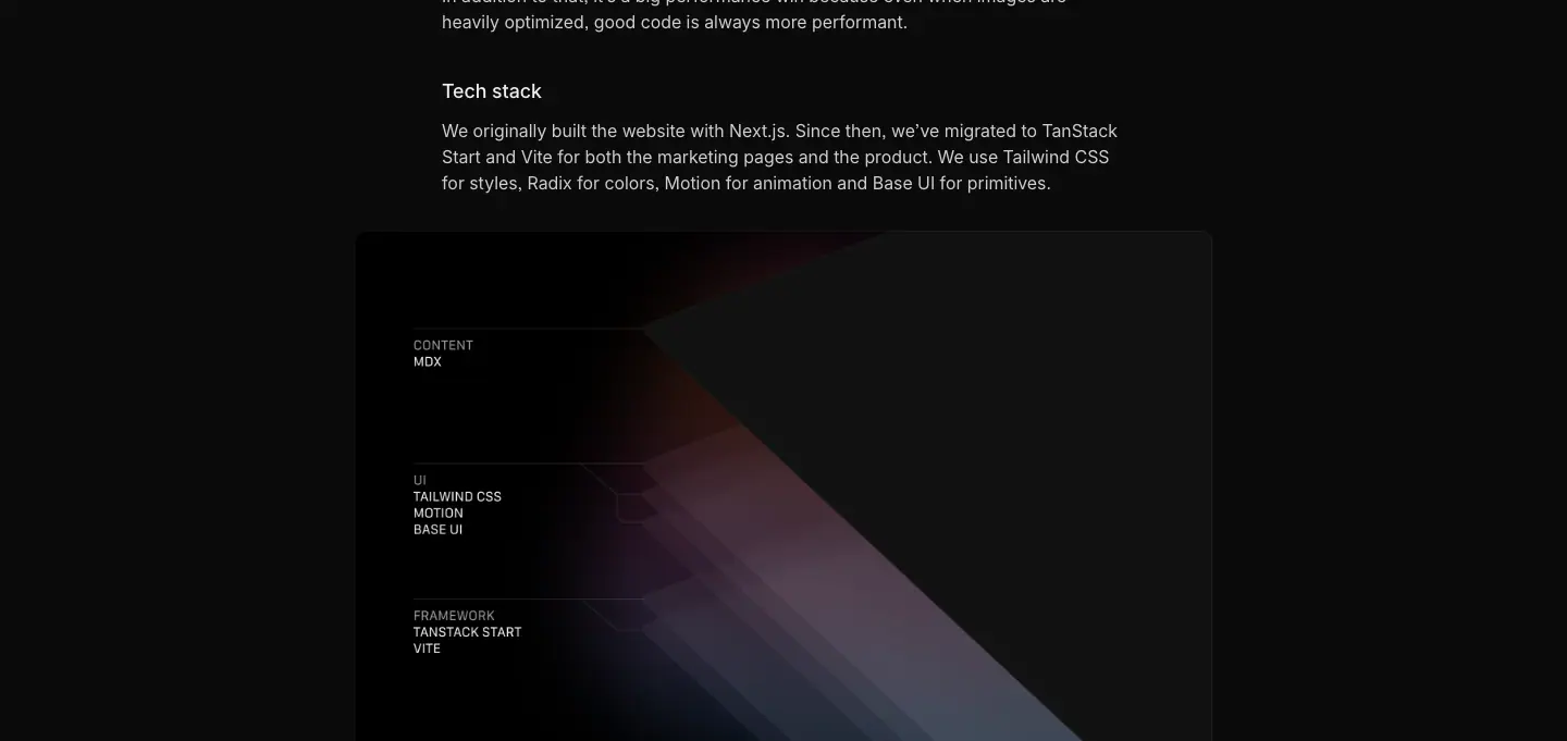
Seed announcement
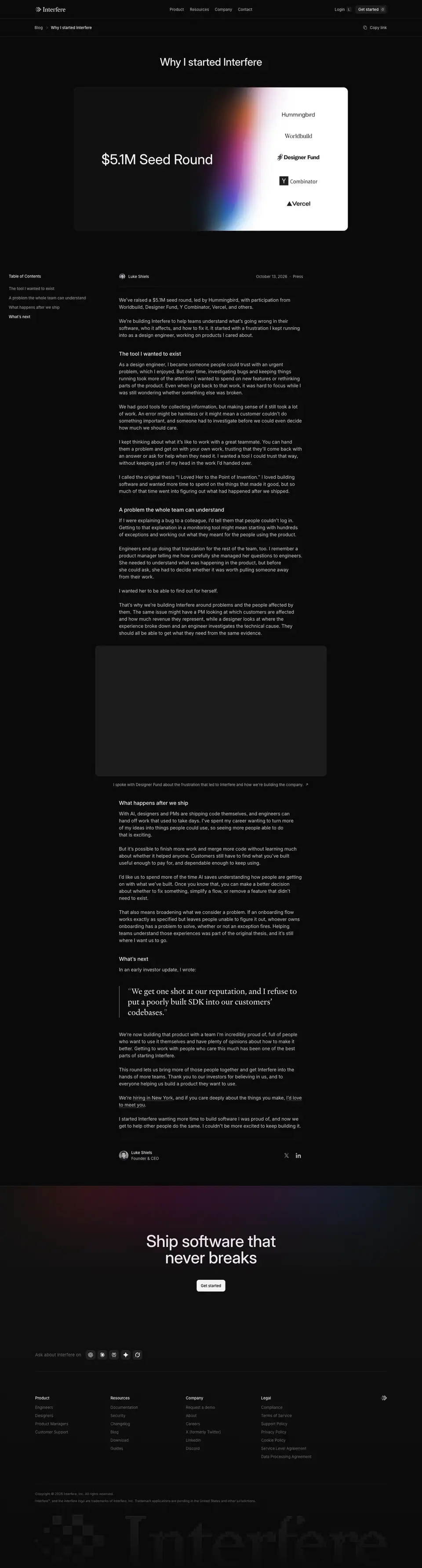
Same template, founder voice ("I started Interfere…"), section H2s "The tool I wanted to exist", "A problem the whole team can understand", "What happens after we ship", "What's next", a video embed, and the only Heldane pull quote in the blog: "We get one shot at our reputation, and I refuse to put a poorly built SDK into our customers' codebases."
Changelog index · https://interfere.com/changelog
13,027 px. All 13 entries on one long page (no pagination).

Layout
- H1 "Changelog" 36/44 at x 120.
- Each entry is a block separated by a full-width hairline carrying the date (13 px
.392) left and "Copy link" right.
- Left column (560 px): entry title as H2 (28/36, weight 450, −0.28 px), then author avatars with name and role (13 px).
- Right column: a 558 px cover image at x 761, then the body (15/24
.686) under it, with inline code, bold lead-ins, code blocks and lists.
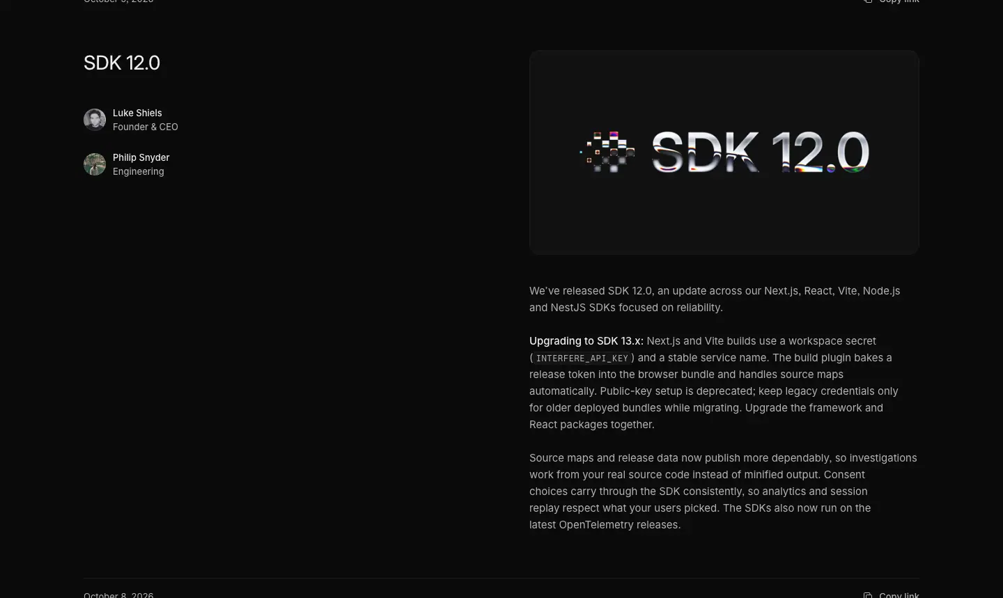
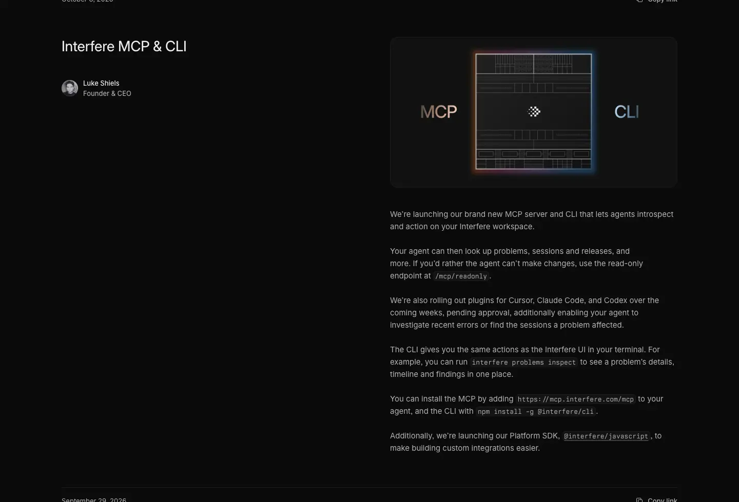
Covers
Each release gets its own designed cover: dark tile, brand gradient light, product fragment, and the feature name set in the cover ("Make Interfere your own using the MCP", "Interfere Desktop App", "Command Menu", a large pixel-styled "SDK 12.0", "MCP · CLI" bracketing a terminal window, a pixel SOC 2 seal).
Why: a cover per release turns the changelog into a marketing surface (each entry is shareable on social with its own image) and shows craft at a steady cadence. Weight 450 on titles keeps a long page of headings quieter than marketing H2s.
Changelog entry template
Captured: https://interfere.com/changelog/desktop-app (2,665 px) and https://interfere.com/changelog/mcp-feedback (3,049 px).
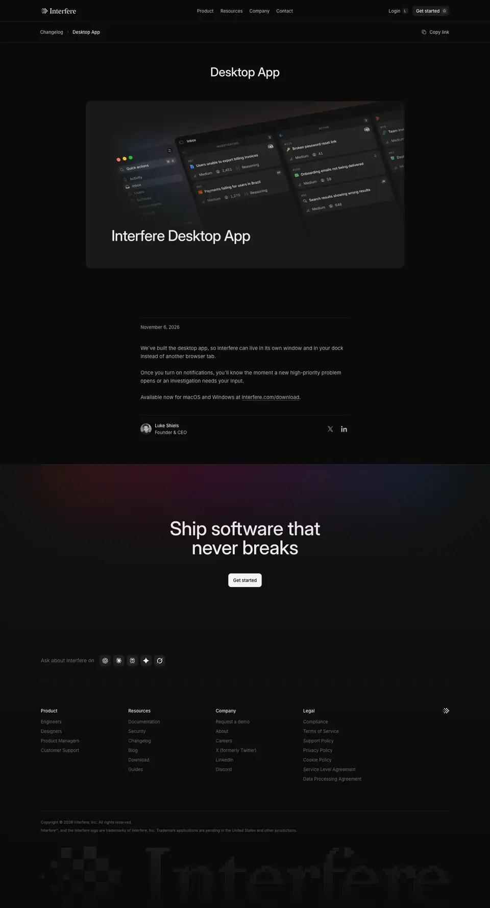
Layout
- Breadcrumb bar: "Changelog / Desktop App" + "Copy link".
- H1 36/44 centered ("Desktop App").
- Cover at ≈ 640 px wide, centered.
- Body in the article column: date "November 6, 2026" (13 px
.392), 15/24 paragraphs, a link to interfere.com/download.
- Author row with X / LinkedIn icons, then the closing CTA.
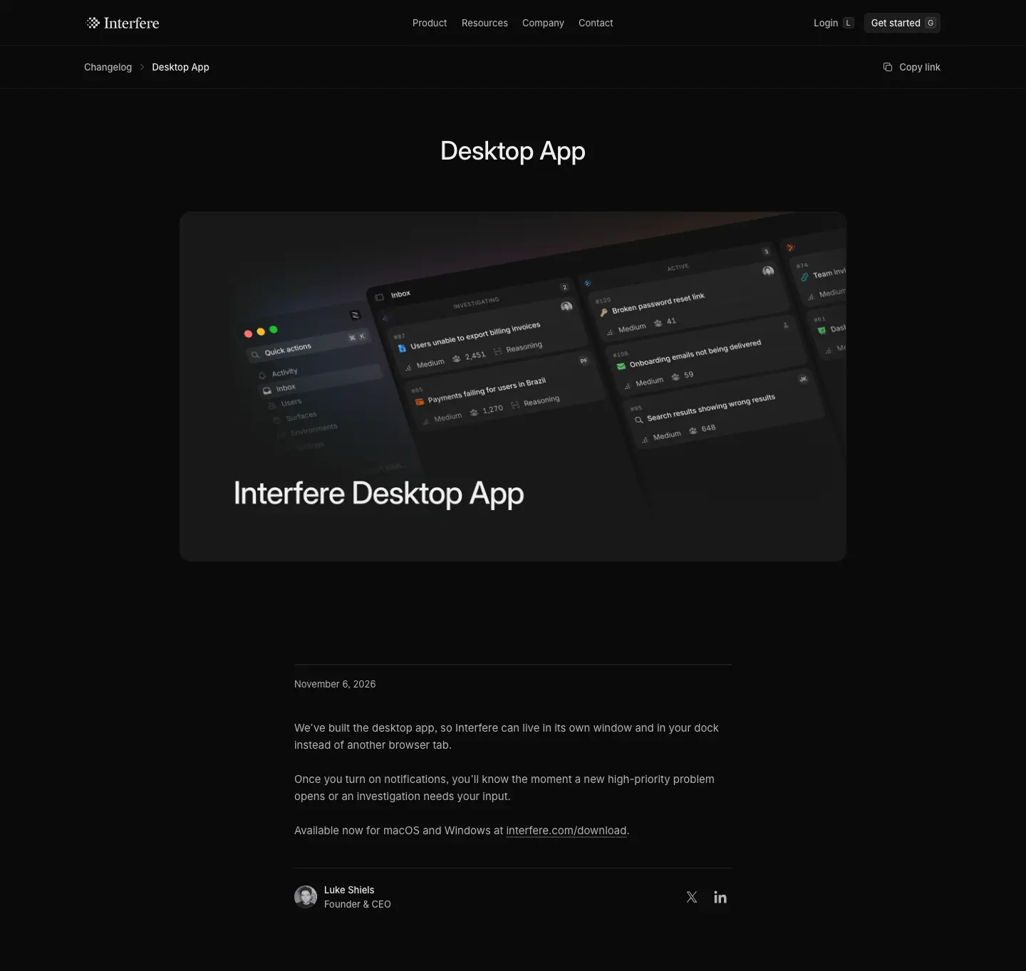
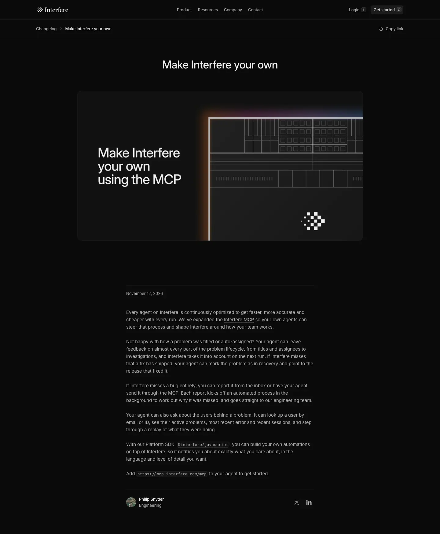
Why: the single-entry page is a share target. Centered title and cover read like a press release card; the body stays short because the index already shows the full text.
Guides index · https://interfere.com/guides
7,395 px. 28 guides in three categories (/guides/category/ai-agents, /comparisons, /errors).

Layout
- H1 "Guides" 36/44 at x 120.
- Two-up grid: 2 × 592 px cards, 16 px gap, ≈ 483 px row pitch.
- Card: a templated cover (309 px tall, dark tile, brand gradient glowing from the bottom, 2–3 app-icon tiles linked by a labelled connector), then "Nov 17, 2026 · Production errors" meta (13 px
.392), title 20/24, description 13/20 .686 clamped to 2 lines.
Cover templates
| Template |
Example |
| A → MCP → Interfere |
"How to add an MCP server to ChatGPT", Cursor, Codex, Claude Code |
| A vs B |
"Interfere vs Sentry", "PostHog vs Sentry", "Sentry vs Datadog" |
| Tool grid (2 × 3 or 3 × 3 logo chips) |
"Datadog alternatives", "Sentry alternatives", "AI root cause analysis tools" |
| Browser error chips |
"Cannot read properties of undefined" (Chrome / Firefox / Safari columns with red error strings) |
| Flow diagram |
"What is MTTR?" (Detect → Triage → Fix → Recovered) |
Why: these are search-intent pages (errors, alternatives, MCP how-tos). A templated cover system gives each a unique, on-brand image at near-zero cost and keeps the grid consistent.
Guide post template
Captured: https://interfere.com/guides/interfere-vs-sentry (6,774 px) and https://interfere.com/guides/what-is-otlp (11,429 px).
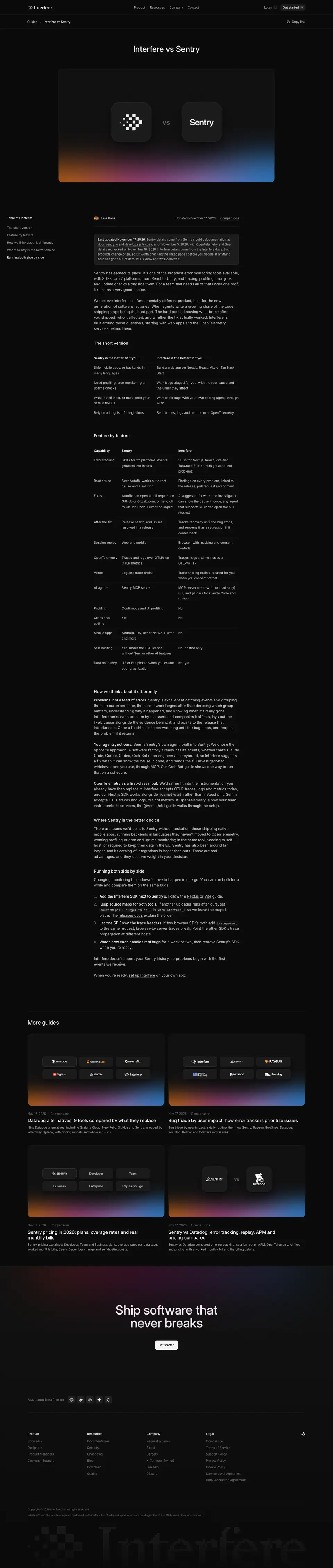
Layout
Same article shell as the blog post: breadcrumb + Copy link, centered H1 36/44, a 934 px cover, sticky table of contents on the left, 628 px body at 16/24 .80, H2 18/24.
Guide-specific blocks:
| Block |
Measured / seen |
| "Last updated" note |
bordered box at the top ("Last updated November 17, 2026. Sentry details come from Sentry's public documentation…") |
| Comparison table |
14/24 text, header row 14/600, label column; "Feature by feature" rows (Error tracking, Root cause, Fixes, After the fix, Session replay, OpenTelemetry, Vercel, AI agents, Profiling, Crons and uptime, Mobile apps, Self-hosting, Data residency) |
| Two-column "short version" |
"Sentry is the better fit if you…" / "Interfere is the better fit if you…" |
| Inline code |
Berkeley Mono 13/20 (99 code spans on the OTLP guide) |
| Numbered steps |
"Running both side by side" |
| More guides |
a two-up grid of related guide cards at the end |

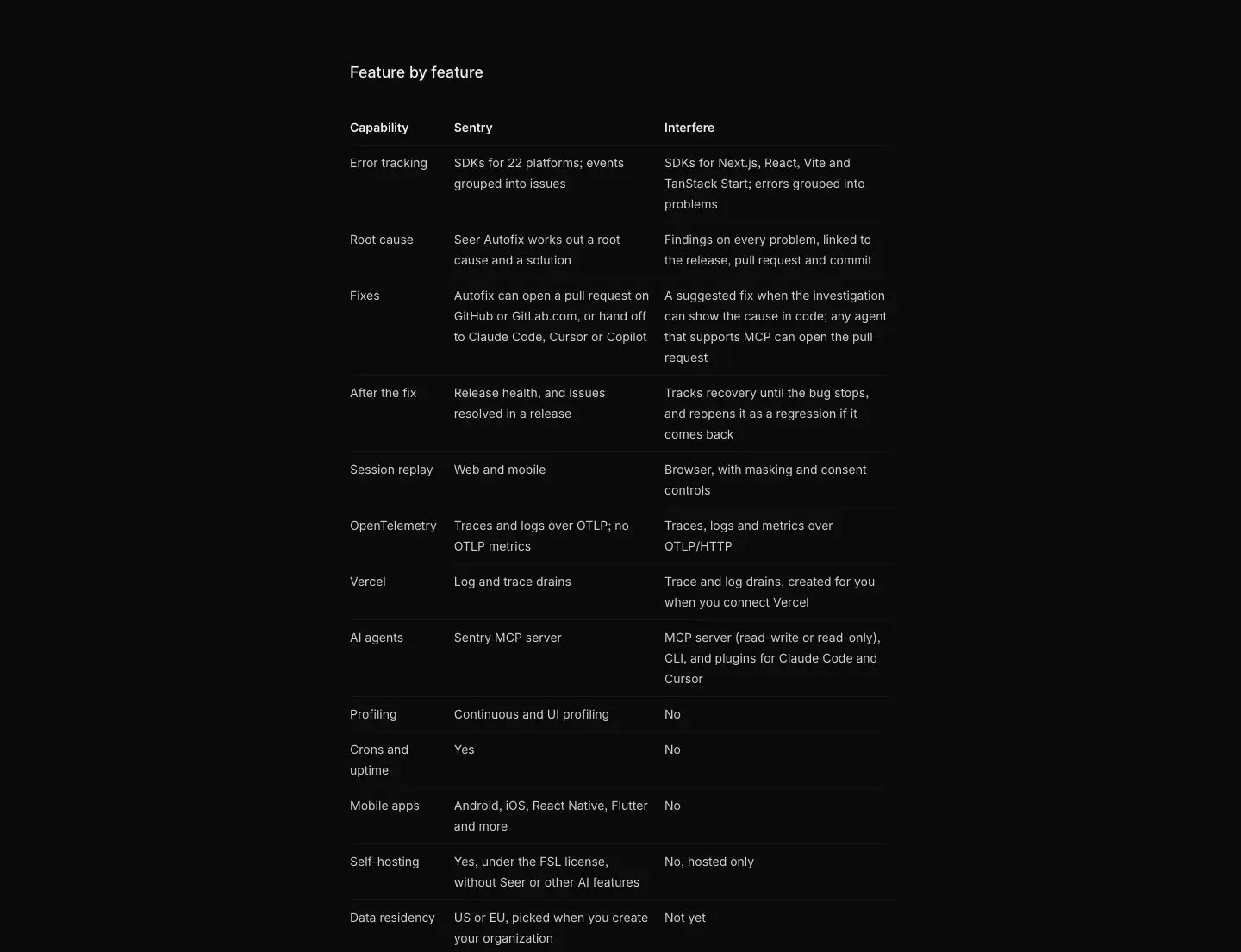
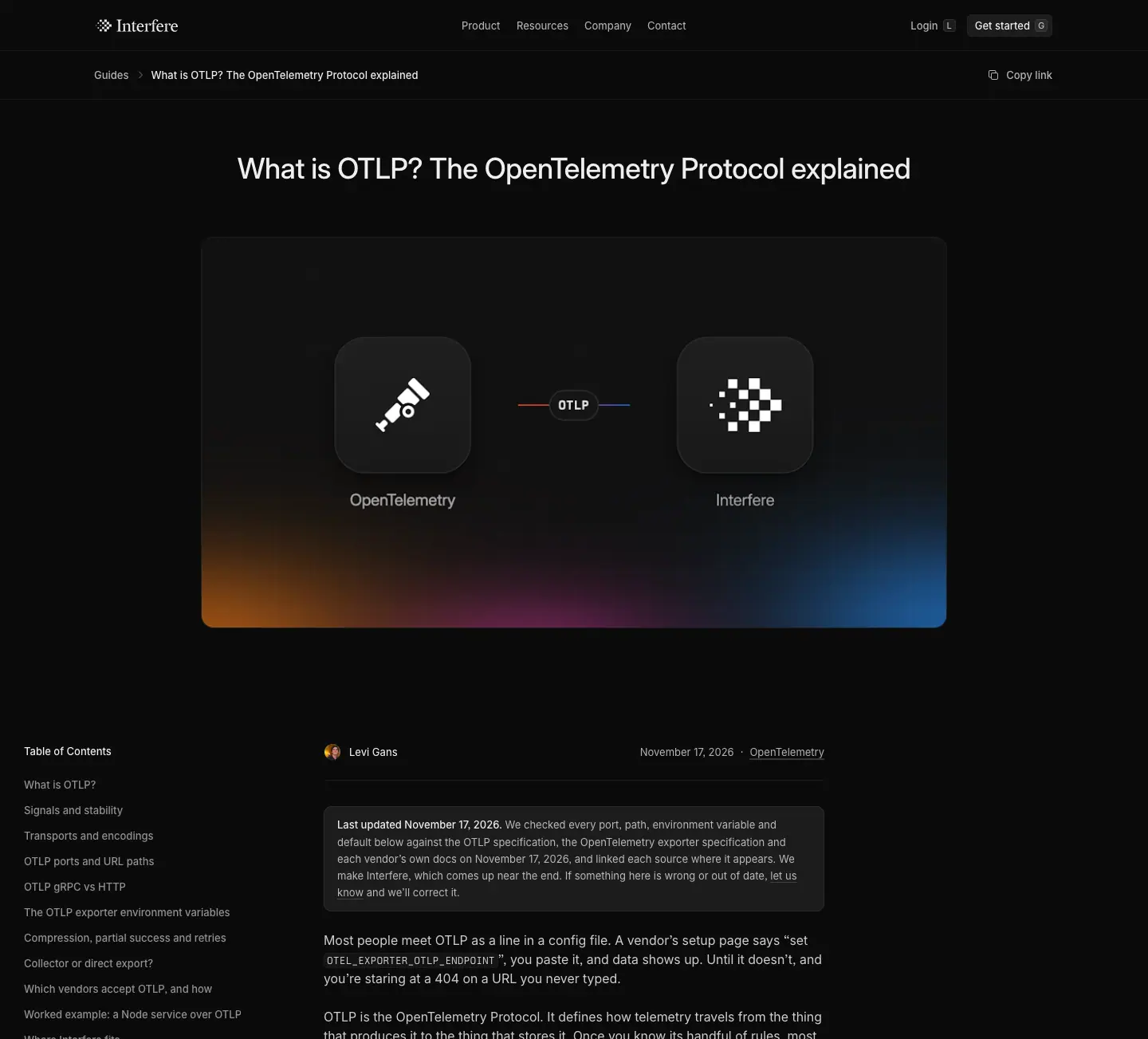
Why: comparison pages convert high-intent search traffic. Being candid ("Where Sentry is the better choice") builds trust with engineers who distrust vendor content, and the dated "Last updated" note supports accuracy.
Legal template · https://interfere.com/legal/privacy-policy
15,359 px. The same template serves all six legal pages (cookie policy, DPA, privacy policy, SLA, support policy, terms).

Layout
- Breadcrumb "Legal / Privacy Policy".
- H1 36/44 left, "Last updated on Jan 3, 2026" (13 px
.392) and "Save as PDF" action on the same line.
- Body column ≈ 628 px, 15/24
.686, bold inline terms, bullet lists, italic summaries.
- Right-hand sticky Table of Contents (≈ 300 px): 18 entries, current entry on a
.07 fill.
- H2s at 18/24.
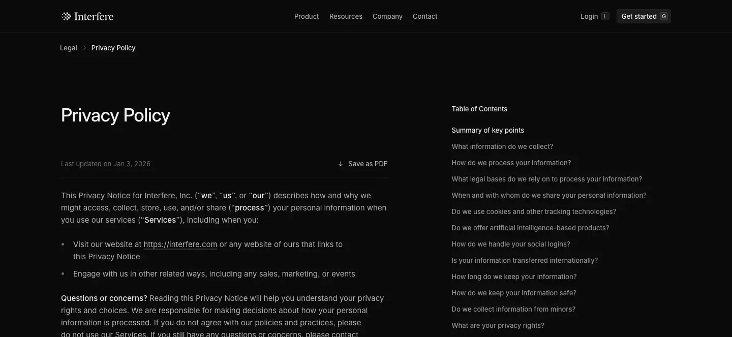
Why: legal pages are scanned, not read. A sticky TOC and a PDF export answer procurement and legal-review needs. Keeping them in the same visual system (dark, Inter, same footer) avoids the "abandoned template" look many sites have.
Docs · https://interfere.com/docs
71 documentation pages (see public pages). Built on Mintlify (<meta name="generator" content="Mintlify">), served under the main domain.
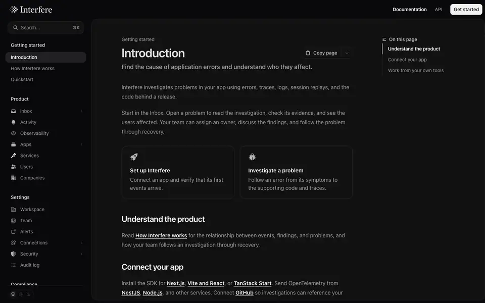
How it differs from the marketing site
|
Marketing |
Docs |
| Font |
InterVariable with ss03 |
InterVariable via Mintlify stack |
| H1 |
36/44, 500, −1% |
36/40, 600, −0.9 px (−2.5%) |
| H2 |
28/36 or 18/24, 500 |
24/32, 600, −0.6 px |
| Body |
15/24 .686, 16/24 .80 |
16/28, #9f9f9f |
| Nav text |
13 px |
14 px, #9f9f9f; group titles 14/550 #dfdfdf |
| Colors |
white alpha |
solid grays (#f3f3f3, #dfdfdf, #9f9f9f) |
| Theme |
dark only |
system / light / dark switch (bottom-left) |
Layout
- Top bar: logo lockup, "Documentation" / "API" tabs, white "Get started".
- Left sidebar (≈ 256 px): search with
⌘K, groups Getting started / Product / Settings / Compliance with line icons and chevrons.
- Content in a raised rounded container (fill ≈
#111, ≈ 16 px radius, inset from the viewport) — echoing the product app shell.
- Right "On this page" TOC with a vertical rule and active marker.
- "Copy page" split button (for pasting docs into an AI assistant) and a
/docs/llms.txt notice.
- Card links "Set up Interfere", "Investigate a problem" with icons, 1 px borders, 16 px radius.
Why: Mintlify gives search, versioning and API reference for free; the team themed it close to the brand (dark, Inter, the raised container) rather than rebuilding it. The llms.txt and "Copy page" features target AI coding agents, the same audience the footer's "Ask about Interfere on…" row targets.